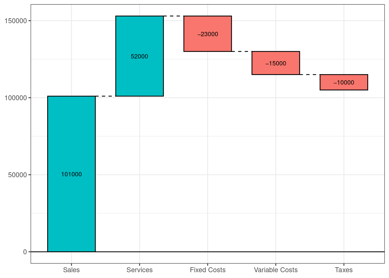
9.21 Waterfall Charts
A waterfall chart illustrates the cumulative effect of a sequence of positive and negative values.
Let’s create a dataset to plot the cumulative effect of revenue and expenses for a fictional company sing the
waterfallfunction in thewaterfallspackage.
# create company income statement
category <- c("Sales", "Services", "Fixed Costs",
              "Variable Costs", "Taxes")
amount <- c(101000, 52000, -23000, -15000, -10000)
income <- data.frame(category, amount)

library(ggplot2); library(waterfalls)
waterfall(income) # create waterfall chart