8.10 Visualizing logistic regression
Using the fitted model, we visualize the relationship between age and the probability of being married, holding the other variables constant.
The
scale = "response"option creates a plot based on a probability (rather than log-odds) scale.
# plot results
library(ggplot2)
library(visreg)
visreg(cps85_glm, "age",
       gg = TRUE,
       scale="response") +
  labs(y = "Prob(Married)",
       x = "Age",
       title = "Relationship of age and marital status",
       subtitle = "controlling for sex, race, and job sector",
       caption = "source: Current Population Survey 1985")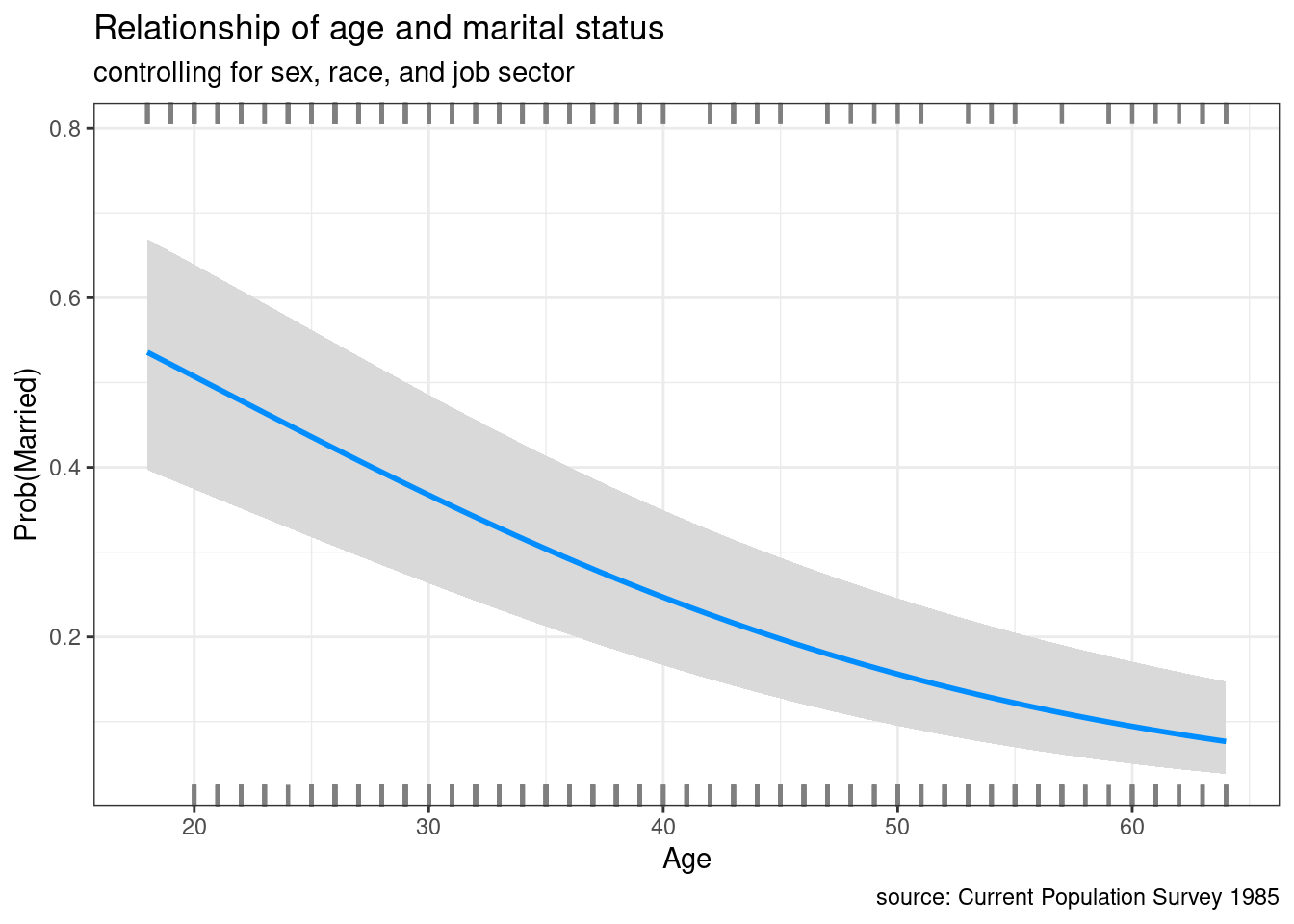
- Here we see that the probability of being married is estimated to be roughly 0.5 at age 20 and decreases to 0.1 at age 60, controlling for the other variables.