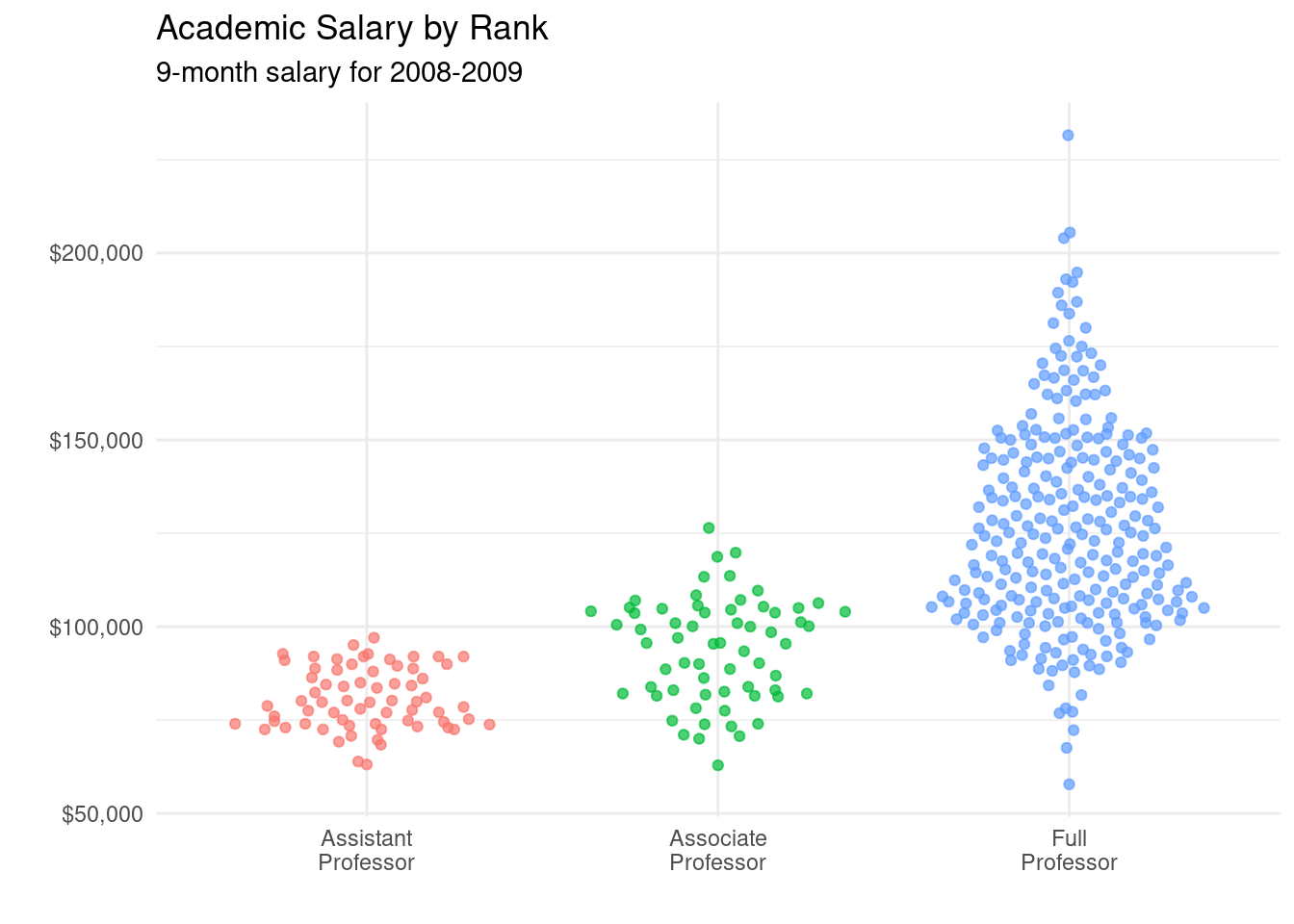
4.16 Beeswarm Plots
Beeswarm plots (also called violin scatter plots) are similar to jittered scatterplots, in that they display the distribution of a quantitative variable by plotting points in way that reduces overlap. In addition, they also help display the density of the data at each point (in a manner that is similar to a violin plot).
# plot the distribution of salaries
# by rank using beewarm-syle plots
library(ggbeeswarm)
library(scales)
ggplot(Salaries,
       aes(x = factor(rank,
                      labels = c("Assistant\nProfessor",
                                 "Associate\nProfessor",
                                 "Full\nProfessor")),
           y = salary,
           color = rank)) +
  geom_quasirandom(alpha = 0.7,
                   size = 1.5) +
  scale_y_continuous(label = dollar) +
  labs(title = "Academic Salary by Rank",
       subtitle = "9-month salary for 2008-2009",
       x = "",
       y = "") +
  theme_minimal() +
  theme(legend.position = "none")