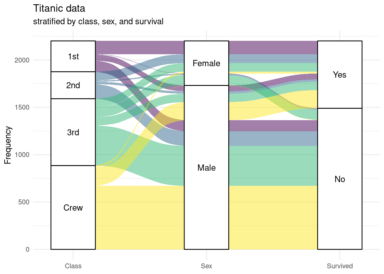
9.13 Modified Alluvial Diagram
Here is an alternative visualization. Survived becomes an axis and Class becomes the fill color. Colors are chosen from the viridis palette. Additionally, the legend is suppressed.
library(ggplot2); library(ggalluvial)

ggplot(titanic_table,
       aes(axis1 = Class,
           axis2 = Sex,
           axis3 = Survived,
           y = n)) +
  geom_alluvium(aes(fill = Class)) +
  geom_stratum() +
  geom_text(stat = "stratum",
            aes(label = after_stat(stratum))) +
  scale_x_discrete(limits = c("Class", "Sex", "Survived"),
                   expand = c(.1, .1)) +
  scale_fill_viridis_d() +
  labs(title = "Titanic data",
       subtitle = "stratified by class, sex, and survival",
       y = "Frequency") +
  theme_minimal() +
  theme(legend.position = "none")