4.12 Violin plots
Violin plots are similar to kernel density plots, but are mirrored and rotated 90 degrees.
# plot the distribution of salaries
# by rank using violin plots
ggplot(Salaries,
       aes(x = rank,
           y = salary)) +
  geom_violin() +
  labs(title = "Salary distribution by rank")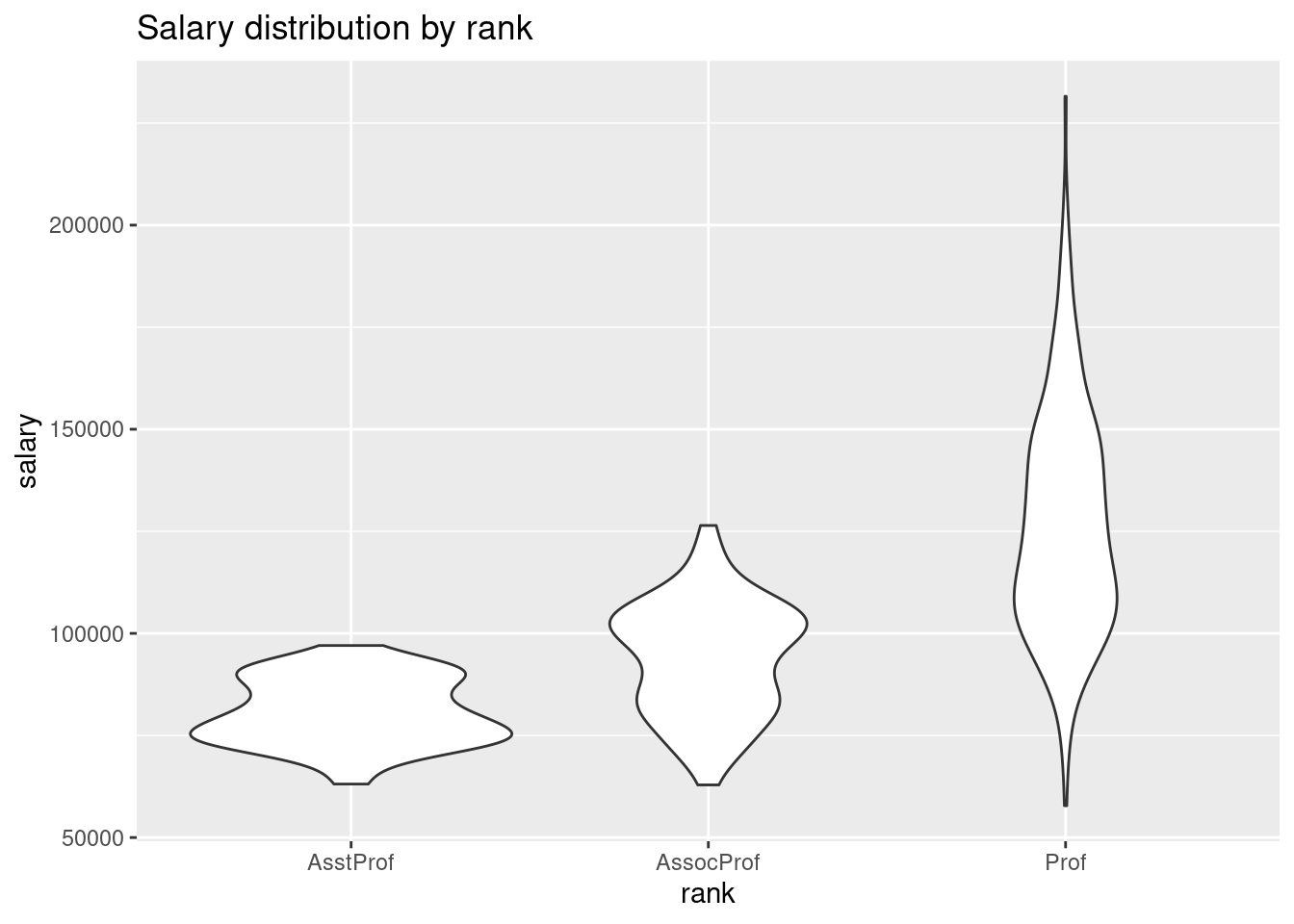
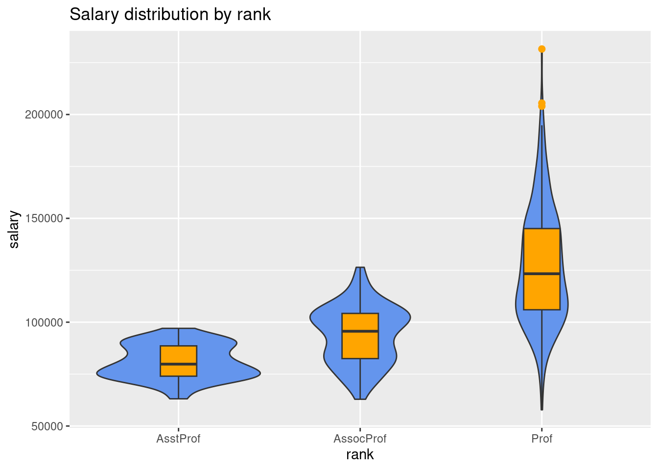
- A useful variation is to superimpose boxplots on violin plots.
# plot the distribution using violin and boxplots
ggplot(Salaries,
       aes(x = rank,
           y = salary)) +
  geom_violin(fill = "cornflowerblue") +
  geom_boxplot(width = .2,
               fill = "orange",
               outlier.color = "orange",
               outlier.size = 2) +
  labs(title = "Salary distribution by rank")