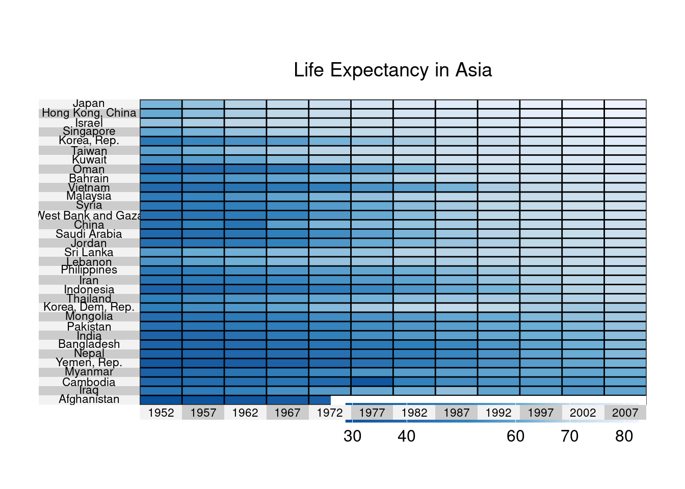
9.16 Heatmap for Time Series
Below we make a heatmap to display changes in life expectancies over time for Asian countries using data from the
gapminderdataset.Since the data is in long format, we’ll (1) convert to wide format, (2) ensure that it is a data frame, and (3) convert the variable country into row names.
Finally, we (1) sort the data by 2007 life expectancy and (2) change the color scheme.
library(tidyr); library(dplyr)
data(gapminder, package="gapminder") # load data

asia <- gapminder %>%
  filter(continent == "Asia") %>% # subset Asian countries
  select(year, country, lifeExp)

plotdata <- spread(asia, year, lifeExp) # convert to long to wide format

plotdata <- as.data.frame(plotdata) #ensure it's a data frame
row.names(plotdata) <- plotdata$country # save country as row names
plotdata$country <- NULL
sort.order <- order(plotdata$"2007") # row order

library(RColorBrewer)
colors <- rev(brewer.pal(5, "Blues")) # color scheme

superheat(plotdata,
          scale = FALSE,
          left.label.text.size=3,
          bottom.label.text.size=3,
          bottom.label.size = .05,
          heat.pal = colors,
          order.rows = sort.order,
          title = "Life Expectancy in Asia")