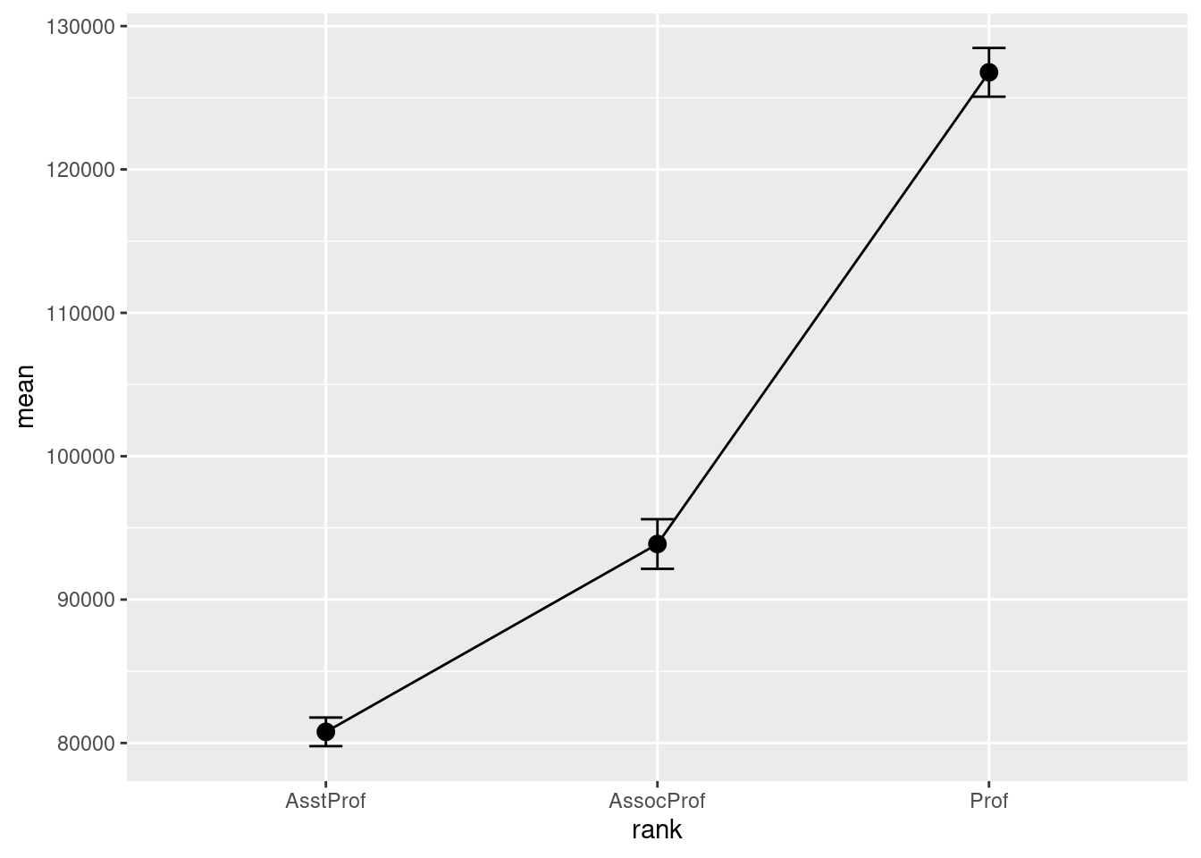
Mean/SEM plots
# calculate means, standard deviations,
# standard errors, and 95% confidence
# intervals by rank
library(dplyr)
plotdata <- Salaries %>%
  group_by(rank) %>%
  summarize(n = n(),
         mean = mean(salary),
         sd = sd(salary),
         se = sd / sqrt(n),
         ci = qt(0.975, df = n - 1) * sd /
        sqrt(n))


# plot the means and standard errors
ggplot(plotdata,
       aes(x = rank,
           y = mean,
           group = 1)) +
  geom_point(size = 3) +
  geom_line() +
  geom_errorbar(aes(ymin = mean - se,
                    ymax = mean + se),
                width = .1)
# calculate means and standard errors by rank and sex
plotdata <- Salaries %>%
  group_by(rank, sex) %>%
  summarize(n = n(),
            mean = mean(salary),
            sd = sd(salary),
            se = sd/sqrt(n))
## `summarise()` has grouped output by 'rank'. You can override using the
## `.groups` argument.
# plot the means and standard errors by sex
ggplot(plotdata, aes(x = rank,
                     y = mean,
                     group=sex,
                     color=sex)) +
  geom_point(size = 3) +
  geom_line(size = 1) +
  geom_errorbar(aes(ymin  =mean - se,
                    ymax = mean+se),
                width = .1)
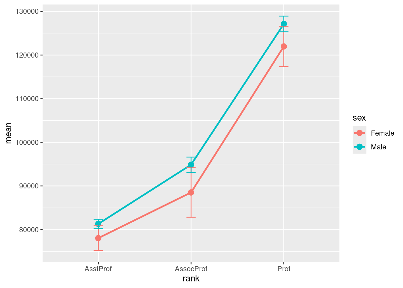
- Unfortunately, the error bars overlap. We can dodge the horizontal positions a bit to overcome this.
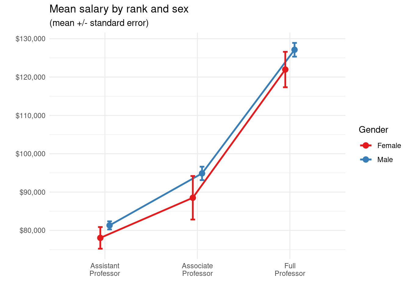
# plot the means and standard errors by sex (dodged)
pd <- position_dodge(0.2)
ggplot(plotdata,
       aes(x = factor(rank,
                      labels = c("Assistant\nProfessor",
                                 "Associate\nProfessor",
                                 "Full\nProfessor")),
           y = mean,
           group=sex,
           color=sex)) +
  geom_point(position=pd,
             size = 3) +
  geom_line(position = pd,
            size = 1) +
  geom_errorbar(aes(ymin = mean - se,
                    ymax = mean + se),
                width = .1,
                position = pd,
                size = 1) +
  scale_y_continuous(label = scales::dollar) +
  scale_color_brewer(palette="Set1") +
  theme_minimal() +
  labs(title = "Mean salary by rank and sex",
       subtitle = "(mean +/- standard error)",
       x = "",
       y = "",
       color = "Gender")