Introduction
- In previous chapters, we learned to plot one to two variables on a single graph
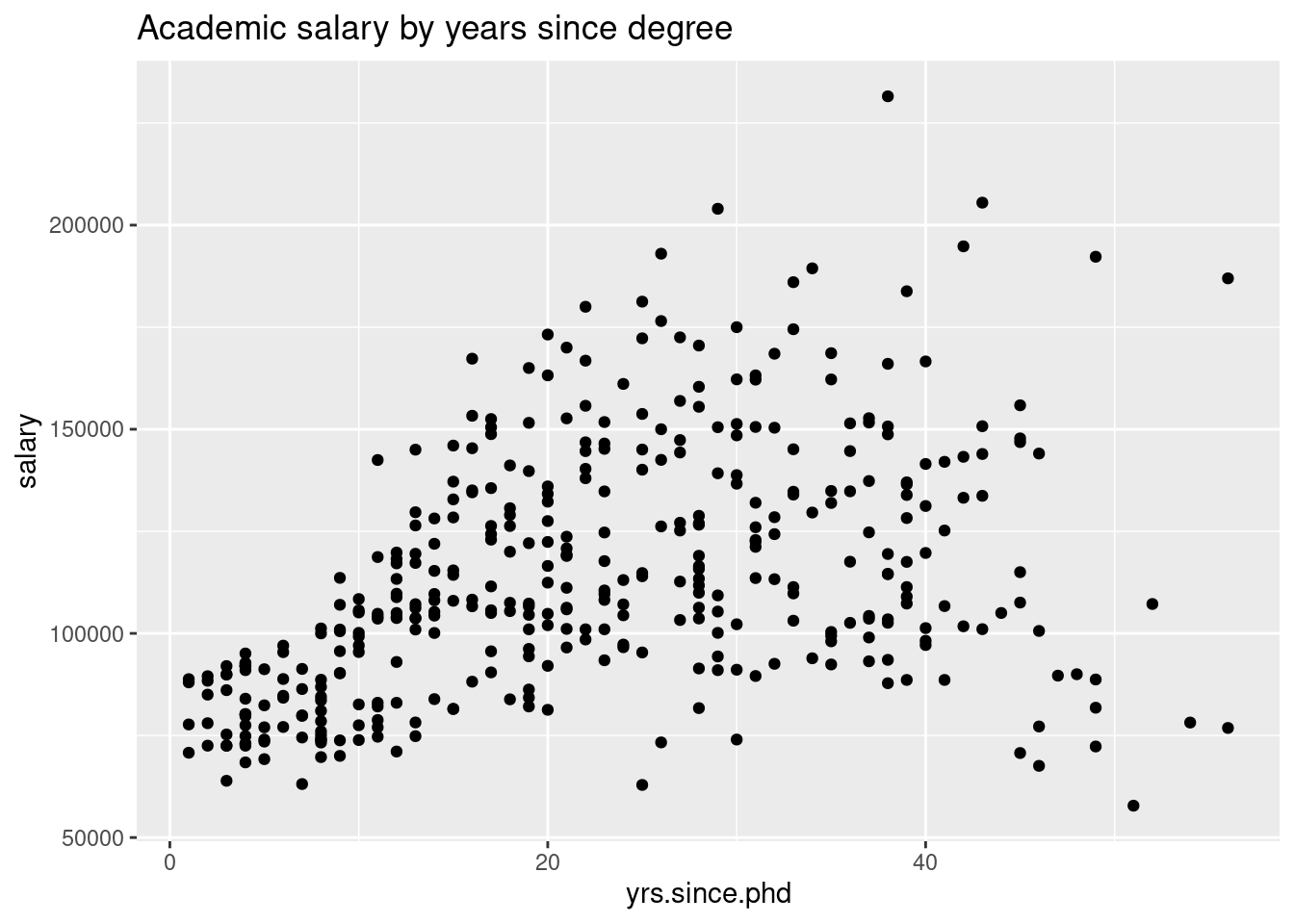
- Here, we are looking at the
Salaries data from the carData package
library(pacman)
p_load(ggplot2, dplyr)

data(Salaries, package="carData")

ggplot(Salaries, aes(x=yrs.since.phd,
                     y=salary)) +
  geom_point() +
  labs(title="Academic salary by years since degree")

- What if we want to visualize more than two variables?
- The
Salaries data set has multiple columns we can plot
##        rank discipline yrs.since.phd yrs.service  sex salary
## 1      Prof          B            19          18 Male 139750
## 2      Prof          B            20          16 Male 173200
## 3  AsstProf          B             4           3 Male  79750
## 4      Prof          B            45          39 Male 115000
## 5      Prof          B            40          41 Male 141500
## 6 AssocProf          B             6           6 Male  97000
