9.12 Alternative Alluvial Diagram
library(ggplot2); library(ggalluvial)

ggplot(titanic_table,
       aes(axis1 = Class,
           axis2 = Survived,
           y = n)) +
  geom_alluvium(aes(fill = Sex)) +
  geom_stratum() +
  geom_text(stat = "stratum",
            aes(label = after_stat(stratum))) +
  scale_x_discrete(limits = c("Class", "Survived"),
                   expand = c(.1, .1)) +
  labs(title = "Titanic data",
       subtitle = "stratified by class, sex, and survival",
       y = "Frequency") +
  theme_minimal()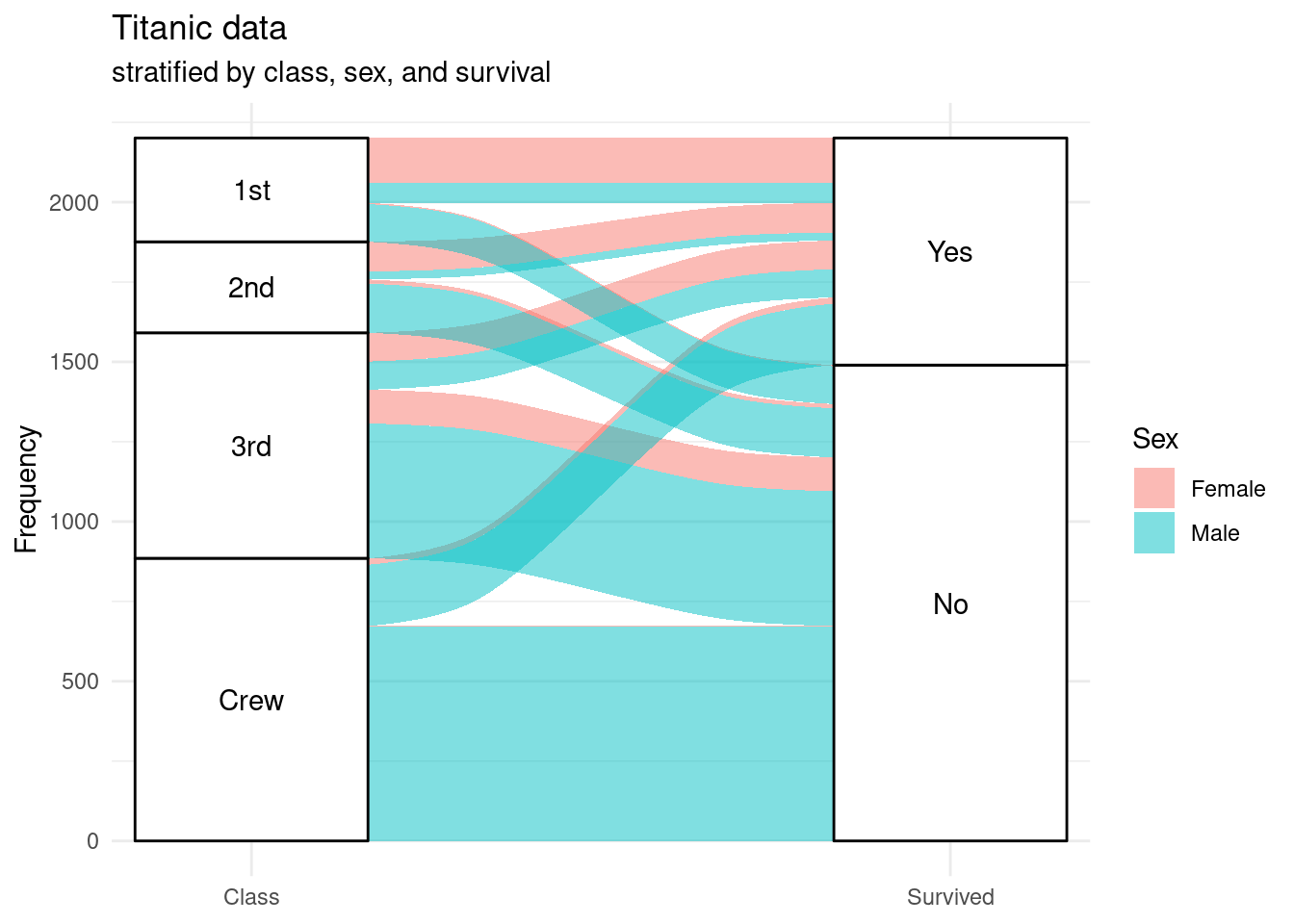
Start at a node on the left and follow the stream field to the right.
The height of the blocks represent the proportion of observations in that cluster and the height of the stream field represents the proportion of observations contained in both blocks they connect.
For example, most crew are male and do not survive. A much larger percent of 1st class females survive, than 1st class males.