4.6 Scatterplot
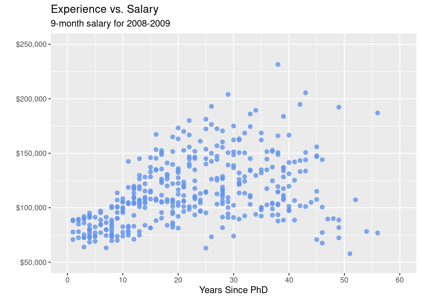
The simplest display of two quantitative variables is a scatterplot, with each variable represented on an axis. For example, using the Salaries dataset, we can plot experience (yrs.since.phd) vs. academic salary (salary) for college professors.
library(ggplot2)
data(Salaries, package="carData")

# simple scatterplot
ggplot(Salaries,
       aes(x = yrs.since.phd,
           y = salary)) +
  geom_point()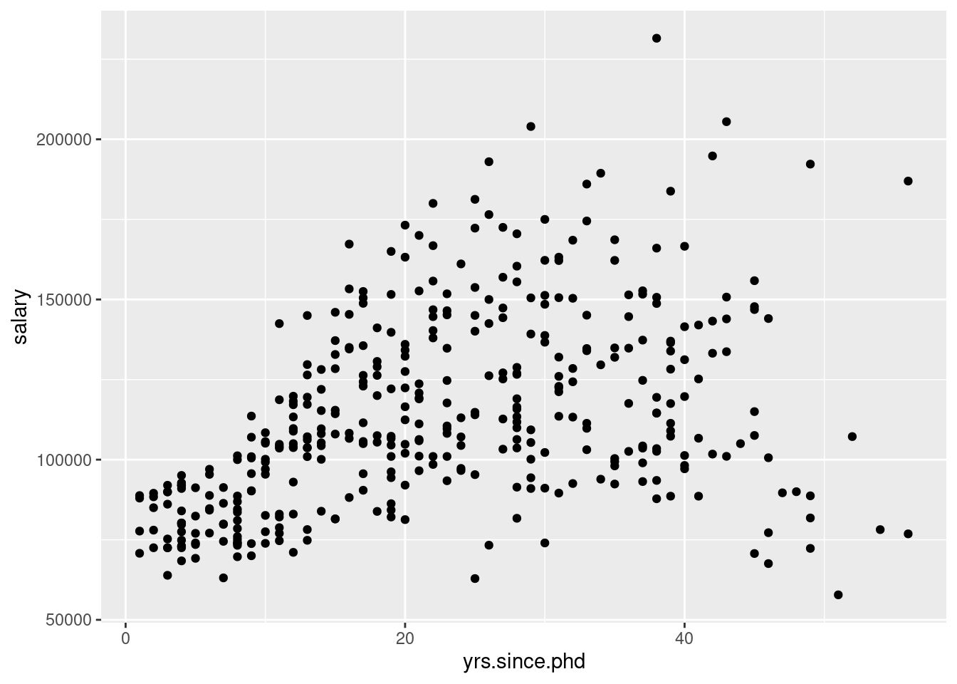
# enhanced scatter plot
ggplot(Salaries,
       aes(x = yrs.since.phd,
           y = salary)) +
  geom_point(color="cornflowerblue",
             size = 2,
             alpha=.8) +
  scale_y_continuous(label = scales::dollar,
                     limits = c(50000, 250000)) +
  scale_x_continuous(breaks = seq(0, 60, 10),
                     limits=c(0, 60)) +
  labs(x = "Years Since PhD",
       y = "",
       title = "Experience vs. Salary",
       subtitle = "9-month salary for 2008-2009")