2.12 Placing the data and mapping options
Plots created with ggplot2 always start with the ggplot function. In the examples above, the data and mapping options were placed in this function. In this case they apply to each geom_ function that follows.
We can also place these options directly within a geom. In that case, they only apply only to that specific geom.
# placing color mapping in the ggplot function
ggplot(plotdata,
       aes(x = exper,
           y = wage,
           color = sex)) +
  geom_point(alpha = .7,
             size = 3) +
  geom_smooth(method = "lm",
              formula = y ~ poly(x,2),
              se = FALSE,
              size = 1.5)
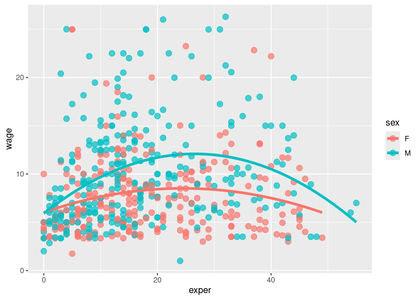
- Since the mapping of sex to color appears in the ggplot function, it applies to both geom_point and geom_smooth. The color of the point indicates the sex, and a separate colored trend line is produced for men and women. Compare this to
# placing color mapping in the geom_point function
ggplot(plotdata,
       aes(x = exper,
           y = wage)) +
  geom_point(aes(color = sex),
             alpha = .7,
             size = 3) +
  geom_smooth(method = "lm",
              formula = y ~ poly(x,2),
              se = FALSE,
              size = 1.5)
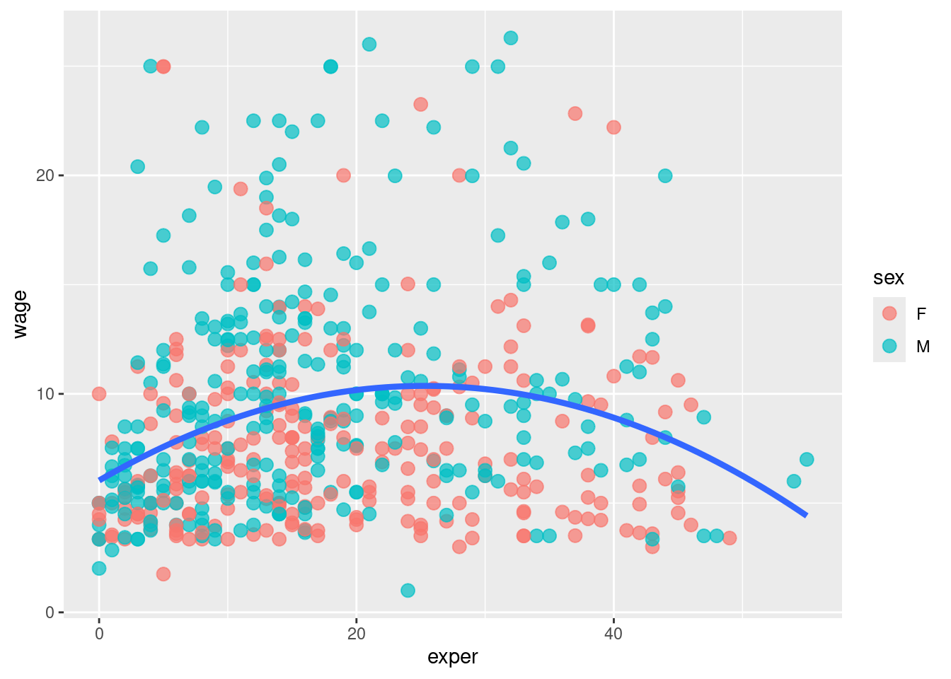
- Since the sex to color mapping only appears in the geom_point function, it is only used there. A single trend line is created for all observations.