5.1 Grouping
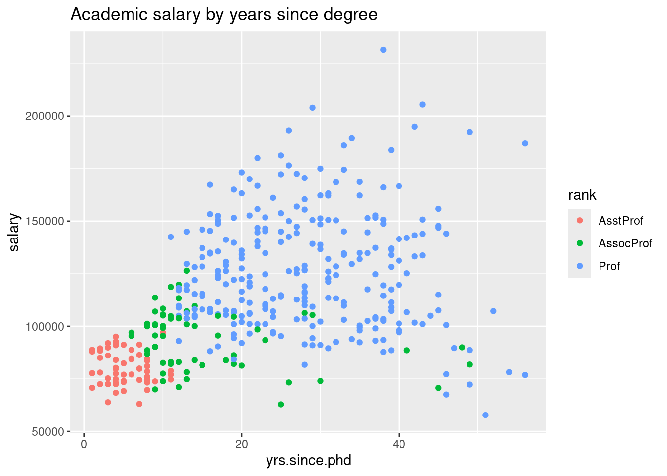
- Grouping involves gathering multiple variables together and plotting them on a single graph
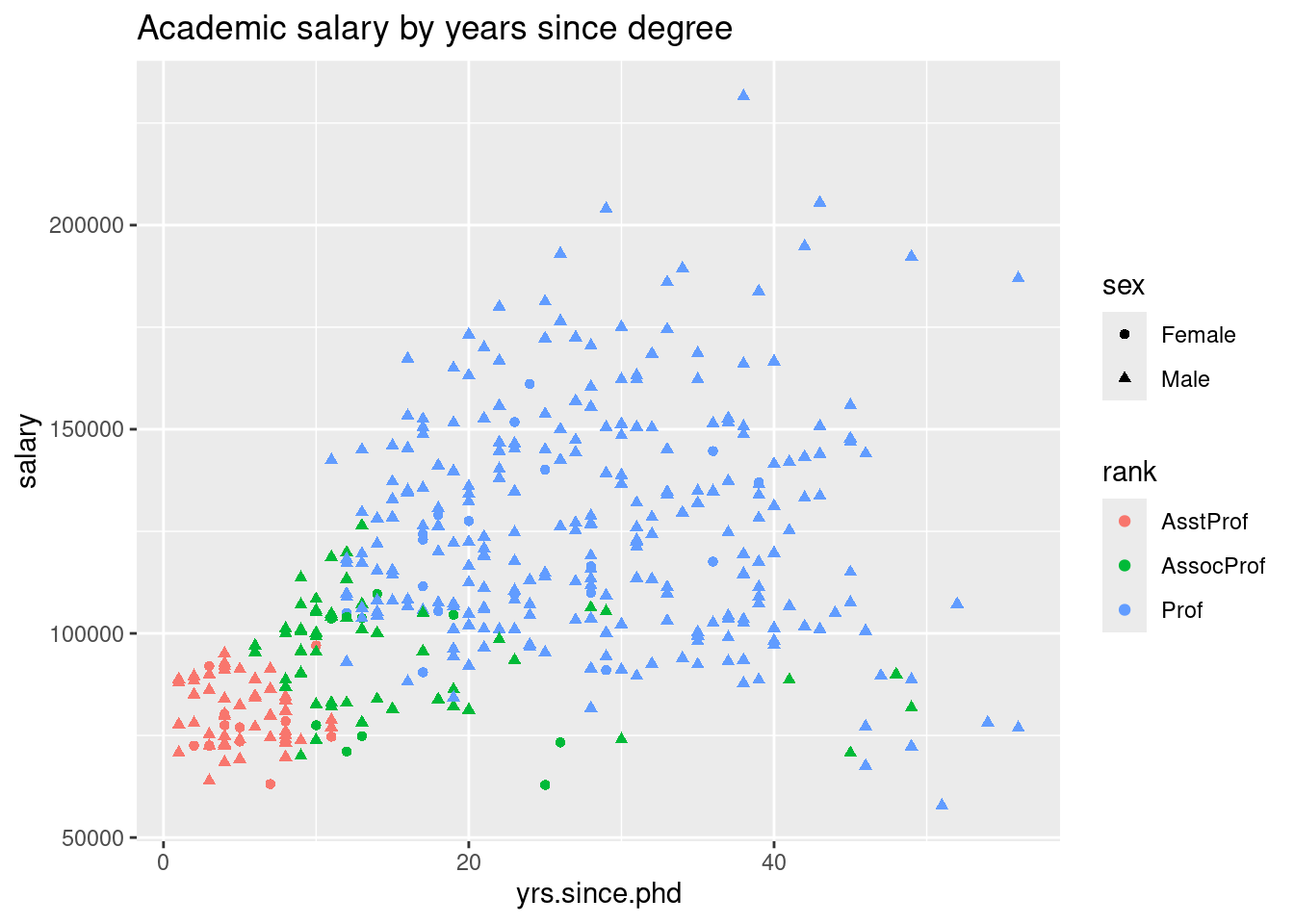
- You can modify different attributes of data points to reflect values of other variables
- Ex. color, size, shape, etc (within
aes()function formappingargument inggplotfunctions)

- NOTE: Be mindful of how busy your graph looks.
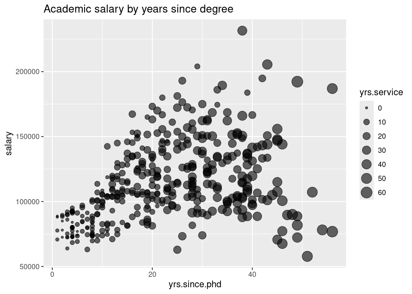
- You can also modify the size and transparency of points.
ggplot(Salaries, aes(x=yrs.since.phd,
                     y=salary,
                      size=yrs.service)) +
  # alpha allows you to change transparency
  # of points
  geom_point(alpha=0.6) +
  labs(title="Academic salary by years since degree")
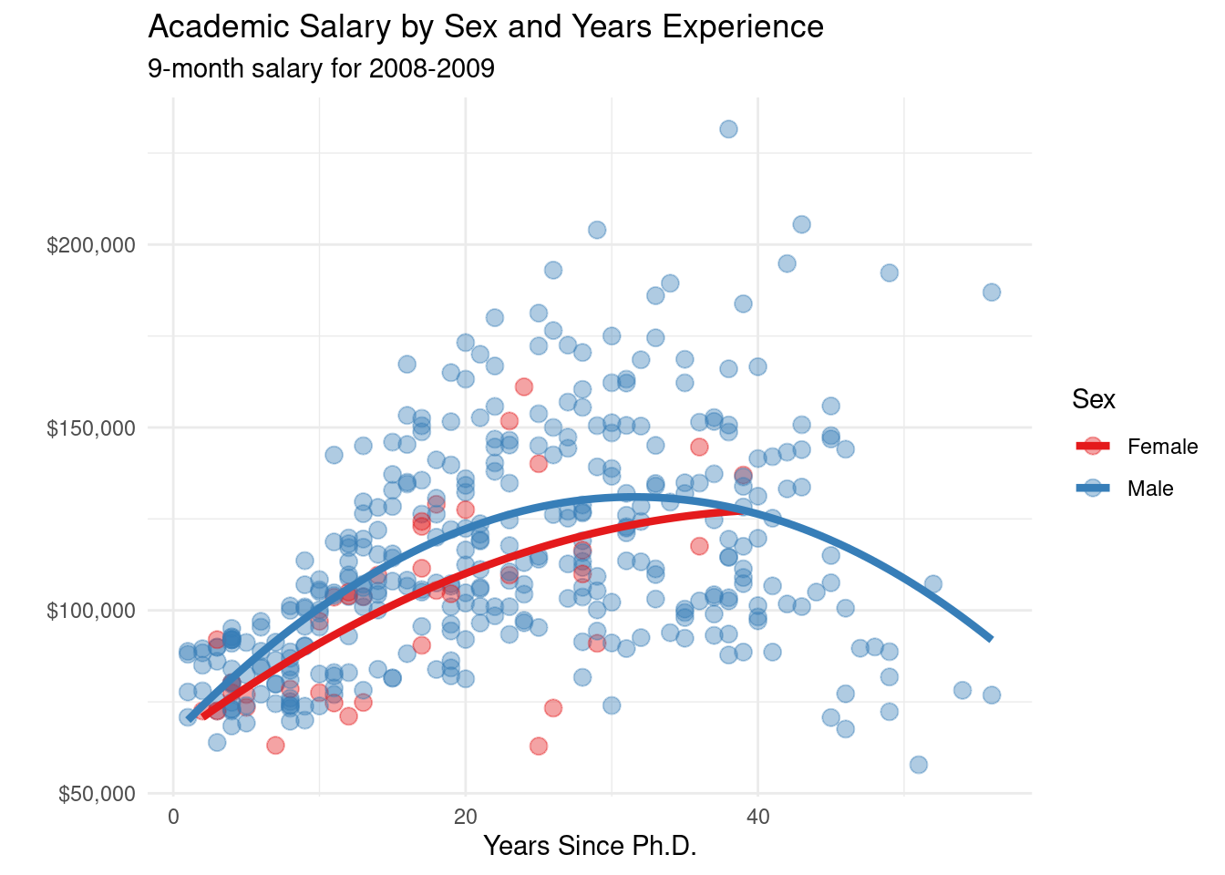
- Here’s another example of grouping with some regression lines incorporated into the graph.
- The benefits of grouping is that it also affects other
ggplotlayers you apply on top of the baseggplotfunction.
# plot experience vs. salary with
# fit lines (color represents sex)
ggplot(Salaries,
       aes(x = yrs.since.phd,
           y = salary,
           color = sex)) +
  geom_point(alpha = .4,
             size = 3) +
  geom_smooth(se=FALSE,
              method = "lm",
              formula = y~poly(x,2),
              size = 1.5) +
  labs(x = "Years Since Ph.D.",
       title = "Academic Salary by Sex and Years Experience",
       subtitle = "9-month salary for 2008-2009",
       y = "",
       color = "Sex") +
  scale_y_continuous(label = scales::dollar) +
  scale_color_brewer(palette = "Set1") +
  theme_minimal()