2.10 labels
Graphs should be easy to interpret and informative labels are a key element in achieving this goal.
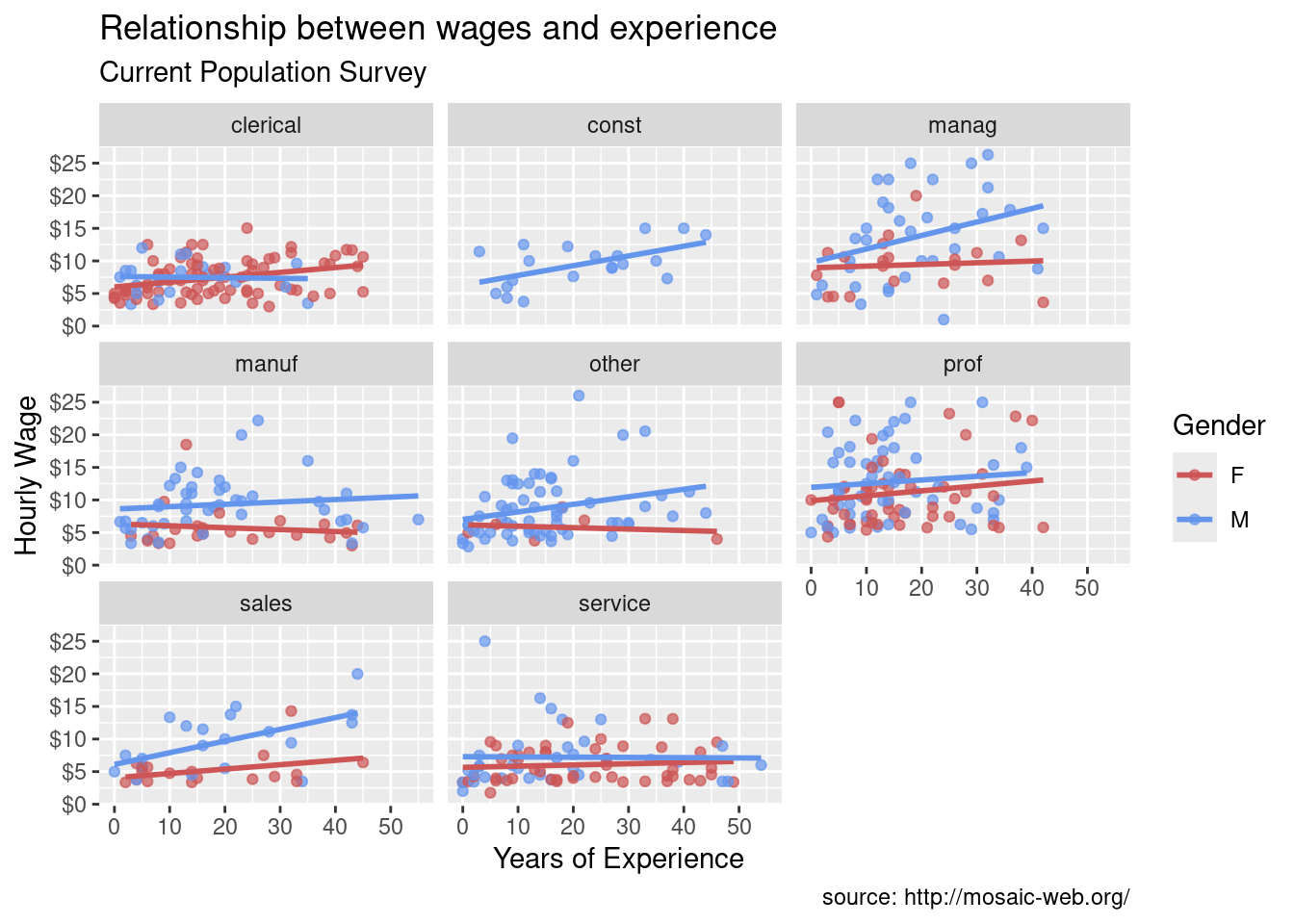
The labs function provides customized labels for the axes and legends. Additionally, a custom title, subtitle, and caption can be added.
# add informative labels
ggplot(data = plotdata,
       mapping = aes(x = exper,
                     y = wage,
                     color = sex)) +
  geom_point(alpha = .7) +
  geom_smooth(method = "lm",
              se = FALSE) +
  scale_x_continuous(breaks = seq(0, 60, 10)) +
  scale_y_continuous(breaks = seq(0, 30, 5),
                     label = scales::dollar) +
  scale_color_manual(values = c("indianred3",
                                "cornflowerblue")) +
  facet_wrap(~sector) +
  labs(title = "Relationship between wages and experience",
       subtitle = "Current Population Survey",
       caption = "source: http://mosaic-web.org/",
       x = " Years of Experience",
       y = "Hourly Wage",
       color = "Gender")
- Now a viewer doesn’t need to guess what the labels expr and wage mean, or where the data come from.