9.4 Modified 3-D Scatterplot (cont.)
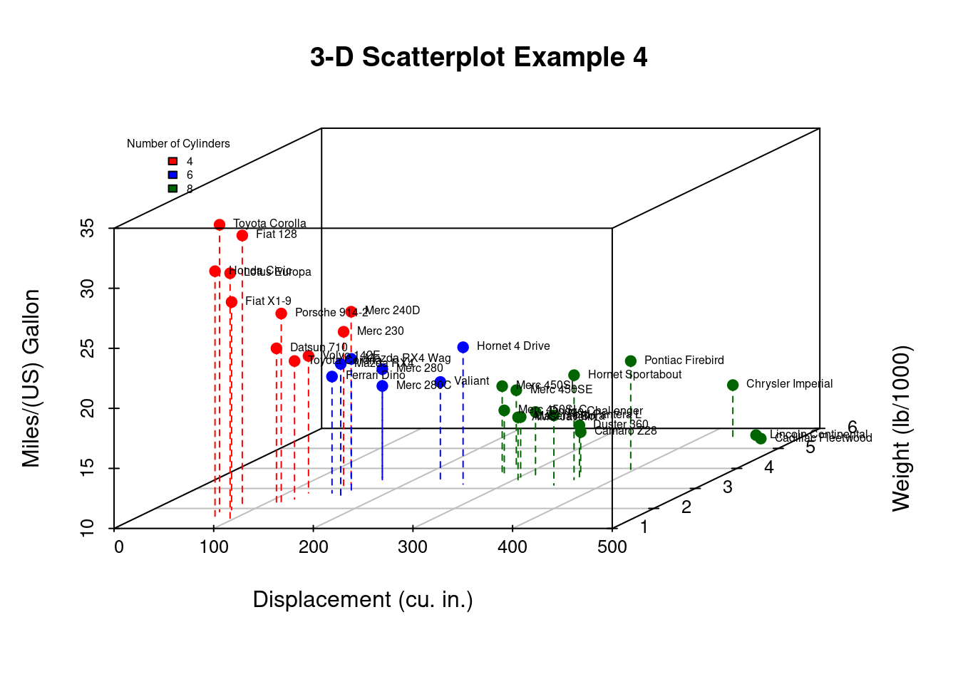
As a final step, we will add information on the number of cylinders in each car. To do this, we’ll
- add a column to the mtcars dataframe indicating the color for each point,
- shorten the y-axis,
- change the drop lines to dashed lines, and,
- add a legend.
library(scatterplot3d)

# create column indicating point color
mtcars$pcolor[mtcars$cyl == 4] <- "red"
mtcars$pcolor[mtcars$cyl == 6] <- "blue"
mtcars$pcolor[mtcars$cyl == 8] <- "darkgreen"

with(mtcars, {
    s3d <- scatterplot3d( x = disp, y = wt, z = mpg,
      color = pcolor, pch = 19, type = "h",
      lty.hplot = 2, scale.y = .75,
      main = "3-D Scatterplot Example 4",
      xlab = "Displacement (cu. in.)",
      ylab = "Weight (lb/1000)",
      zlab = "Miles/(US) Gallon")

     s3d.coords <- s3d$xyz.convert(disp, wt, mpg)
     text(s3d.coords$x, s3d.coords$y,
          labels = row.names(mtcars),
          pos = 4, cex = .5)

legend("topleft", inset=.05, #location
       bty="n", # suppress legend box,
       cex=.5, # shrink text 50%
       title="Number of Cylinders",
       c("4", "6", "8"),
       fill=c("red", "blue", "darkgreen"))
})
- Now, we can easily see that the car with the highest mileage (Toyota Corolla) has low engine displacement, low weight, and 4 cylinders.