2.11 themes
The themes layer refers to all non-data ink.
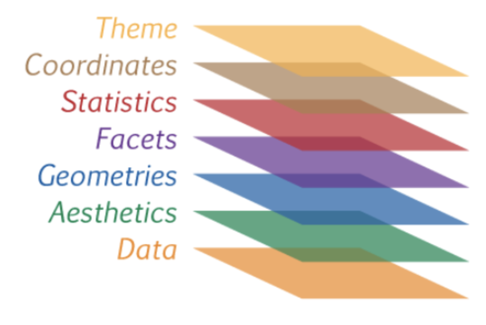
Finally, we can fine tune the appearance of the graph using themes.
Theme functions (which start with theme_) control background colors, fonts, grid-lines, legend placement, and other non-data related features of the graph.
# use a minimalist theme
ggplot(data = plotdata,
       mapping = aes(x = exper,
                     y = wage,
                     color = sex)) +
  geom_point(alpha = .6) +
  geom_smooth(method = "lm",
              se = FALSE) +
  scale_x_continuous(breaks = seq(0, 60, 10)) +
  scale_y_continuous(breaks = seq(0, 30, 5),
                     label = scales::dollar) +
  scale_color_manual(values = c("indianred3",
                                "cornflowerblue")) +
  facet_wrap(~sector) +
  labs(title = "Relationship between wages and experience",
       subtitle = "Current Population Survey",
       caption = "source: http://mosaic-web.org/",
       x = " Years of Experience",
       y = "Hourly Wage",
       color = "Gender") +
  theme_minimal()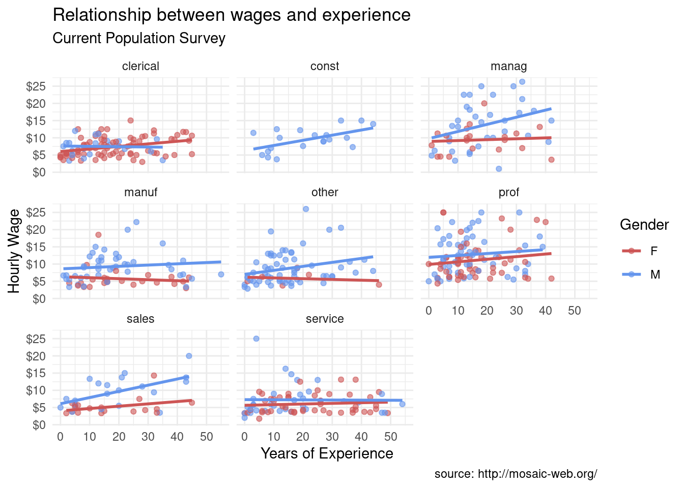
Now we have something. It appears that men earn more than women in management, manufacturing, sales, and the “other” category.
They are most similar in clerical, professional, and service positions. The data contain no women in the construction sector. For management positions, wages appear to be related to experience for men, but not for women (this may be the most interesting finding). This also appears to be true for sales.
These findings are tentative. They are based on a limited sample size and do not involve statistical testing to assess whether differences may be due to chance variation.