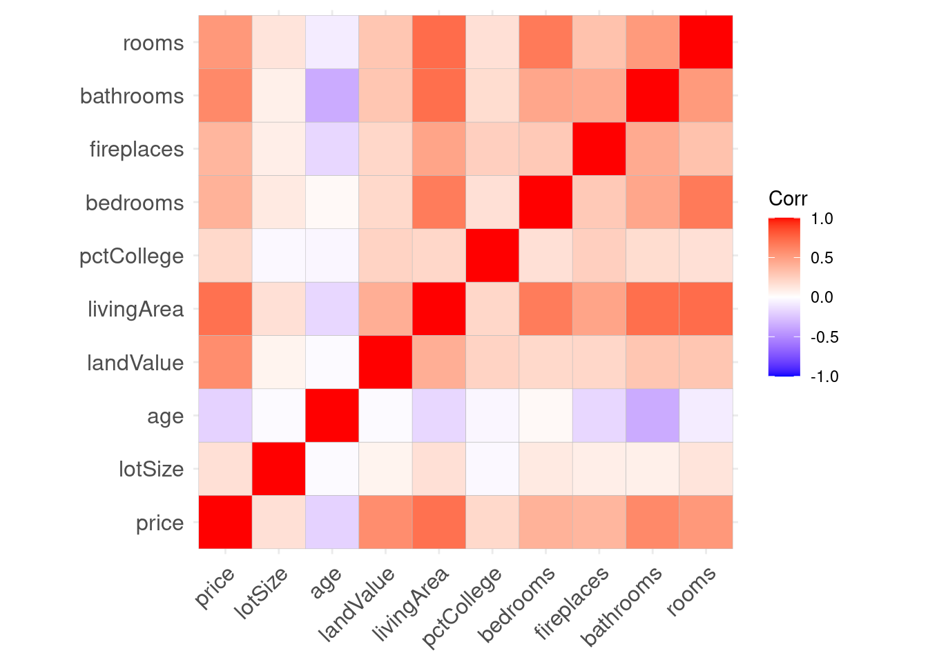
8.3 ggcorrplot package
The
ggcorrplotfunction in theggcorrplotpackage can be used to visualize these correlations.By default, it creates a
ggplot2graph were darker red indicates stronger positive correlations, darker blue indicates stronger negative correlations and white indicates no correlation.