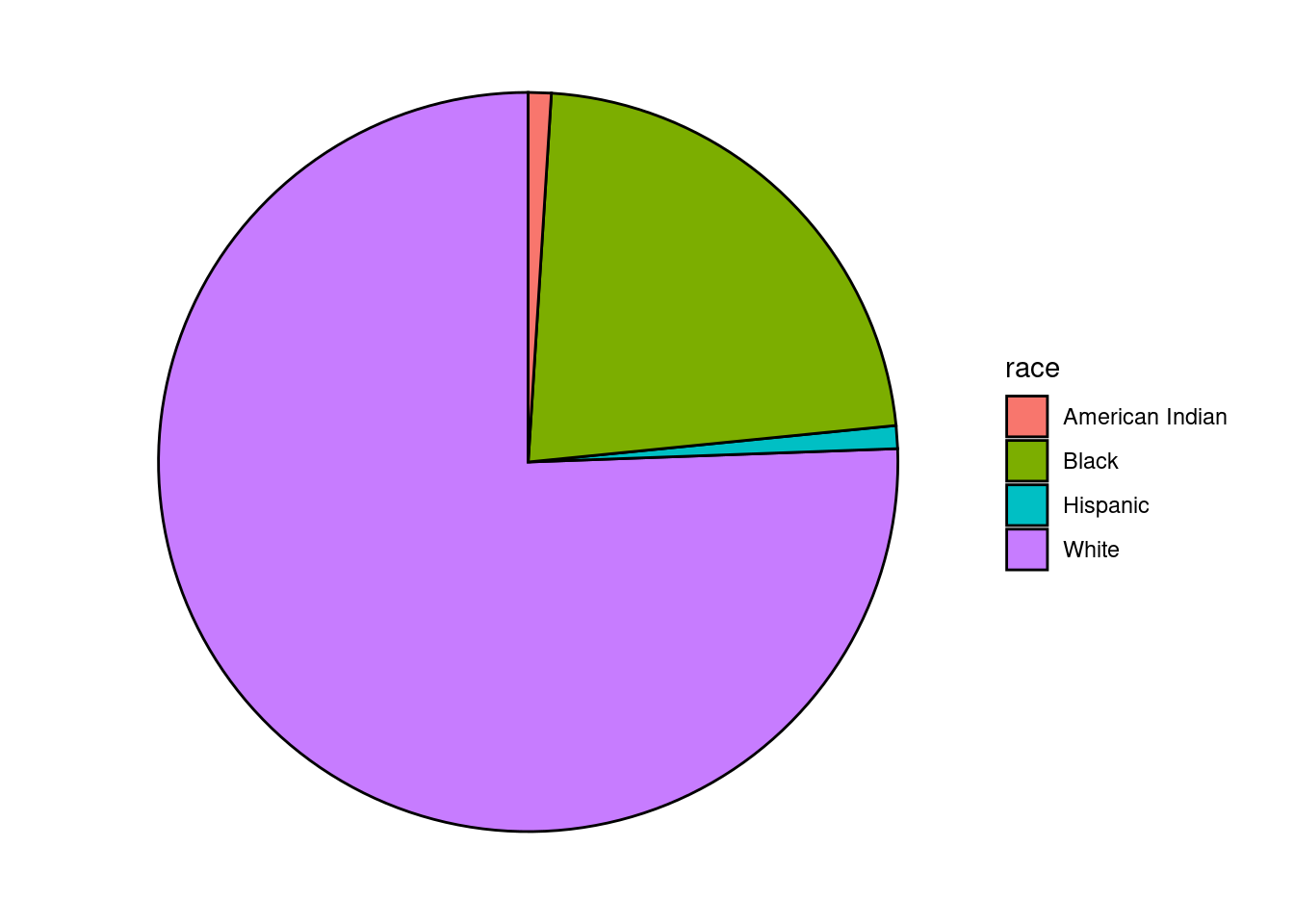
3.5 Pie Chart
A pie chart is a circle divided into sectors that each represent a proportion of the whole.
# create a basic ggplot2 pie chart
plotdata <- Marriage %>%
    count(race) %>%
    arrange(desc(race)) %>%
    mutate(prop = round(n * 100 / sum(n), 1),
           lab.ypos = cumsum(prop) - 0.5  *prop)

  ggplot(plotdata,
         aes(x = "",
             y = prop,
             fill = race)) +
    geom_bar(width = 1,
             stat = "identity",
             color = "black") +
    coord_polar("y",
                start = 0,
                direction = -1) +
    theme_void()