4.15 Strip plots
The relationship between a grouping variable and a numeric variable can be displayed with a scatter plot. For example
# plot the distribution of salaries
# by rank using strip plots
ggplot(Salaries,
       aes(y = rank,
           x = salary)) +
  geom_point() +
  labs(title = "Salary distribution by rank")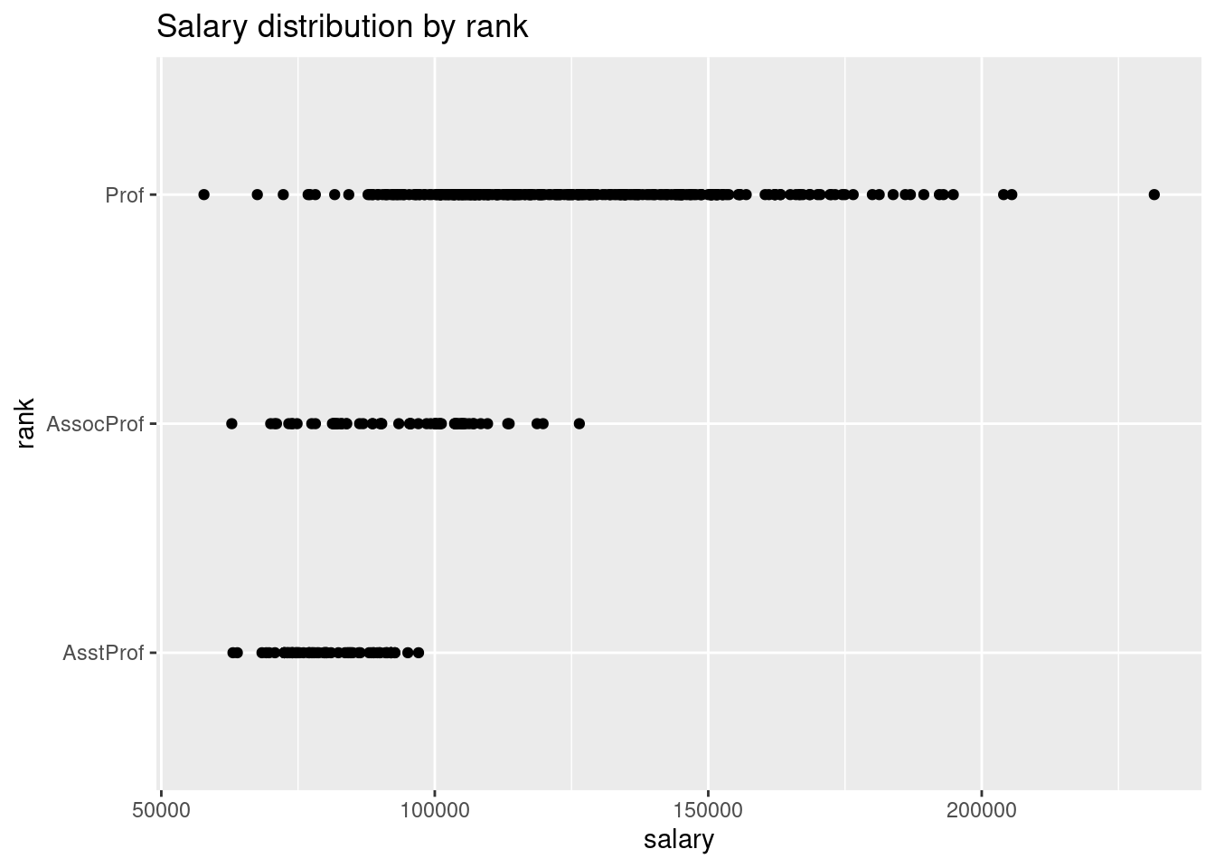
# plot the distribution of salaries
# by rank using jittering
ggplot(Salaries,
       aes(y = rank,
           x = salary)) +
  geom_jitter() +
  labs(title = "Salary distribution by rank")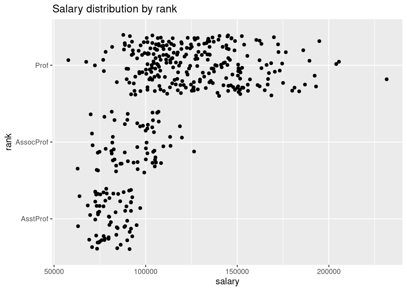
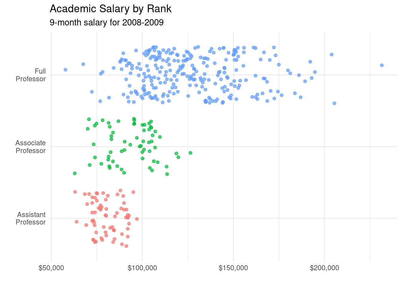
- It is easier to compare groups if we use color
# plot the distribution of salaries
# by rank using jittering
library(scales)
ggplot(Salaries,
       aes(y = factor(rank,
                      labels = c("Assistant\nProfessor",
                                 "Associate\nProfessor",
                                 "Full\nProfessor")),
           x = salary,
           color = rank)) +
  geom_jitter(alpha = 0.7,
              size = 1.5) +
  scale_x_continuous(label = dollar) +
  labs(title = "Academic Salary by Rank",
       subtitle = "9-month salary for 2008-2009",
       x = "",
       y = "") +
  theme_minimal() +
  theme(legend.position = "none")