2.7 grouping
In addition to mapping variables to the x and y axes, variables can be mapped to the color, shape, size, transparency, and other visual characteristics of geometric objects.
This allows groups of observations to be superimposed in a single graph.
Let’s add sex to the plot and represent it by color.
# indicate sex using color
ggplot(data = plotdata,
       mapping = aes(x = exper,
                     y = wage,
                     color = sex)) +
  geom_point(alpha = .7,
             size = 3) +
  geom_smooth(method = "lm",
              se = FALSE,
              size = 1.5)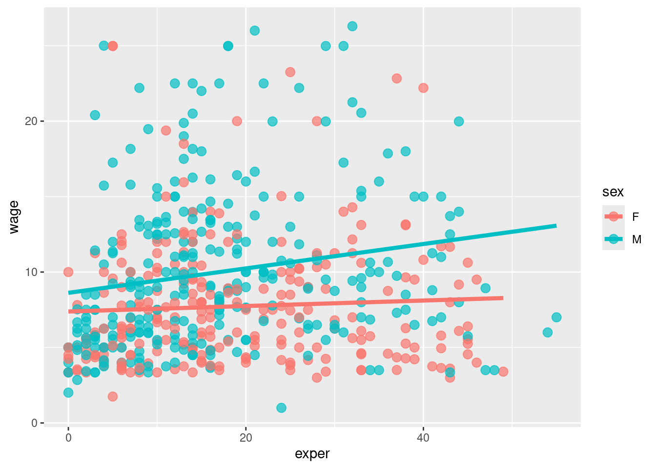
- It appears that men tend to make more money than women. Additionally, there may be a stronger relationship between experience and wages for men than than for women.