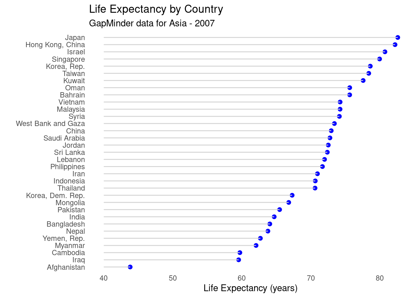
4.17 Cleveland Dot Charts
Cleveland plots are useful when you want to compare a numeric statistic for a large number of groups.
data(gapminder, package="gapminder")

# subset Asian countries in 2007
library(dplyr)
plotdata <- gapminder %>%
  filter(continent == "Asia" &
         year == 2007)


# Fancy Cleveland plot
ggplot(plotdata,
       aes(x=lifeExp,
           y=reorder(country, lifeExp))) +
  geom_point(color="blue",
             size = 2) +
  geom_segment(aes(x = 40,
               xend = lifeExp,
               y = reorder(country, lifeExp),
               yend = reorder(country, lifeExp)),
               color = "lightgrey") +
  labs (x = "Life Expectancy (years)",
        y = "",
        title = "Life Expectancy by Country",
        subtitle = "GapMinder data for Asia - 2007") +
  theme_minimal() +
  theme(panel.grid.major = element_blank(),
        panel.grid.minor = element_blank())