9.7 Modified Bubble Chart
ggplot(mtcars, aes(x = wt, y = mpg, size = hp)) +
  geom_point(alpha = .5,
             fill="cornflowerblue",
             color="black",
             shape=21) +
  scale_size_continuous(range = c(1, 14)) +
  labs(title = "Auto mileage by weight and horsepower",
       subtitle = "Motor Trend US Magazine (1973-74 models)",
       x = "Weight (1000 lbs)",
       y = "Miles/(US) gallon",
size = "Gross horsepower") 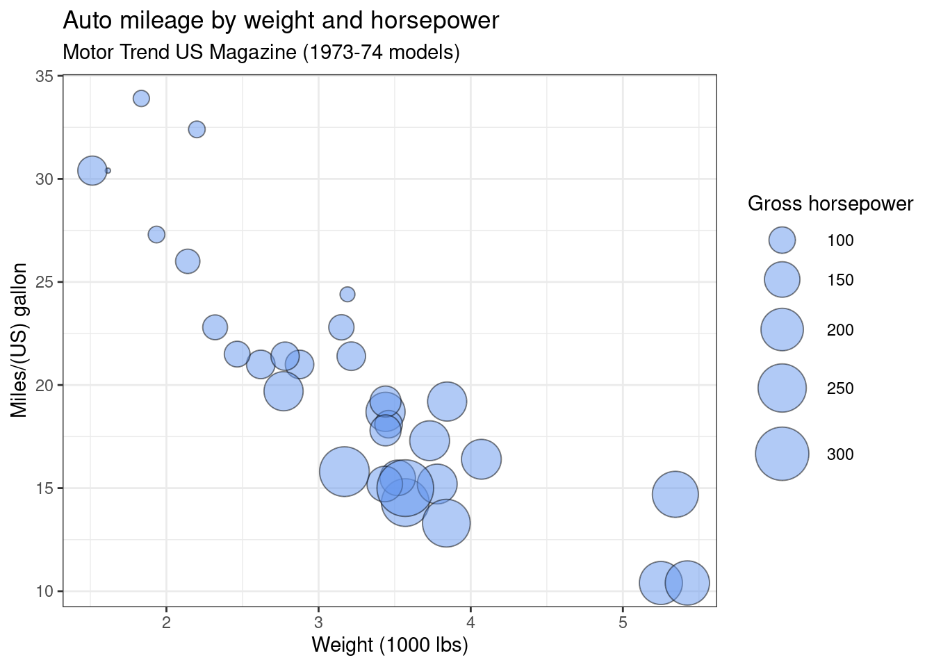
The
rangeparameter in thescale_size_continuousfunction specifies the minimum and maximum size of the plotting symbol. The default isrange = c(1, 6).The shape option in the
geom_pointfunction specifies an circle with a border color and fill color.From the graph, generally we see that miles per gallon decreases with increased car weight and horsepower.