4.9 Bar chart (on summary statistics)
In previous sections, bar charts were used to display the number of cases by category for a single variable or for two variables. You can also use bar charts to display other summary statistics (e.g., means or medians) on a quantitative variable for each level of a categorical variable.
data(Salaries, package="carData")

# calculate mean salary for each rank
library(dplyr)
plotdata <- Salaries %>%
  group_by(rank) %>%
  summarize(mean_salary = mean(salary))

# plot mean salaries
ggplot(plotdata,
       aes(x = rank,
           y = mean_salary)) +
  geom_bar(stat = "identity")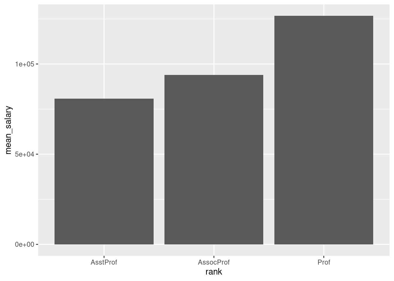
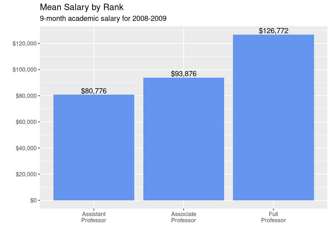
# plot mean salaries in a more attractive fashion
library(scales)
ggplot(plotdata,
       aes(x = factor(rank,
                      labels = c("Assistant\nProfessor",
                                 "Associate\nProfessor",
                                 "Full\nProfessor")),
                      y = mean_salary)) +
  geom_bar(stat = "identity",
           fill = "cornflowerblue") +
  geom_text(aes(label = dollar(mean_salary)),
            vjust = -0.25) +
  scale_y_continuous(breaks = seq(0, 130000, 20000),
                     label = dollar) +
  labs(title = "Mean Salary by Rank",
       subtitle = "9-month academic salary for 2008-2009",
       x = "",
       y = "")