9.6 Bubble Charts
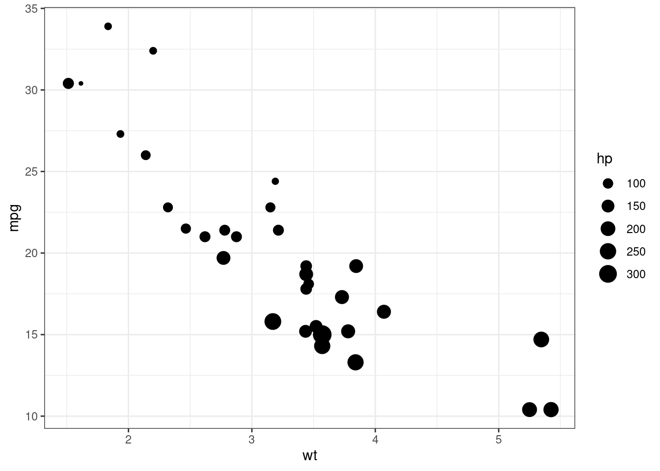
A bubble chart is basically just a scatterplot where the point size is proportional to the values of a third quantitative variable.
Bubble charts are quite popular but controversial for the same reason that pie charts are controversial, the fact that people are better at judging length than volume.
Here we use the
mtcarsdataset to plot car weight vs. mileage and use point size to represent horsepower.
