4.8 Line plot
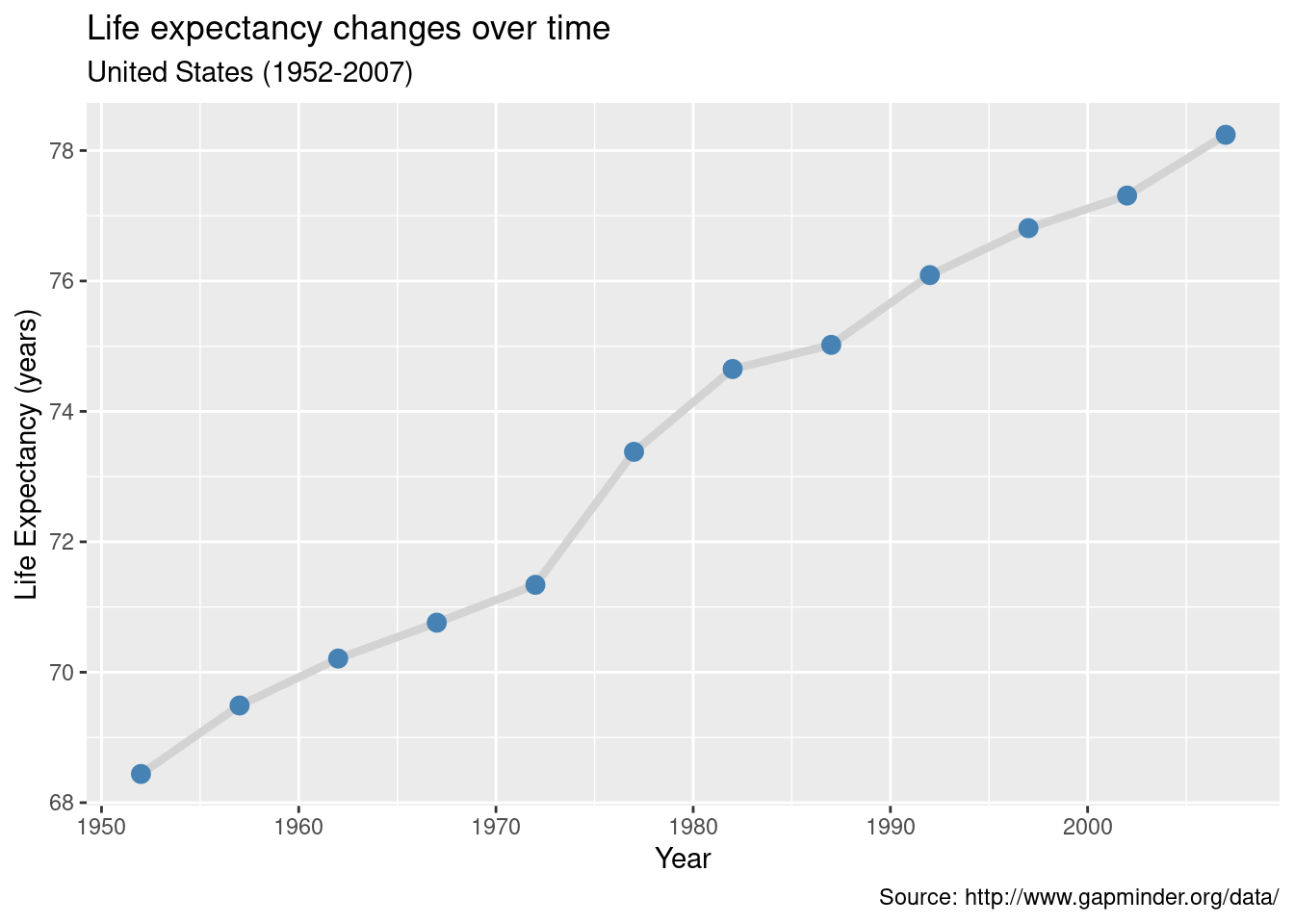
When one of the two variables represents time, a line plot can be an effective method of displaying relationship. For example, the code below displays the relationship between time (year) and life expectancy (lifeExp) in the United States between 1952 and 2007. The data comes from the gapminder dataset.
data(gapminder, package="gapminder")

# Select US cases
library(dplyr)
plotdata <- filter(gapminder,
                   country == "United States")

# simple line plot
ggplot(plotdata,
       aes(x = year,
           y = lifeExp)) +
  geom_line()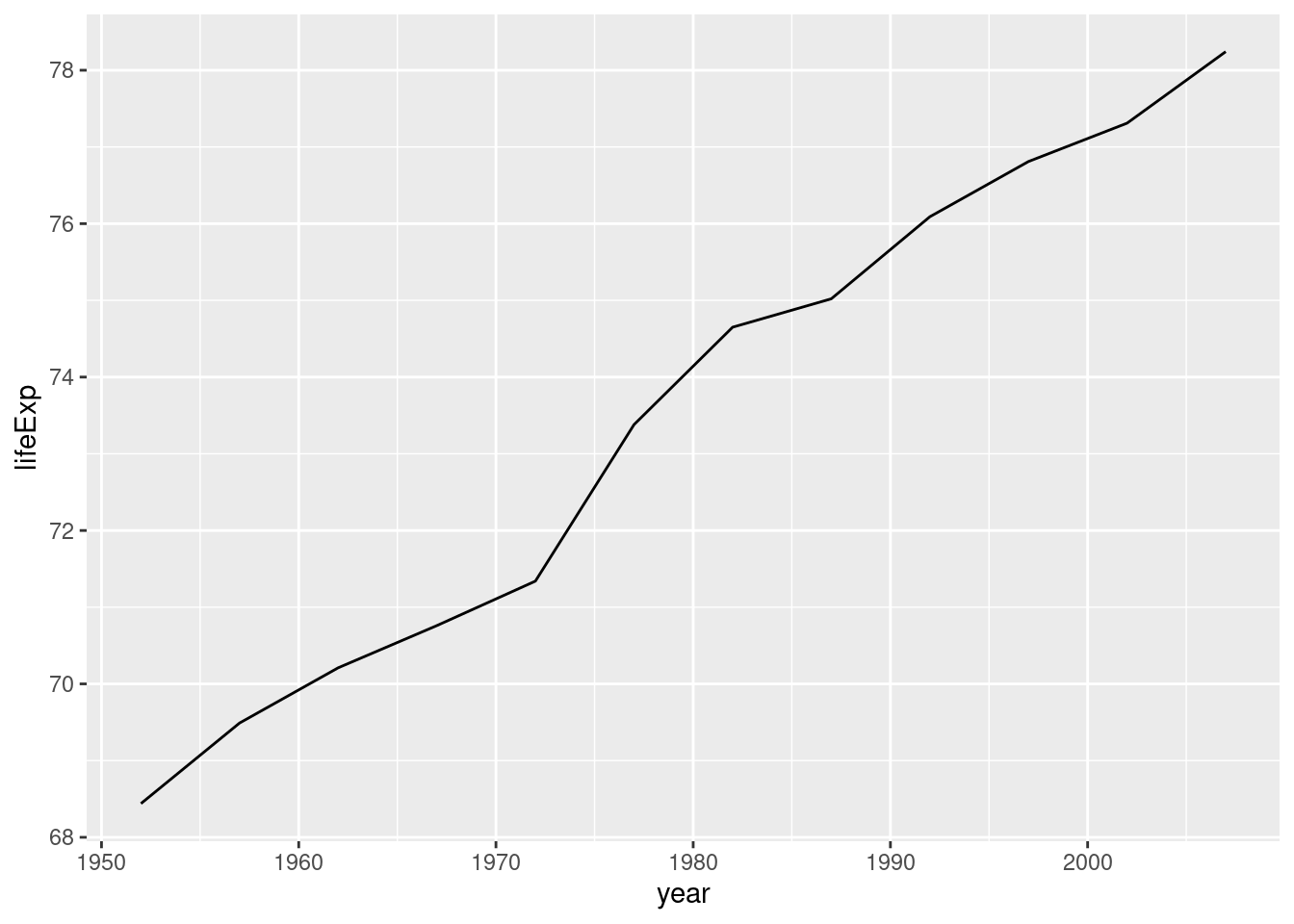
# line plot with points
# and improved labeling
ggplot(plotdata,
       aes(x = year,
           y = lifeExp)) +
  geom_line(size = 1.5,
            color = "lightgrey") +
  geom_point(size = 3,
             color = "steelblue") +
  labs(y = "Life Expectancy (years)",
       x = "Year",
       title = "Life expectancy changes over time",
       subtitle = "United States (1952-2007)",
       caption = "Source: http://www.gapminder.org/data/")