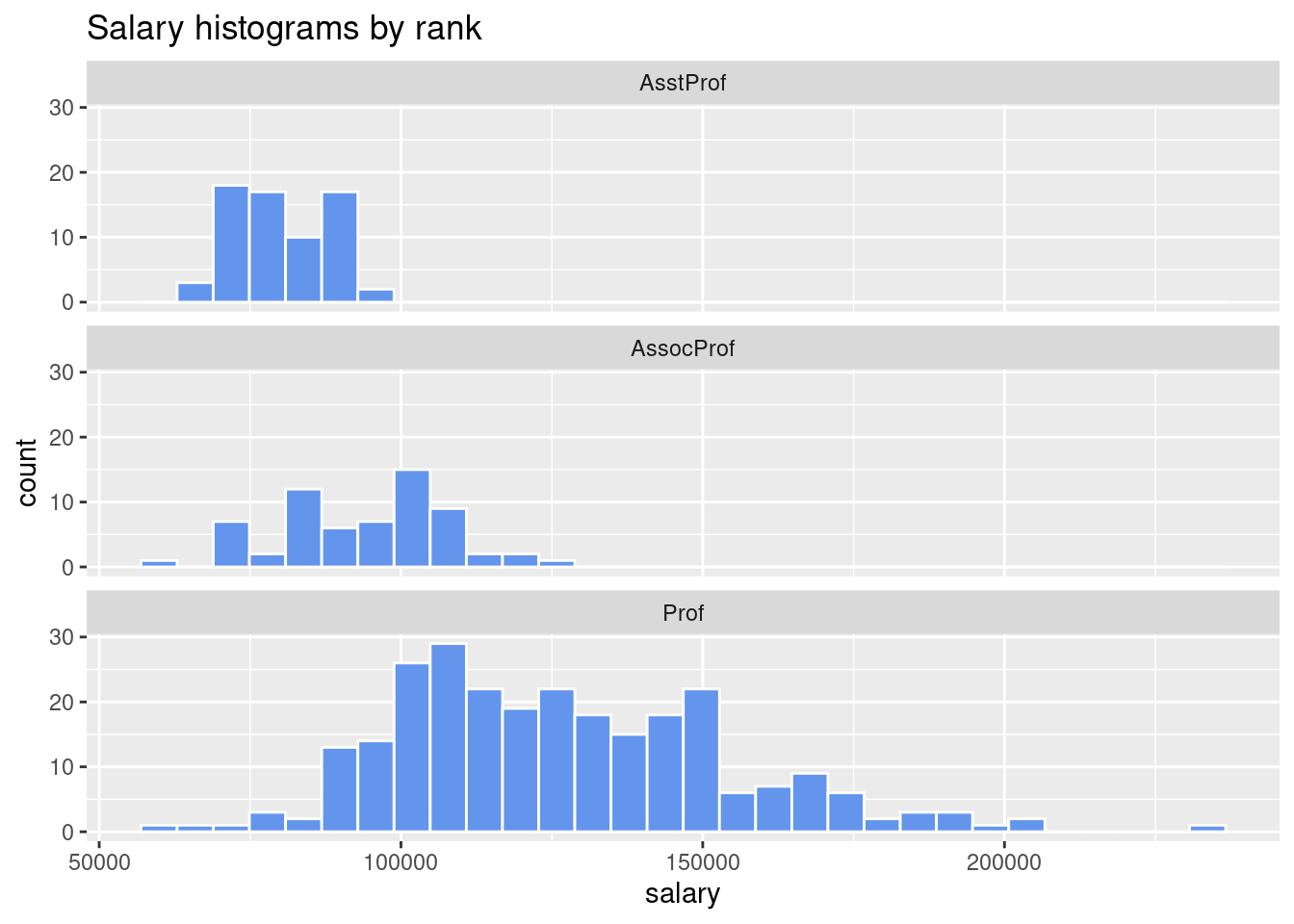
Faceting
- Faceting is when we have separate graphs that each correspond to different levels of a variable.
facet_wrap lets you create several graphs of the same type for each level of the variable being faceted at.- Formula for facet wrapping is
ggplot(Salaries, aes(x = salary)) +

  geom_histogram(fill = "cornflowerblue",
                 color = "white") +
  facet_wrap(~rank, ncol = 1) +
  labs(title = "Salary histograms by rank")
## `stat_bin()` using `bins = 30`. Pick better value with `binwidth`.
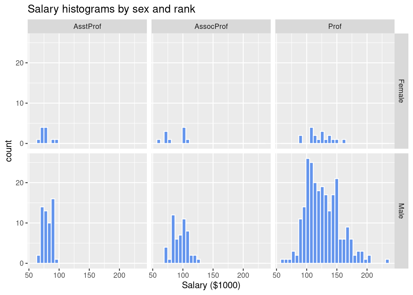
- The
facet_grid function is best suited for faceting against multiple variables.
- Formula for the
facet_grid function is row variables ~ column variables.
# plot salary histograms by rank and sex
ggplot(Salaries, aes(x = salary / 1000)) +
  geom_histogram(color = "white",
                 fill = "cornflowerblue") +
  facet_grid(sex ~ rank) +
  labs(title = "Salary histograms by sex and rank",
       x = "Salary ($1000)")
## `stat_bin()` using `bins = 30`. Pick better value with `binwidth`.
- You can also combine grouping variables together and faceting together in one graph, such as what we do with the
gapminder data from the gapminder package below.
- Note that the dot in the faceting formula
.~ rank + discipline means that there are no row variables so rank + discipline ~. means no column variables.
- Also note the theme functions used in the code below are used to simplify the background color, rotate the x-axis text, and make the font size smaller
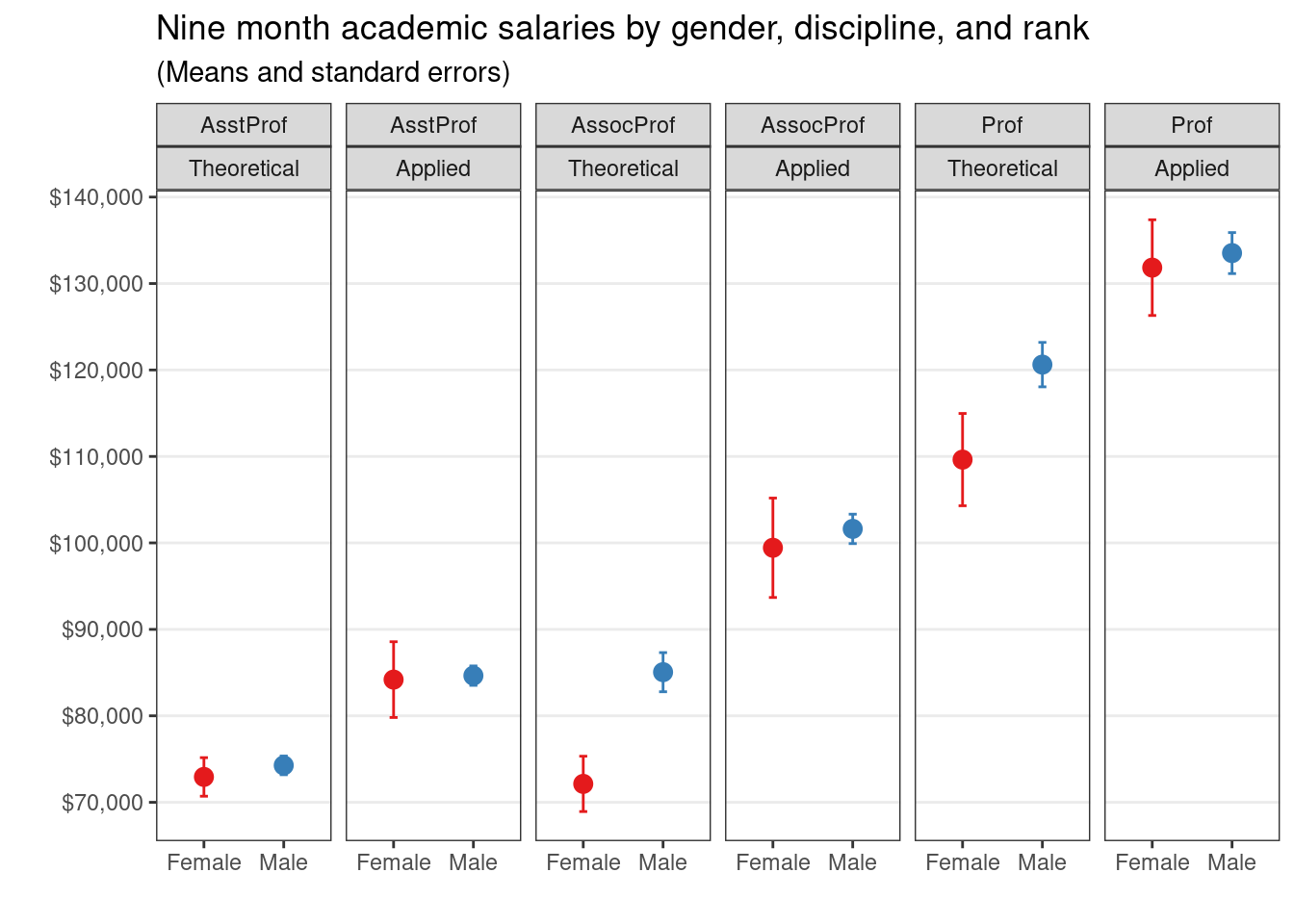
# calculate means and standard errors by sex,
# rank and discipline

library(dplyr)
plotdata <- Salaries %>%
  group_by(sex, rank, discipline) %>%
  summarize(n = n(),
            mean = mean(salary),
            sd = sd(salary),
            se = sd / sqrt(n))
## `summarise()` has grouped output by 'sex', 'rank'. You can override using the
## `.groups` argument.
# create better labels for discipline
plotdata$discipline <- factor(plotdata$discipline,
                              labels = c("Theoretical",
                                         "Applied"))
# create plot
ggplot(plotdata,
       aes(x = sex,
           y = mean,
           color = sex)) +
  geom_point(size = 3) +
  geom_errorbar(aes(ymin = mean - se,
                    ymax = mean + se),
                width = .1) +
  scale_y_continuous(breaks = seq(70000, 140000, 10000),
                     label = scales::dollar) +
  facet_grid(. ~ rank + discipline) +
  theme_bw() +
  theme(legend.position = "none",
        panel.grid.major.x = element_blank(),
        panel.grid.minor.y = element_blank()) +
  labs(x="",
       y="",
       title="Nine month academic salaries by gender, discipline, and rank",
       subtitle = "(Means and standard errors)") +
  scale_color_brewer(palette="Set1")