2.2 Assessing Model Accuracy
There is no free lunch in statistics: no one method dominates all others over all possible problems.
Selecting the best approach can be challenging in practice.
2.2.1 Measuring Quality of Fit
There is no free lunch in statistics: no one method dominates all others over all possible data sets. On a particular data set, one specific method may work best, but some other method may work better on a similar but different data set.
MSE
We always need some way to measure how well a model’s predictions actually match the observed data.
In the regression setting, the most commonly-used measure is the mean squared error (MSE), given by \[ MSE = \frac{1}{n}\sum_{i=1}^n(y_i-\hat{f}(x_i))^2,\]
The MSE will be small if the predicted responses are very close to the true responses,and will be large if for some of the observations, the predicted and true responses differ substantially.
Training vs. Test
The MSE in the above equation is computed using the training data that was used to fit the model, and so should more accurately be referred to as the training MSE.
In general, we do not really care how well the method works on the training data.
We are interested in the accuracy of the predictions that we obtain when we apply our method to previously unseen test data.
\[\mathrm{Ave}(y_0 - \hat{f}(x_0))^2 ,\]
We’d like to select the model for which this quantity is as small as possible on unseen, future samples.
The degrees of freedom is a quantity that summarizes the flexibility of a curve. The training MSE declines monotonically as flexibility increases.
Overfitting
As model flexibility increases, training MSE will decrease, but the test MSE may not. When a given method yields a small training MSE but a large test MSE, we are said to be overfitting the data.
Overfitting refers specifically to the case in which a less flexible model would have yielded a smaller test MSE.
MSE, for a given value, can always be decomposed into the sum of three fundamental quantities: the variance of \(\hat{f}(x_0)\), the squared bias of \(\hat{f}(x_0)\) and the variance of the error terms \(\epsilon\). That is,
\[E\big(y_0 - \hat{f}(x_0)\big)^2 = \mathrm{Var}\big(\hat{f}(x_0)\big) +[\mathrm{Bias}\big(\hat{f}(x_0)\big)]^2 + \mathrm{Var}(\epsilon)\]
Here the notation \(E\big(y_0 - \hat{f}(x_0)\big)^2\) defines the expected test MSE at \(x_0\) and refers to the average test MSE that we would obtain if we repeatedly estimated \(f\) using a large number of training sets, and tested each at \(x_0\). The overall expected test MSE can be computed by averaging \(E \big(y_0 - \hat{f}x(x_0)\big)^2\) over all possible values of \(x_0\) in the test set
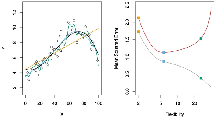
FIGURE 2.9. Left: Data simulated from f, shown in black. Three estimates of f are shown: the linear regression line (orange curve), and two smoothing spline fits (blue and green curves). Right: Training MSE (grey curve), test MSE (red curve), and minimum possible test MSE over all methods (dashed line). Squares represent the training and test MSEs for the three fits shown in the left-hand panel.
The orange, blue and green squares indicate the MSEs associated with the corresponding curves in the left hand panel. A more restricted and hence smoother curve has fewer degrees of freedom than a wiggly curve—note that in Figure 2.9, linear regression is at the most restrictive end, with two degrees of freedom. The training MSE declines monotonically as flexibility increases.
As the flexibility of the statistical learning method increases, we observe a monotone decrease in the training MSE and a U-shape in the test MSE. This is a fundamental property of statistical learning that holds regardless of the particular data set at hand and regardless of the statistical method being used. As model flexibility increases, training MSE will decrease, but the test MSE may not.
When a given method yields a small training MSE but a large test MSE, we are said to be overfitting the data.
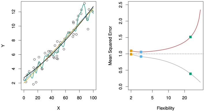
FIGURE 2.10. Details are as in Figure 2.9, using a different true f that is much closer to linear. In this setting, linear regression provides a very good fit to the data.
Another example in which the true \(f\) is approximately linear.
However, because the truth is close to linear, the test MSE only decreases slightly before increasing again, so that the orange least squares fit is substantially better than the highly flexible green curve.
Figure 2.11 displays an example in which f is highly non-linear. The training and test MSE curves still exhibit the same general patterns, but now there is a rapid decrease in both curves before the test MSE starts to increase slowly.
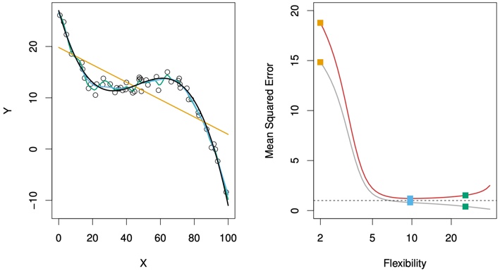
FIGURE 2.11. Details are as in Figure 2.9, using a different f that is far from linear. In this setting, linear regression provides a very poor fit to the data.
We need to select a statistical learning method that simultaneously achieves low variance and low bias.
2.2.2 The Bias-Variance Trade-Off
As we use more flexible methods, the variance will increase and the bias will decrease. As we increase the flexibility of a class of methods, the bias tends to initially decrease faster than the variance increases. However, at some point increasing flexibility has little impact on the bias but starts to significantly increase the variance. When this happens the test MSE increases.
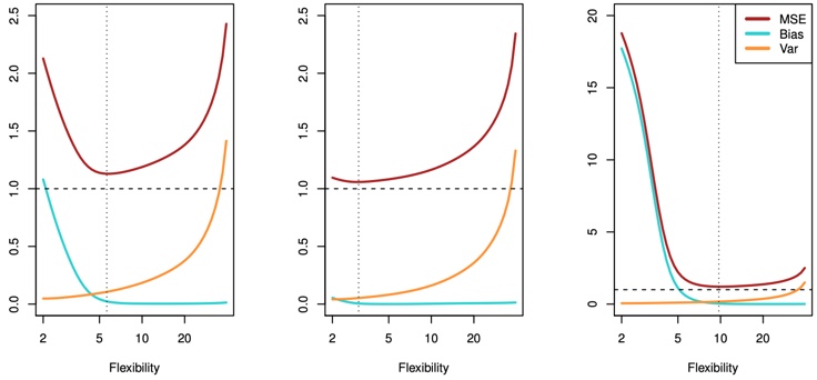
FIGURE 2.12. Squared bias (blue curve), variance (orange curve), Var(ϵ) (dashed line), and test MSE (red curve) for the three data sets in Figures 2.9–2.11. The vertical dotted line indicates the flexibility level corresponding to the smallest test MSE.
In all three cases, the variance increases and the bias decreases as the method’s flexibility increases. The relationship between bias, variance, and test set MSE given is referred to as the bias-variance trade-off.
The challenge lies in finding a method for which both the variance and the squared bias are low. This trade-off is one of the most important recurring themes in this book.
2.2.3 The Classification Setting
The most common approach for quantifying the accuracy of our estimate \(\hat{f}\) is the training error rate, the proportion of mistakes that are made if we apply our estimate \(\hat{f}\) to the training observations: \[\frac{1}{n}\sum_{i=1}^{n}I(y_i \ne \hat{y}_i).\]
The above equation computes the fraction of incorrect classifications.
The equation is referred to as the training error rate because it is computed based on the data that was used to train our classifier.
Again, we are most interested in the error rates that result from applying our classifier to test observations that were not used in training.
Test Error
The test error rate associated with a set of test observations of the form \((x_0, y_0)\) is given by
\[\mathrm{Ave}\big(I(y_i \ne \hat{y}_i)\big).\]
Where \(\hat{y}_0\) is the predicted class label that results from applying the classifier to the test observation with predictor \(x_0\). A good classifier is one for which the test error is smallest.
The Bayes Classifier
Hypothetical – cannot be done in practice
The test error rate is minimized, on average, by a very simple classifier that assigns each observation to the most likely class, given its predictor values. In other words, we should simply assign a test observation with predictor vector \(x_0\) to the class \(j\) for which
\[\mathrm{Pr}(Y=j|X=x_0).\]
Note that is a conditional probability: it is the probability that \(Y = j\), given the observed predictor vector \(X_0\). This very simple classifier is called the Bayes classifier.
Bayes Classifier Decision Boundary
Figure 2.13 provides an example using a simulated data set in a two dimensional space consisting of predictors X1 and X2. The orange and blue circles correspond to training observations that belong to two different classes. For each value of X1 and X2, there is a different probability of the response being orange or blue.
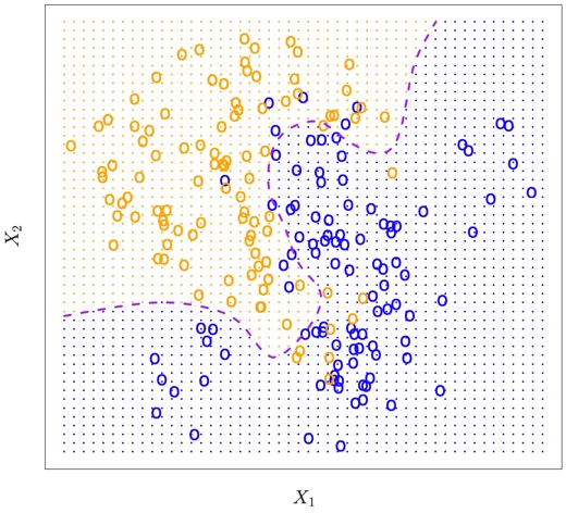
FIGURE 2.13. A simulated data set consisting of 100 observations in each of two groups, indicated in blue and in orange. The purple dashed line represents the Bayes decision boundary. The orange background grid indicates the region in which a test observation will be assigned to the orange class, and the blue background grid indicates the region in which a test observation will be assigned to the blue class.
The purple dashed line represents the points where the probability is exactly 50%. This is called the Bayes decision boundary. An observation that falls on the orange side of the boundary will be assigned to the orange class, and similarly an observation on the blue side of the boundary will be assigned to the blue class.
The Bayes classifier produces the lowest possible test error rate, called the Bayes error rate.
The overall Bayes error rate is given by
\[1- E\big(\mathop{\mathrm{max}}_{j}(Y=j|X)\big),\]
where the expectation averages the probability over all possible values of X. The Bayes error rate is analogous to the irreducible error, discussed earlier.
K-Nearest Neighbors
It is a classifier of unlabeled example which needs to be classified into one of the several labeled groups
For real data, we do not know the conditional distribution of \(Y\) given \(X\), and so computing the Bayes classifier is impossible.
Many approaches attempt to estimate the conditional distribution of \(Y\) given \(X\), and then classify a given observation to the class with highest estimated probability. One such method is the K-nearest neighbors (KNN) classifier.
Given a positive integer K and a test observation \(t_{0}\), the KNN classifier first identifies the K points in the training data that are closest to \(x_0\)
\[\mathrm{Pr}(Y=j|X=x_0) = \frac{1}{K}\sum_{i \in \mathcal{N}_0} I (y_i = j)\]
Finally, KNN classifies the test observation \(x_0\) to the class with the largest probability.
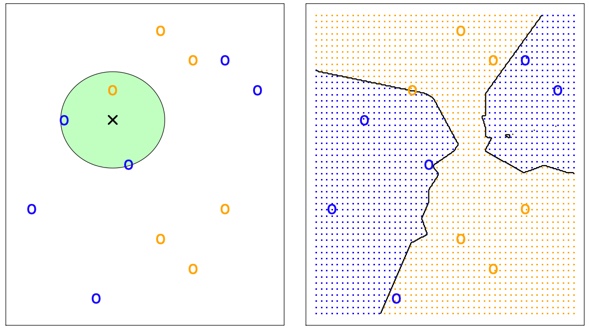
Figure 2-143
The KNN approach with \(K\) = 3 at all of the possible values for \(X_1\) and \(X_2\), and have drawn in the corresponding KNN decision boundary.
Despite the fact that it is a very simple approach, KNN can produce classifiers that are surprisingly close to the optimal Bayes classifier.
KNN with Different K
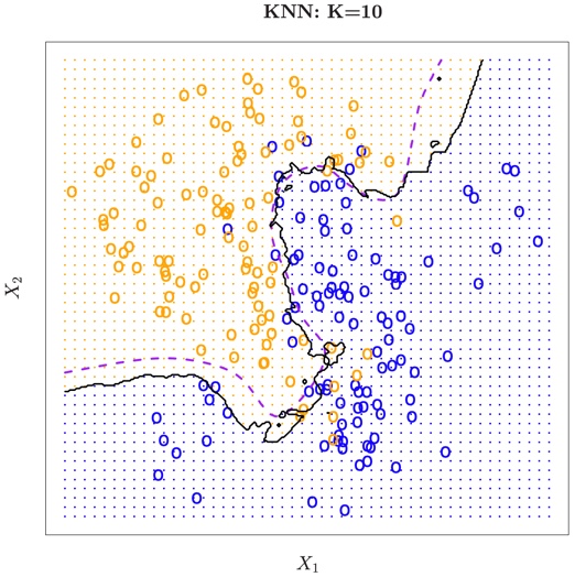
FIGURE 2.15. The black curve indicates the KNN decision boundary on the data from Figure 2.13, using K = 10. The Bayes decision boundary is shown as a purple dashed line. The KNN and Bayes decision boundaries are very similar.
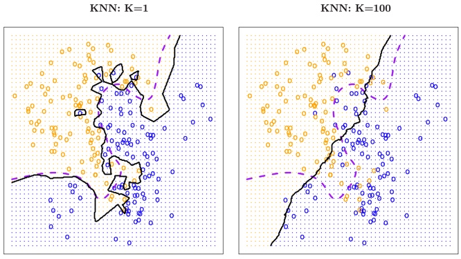
FIGURE 2.16. A comparison of the KNN decision boundaries obtained using K = 1 and K = 100 on the data from Figure 2.13. With K = 1, the decision boundary is overly flexible, while with K = 100 it is not sufficiently flexible. The Bayes decision boundary is shown as a purple dashed line.
The choice of K has a drastic effect on the KNN classifier obtained.
Nearest neighbor methods can be lousy when \(p\) is large.
Reason: the curse of dimensionality. Nearest neighbors tend to be far away in high dimensions.
KNN Tuning
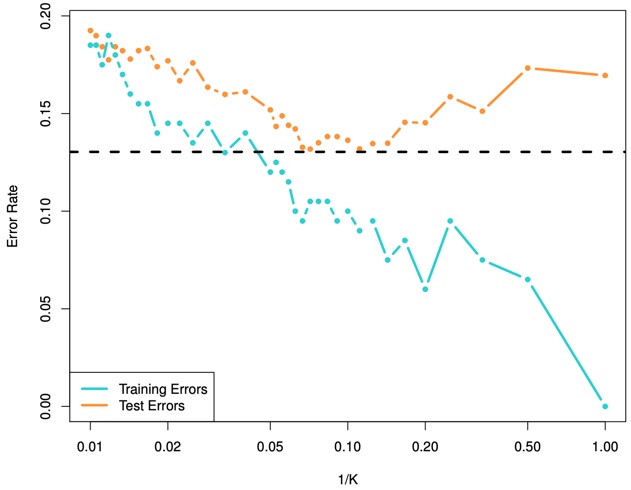
FIGURE 2.17. The KNN training error rate (blue, 200 observations) and test error rate (orange, 5,000 observations) on the data from Figure 2.13, as the level of flexibility (assessed using 1/K on the log scale) increases, or equivalently as the number of neighbors K decreases. The black dashed line indicates the Bayes error rate. The jumpiness of the curves is due to the small size of the training data set.
As we use more flexible classification methods, the training error rate will decline but the test error rate may not.
As \(1/K\) increases, the method becomes more flexible. As in the regression setting, the training error rate consistently declines as the flexibility increases.
However, the test error exhibits a characteristic U-shape, declining at first (with a minimum at approximately \(K\) = 10) before increasing again when the method becomes excessively flexible and overfits.