11.2 Use labels and annotations
- First data set is about the Biochemical Oxygen Demand, found in {datasets} package, it is made of two variables: -Time -Demand
##   Time demand
## 1    1    8.3
## 2    2   10.3
## 3    3   19.0
## 4    4   16.0
## 5    5   15.6
## 6 7 19.8ggplot(BOD, aes(Time, demand)) +
geom_point(size=2) +
geom_smooth() +
labs(
title = "Biochemical Oxygen Demand",
subtitle = "versus Time in an evaluation of water quality",
caption = "Originally from Marske (1967), \nBiochemical Oxygen Demand Data Interpretation Using Sum of Squares Surface M.Sc. Thesis, \nUniversity of Wisconsin – Madison.",
y ="Demand") +
tvthemes::theme_avatar()
- Second dataset is found in the book and made of some random uniform distributions. Here we see how we can coustomise axis title with maths formula.
df <- tibble(
  x = runif(10),
  y = runif(10)
)
ggplot(df, aes(x, y)) +
  geom_point(shape=21, stroke=2,size=5,fill="grey67",alpha=0.7) +
  labs(
    x = quote(sum(x[i] ^ 2, i == 1, n)),
    y = quote(alpha + beta + frac(delta, theta))
  ) +
  tvthemes::theme_brooklyn99()
- Third dataset is the Annual Precipitation in US Cities, the set is made of one observation each column, about the average amount of precipitation (rainfall) in inches for each of 70 United States (and Puerto Rico) cities.
Here we see how to add text to a plot with
geom_text()
##        Mobile        Juneau       Phoenix   Little Rock   Los Angeles
##          67.0          54.7           7.0          48.5          14.0
##    Sacramento San Francisco        Denver      Hartford    Wilmington
## 17.2 20.7 13.0 43.4 40.2## [1] 70cities <- precip%>%names
df <- data.frame(cities,precip)
df %>%
arrange(precip) %>%
ggplot(aes(x=1:70,y=precip)) +
geom_point(shape=21,color="white") +
geom_line(size=0.5,linetype="dashed")+
geom_text(aes(label=cities,size=precip),
hjust = "right",nudge_x = -2,
check_overlap = T) +
labs(title="Trend of Annual Precipitation in US Cities",
x="70 United States Cities",
y="AVG precipitation (rainfall) in inches")+
tvthemes::theme_spongeBob()+
theme(legend.position = "none")## Warning: Using `size` aesthetic for lines was deprecated in ggplot2 3.4.0.
## ℹ Please use `linewidth` instead.
## This warning is displayed once every 8 hours.
## Call `lifecycle::last_lifecycle_warnings()` to see where this warning was
## generated.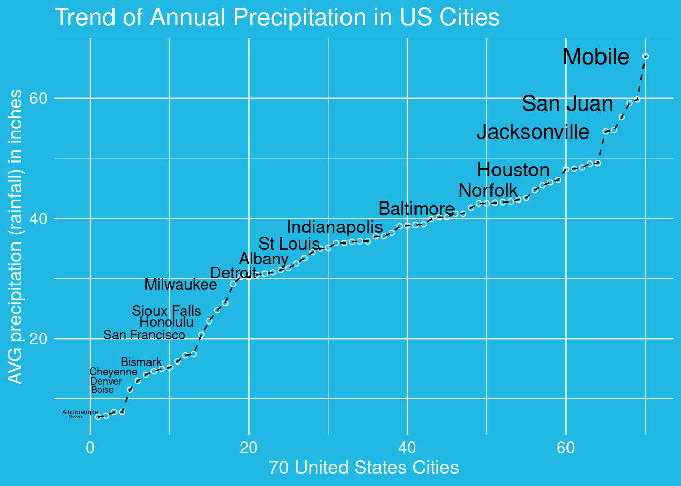
- This is the Edgar Anderson’s Iris Data. It gives the measurements in centimeters of the variables sepal length and width and petal length and width, respectively, for 50 flowers from each of 3 species of iris. The species are Iris setosa, versicolor, and virginica.
ggplot(iris,aes(Sepal.Length,Sepal.Width,group=Species))+
  geom_point(aes(color=Species)) +
  geom_text(data=iris%>%
              group_by(Species)%>%
              filter(Sepal.Length==max(Sepal.Length))%>%
              ungroup(),
    aes(label=Species),
    size=8, hjust="right",
    check_overlap = T) +
  hrbrthemes::theme_modern_rc()
- This is Fuel economy data from 1999 to 2008 for 38 popular models of cars. This dataset contains a subset of the fuel economy data that the EPA makes available on https://fueleconomy.gov/. It contains only models which had a new release every year between 1999 and 2008 - this was used as a proxy for the popularity of the car.
Here we learn how to set the lable in specific place inside the plot.
label <- mpg %>%
  summarise(
    displ = max(displ),
    hwy = max(hwy),
    label = "Increasing engine size is \nrelated to decreasing fuel economy."
  )

ggplot(mpg, aes(displ, hwy)) +
  geom_point(aes(color=factor(hwy)),size=2) +
  geom_text(aes(label = label), data = label,
            color="grey40",size=6,
            vjust = "top", hjust = "right")+
ggthemes::theme_fivethirtyeight() +
  theme(legend.position = "none")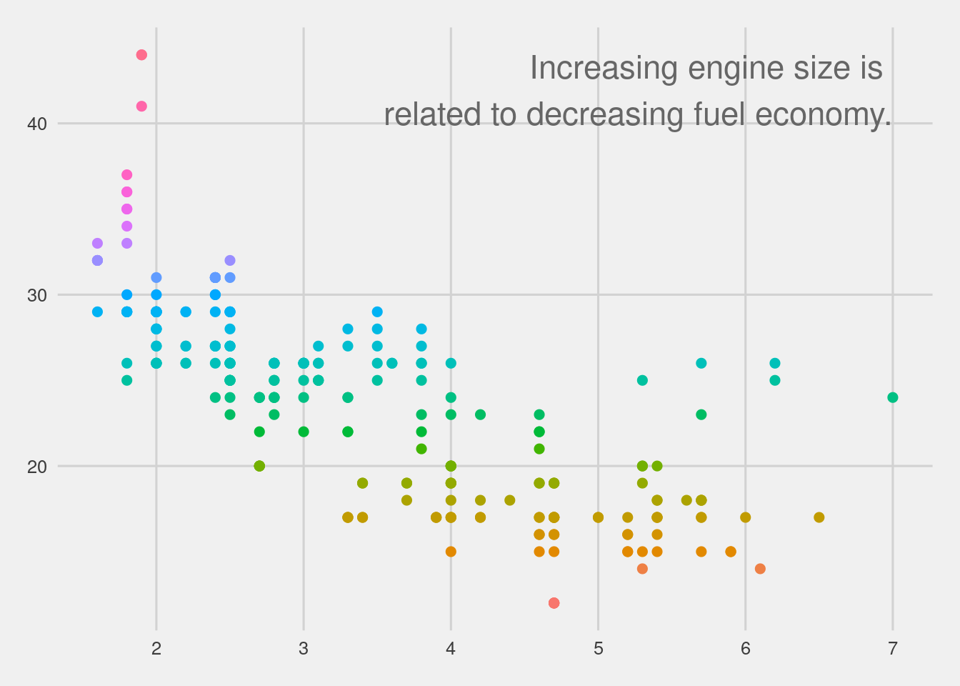
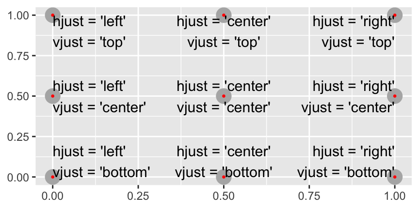
In particular for all the possibility we can refer to this plot for principal adjustments of the text inside the plot.
Other geoms for annotation:
geom_hline()andgeom_vline()to add reference lines. I often make them thick (size = 2) and white (colour = white), and draw them underneath the primary data layer. That makes them easy to see, without drawing attention away from the data.geom_rect()to draw a rectangle around points of interest. The boundaries of the rectangle are defined by aesthetics xmin, xmax, ymin, ymax.geom_segment()with the arrow argument to draw attention to a point with an arrow. Use aesthetics x and y to define the starting location, and xend and yend to define the end location.