Exercises
1. How many rows are in penguins? How many columns?
## # A tibble: 344 × 8
##    species island    bill_length_mm bill_depth_mm flipper_length_mm body_mass_g
##    <fct>   <fct>              <dbl>         <dbl>             <int>       <int>
##  1 Adelie  Torgersen           39.1          18.7               181        3750
##  2 Adelie  Torgersen           39.5          17.4               186        3800
##  3 Adelie  Torgersen           40.3          18                 195        3250
##  4 Adelie  Torgersen           NA            NA                  NA          NA
##  5 Adelie  Torgersen           36.7          19.3               193        3450
##  6 Adelie  Torgersen           39.3          20.6               190        3650
##  7 Adelie  Torgersen           38.9          17.8               181        3625
##  8 Adelie  Torgersen           39.2          19.6               195        4675
##  9 Adelie  Torgersen           34.1          18.1               193        3475
## 10 Adelie  Torgersen           42            20.2               190        4250
## # ℹ 334 more rows
## # ℹ 2 more variables: sex <fct>, year <int>
See first line. 344 rows x 8 columns.
2. What does the bill_depth_mm variable in the penguins data frame describe? Read the help for ?penguins to find out.
Call ?penguins for definition from package documentation
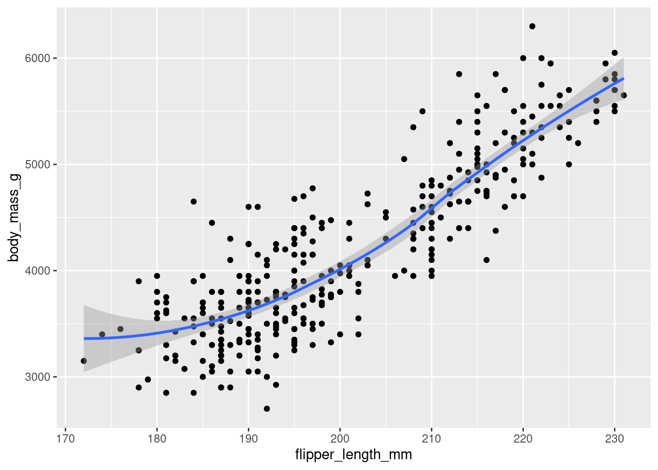
3. Make a scatterplot of bill_depth_mm vs. bill_length_mm. That is, make a scatterplot with bill_depth_mm on the y-axis and bill_length_mm on the x-axis. Describe the relationship between these two variables.

Positive, linear relationship? We’ll see more about this in later exercises.
4. What happens if you make a scatterplot of species vs. bill_depth_mm? What might be a better choice of geom?
## Warning: Removed 2 rows containing missing values or values outside the scale range
## (`geom_point()`).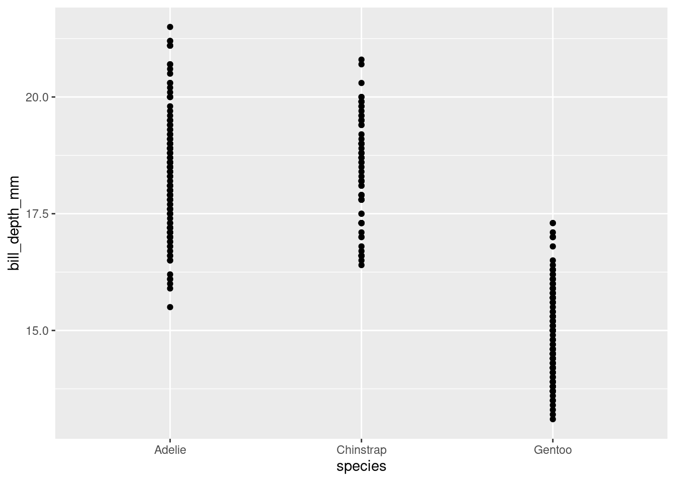
Dotplot for every species. Boxplot would tell us more.
## Warning: Removed 2 rows containing non-finite outside the scale range
## (`stat_boxplot()`).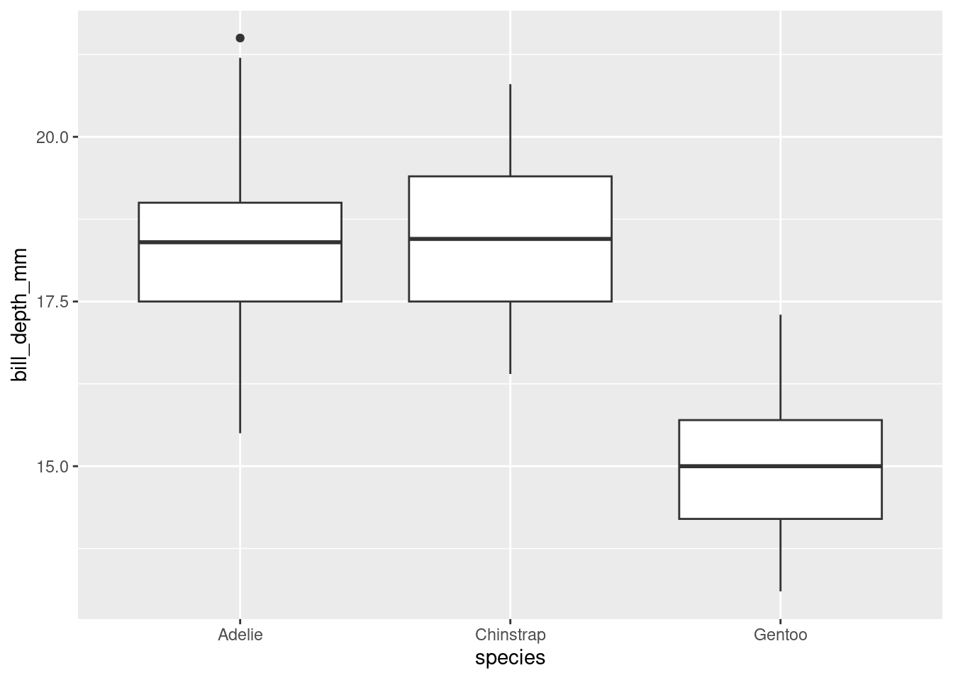
This better compares bill depths across species.
5. Why does the following give an error and how would you fix it?
The error reads ! geom_point() requires the following missing aesthetics: x and y. Call needs x variable and y variable.
6. What does the na.rm argument do in geom_point()? What is the default value of the argument? Create a scatterplot where you successfully use this argument set to TRUE.
From function documentation, “If FALSE, the default, missing values are removed with a warning. If TRUE, missing values are silently removed.”

7. Add the following caption to the plot you made in the previous exercise: “Data come from the palmerpenguins package.” Hint: Take a look at the documentation for labs().
caption argument adds a caption.
ggplot(penguins) +
geom_boxplot(aes(x = species, y = bill_depth_mm)) +
labs(
title = "Distribution of Penguin Bill Depths by Species",
subtitle = "For penguins at Palmer Station Antarctica",
x = "Species",
y = "Bill depth (in millimeters)",
caption = "Data come from the `palmerpenguins` package."
)
8.Recreate the following visualization. What aesthetic should bill_depth_mm be mapped to? And should it be mapped at the global level or at the geom level?
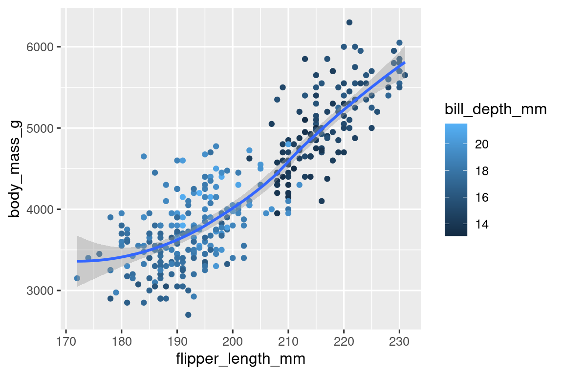
ggplot(data = penguins, aes(x = flipper_length_mm, y = body_mass_g)) +
  geom_point(aes(color = bill_depth_mm)) +
  geom_smooth(method = "loess")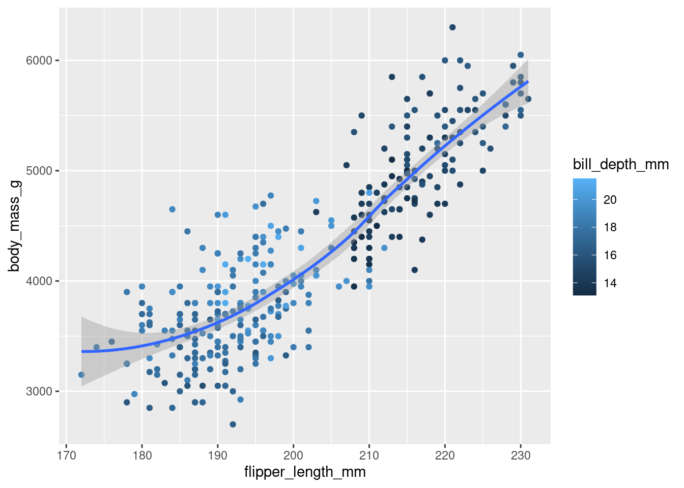
9. Run this code in your head and predict what the output will look like. Then, run the code in R and check your predictions.
ggplot(
  data = penguins,
  mapping = aes(x = flipper_length_mm, y = body_mass_g, color = island)
) +
  geom_point() +
  geom_smooth(se = FALSE)
10. Will these two graphs look different? Why/why not?
ggplot(
  data = penguins,
  mapping = aes(x = flipper_length_mm, y = body_mass_g)
) +
  geom_point() +
  geom_smooth()

ggplot() +
  geom_point(
    data = penguins,
    mapping = aes(x = flipper_length_mm, y = body_mass_g)
  ) +
  geom_smooth(
    data = penguins,
    mapping = aes(x = flipper_length_mm, y = body_mass_g)
  )
Only difference is mapping globally vs. locally, and mapped same in both geoms, so they should look the same.