(more) Exercises
1. Make a bar plot of species of penguins, where you assign species to the y aesthetic. How is this plot different?
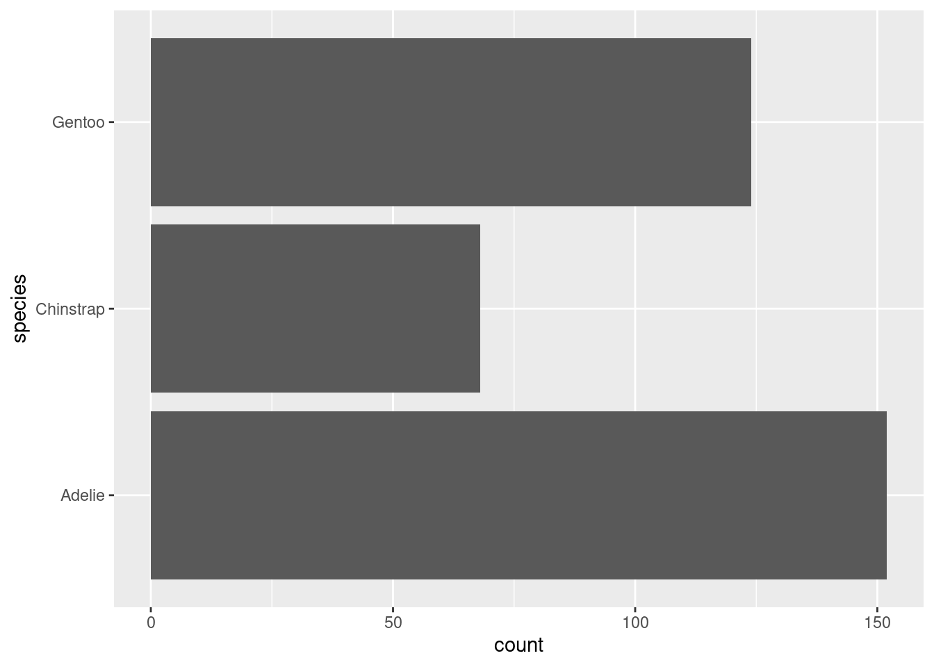
Bars horizontal instead of vertical.
2. How are the following two plots different? Which aesthetic, color or fill, is more useful for changing the color of bars?

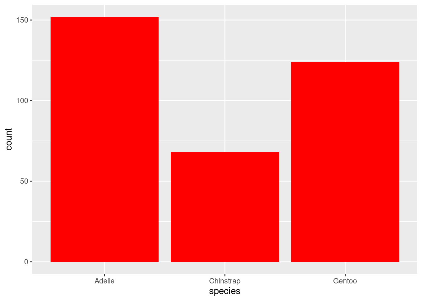
For geom_bar(), “color” affects borders. “Fill” affects inside.
3. What does the bins argument in geom_histogram() do?
The bins argument is helpful when you don’t have a particular bin width in mind, but you do want to narrow things down to a particular number of bins.
4. Make a histogram of the carat variable in the diamonds dataset that is available when you load the tidyverse package. Experiment with different binwidths. What binwidth reveals the most interesting patterns?
Let’s try 1, 0.1, and 0.01.
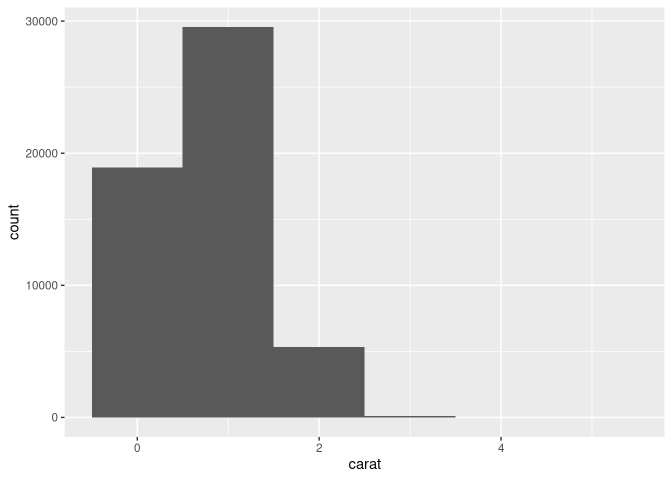


Here, a binwidth of 0.1 seems to be a good compromise between showing granularity in the data and not overwhelming ourselves with too many bars.