9.12
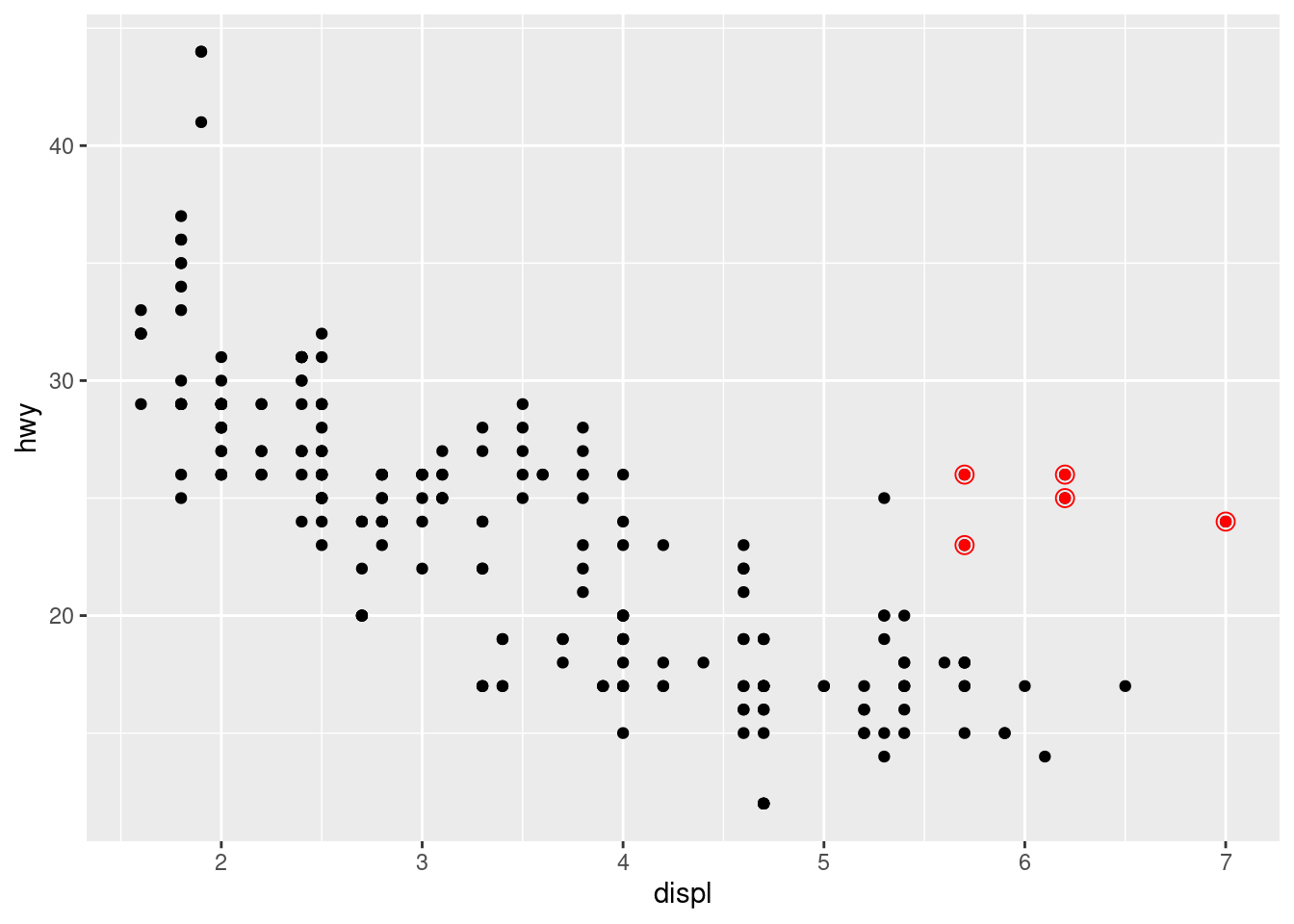
- We can also specify different data for different layer. Here, we use red points as well as open circles to highlight two-seater cars. The local data argument in
geom_smooth()overrides the global data argument inggplot()for that layer only.
ggplot(mpg, aes(x = displ, y = hwy)) +
  geom_point() +
  geom_point(
    data = mpg |> filter(class == "2seater"),
    color = "red"
  ) +
  geom_point(
    data = mpg |> filter(class == "2seater"),
    shape = "circle open", size = 3, color = "red"
  )
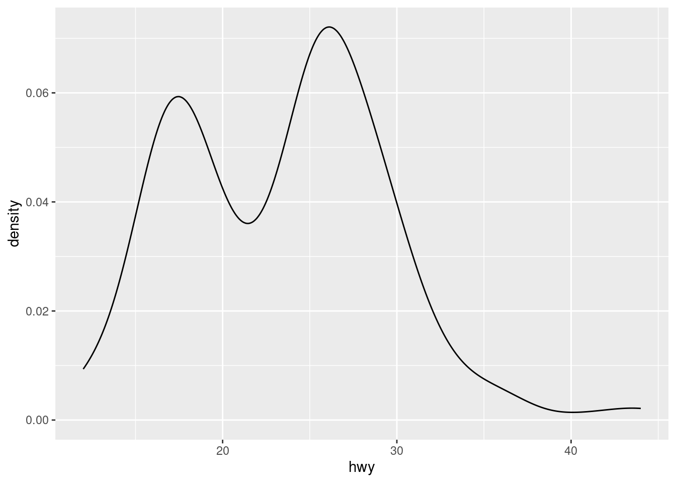
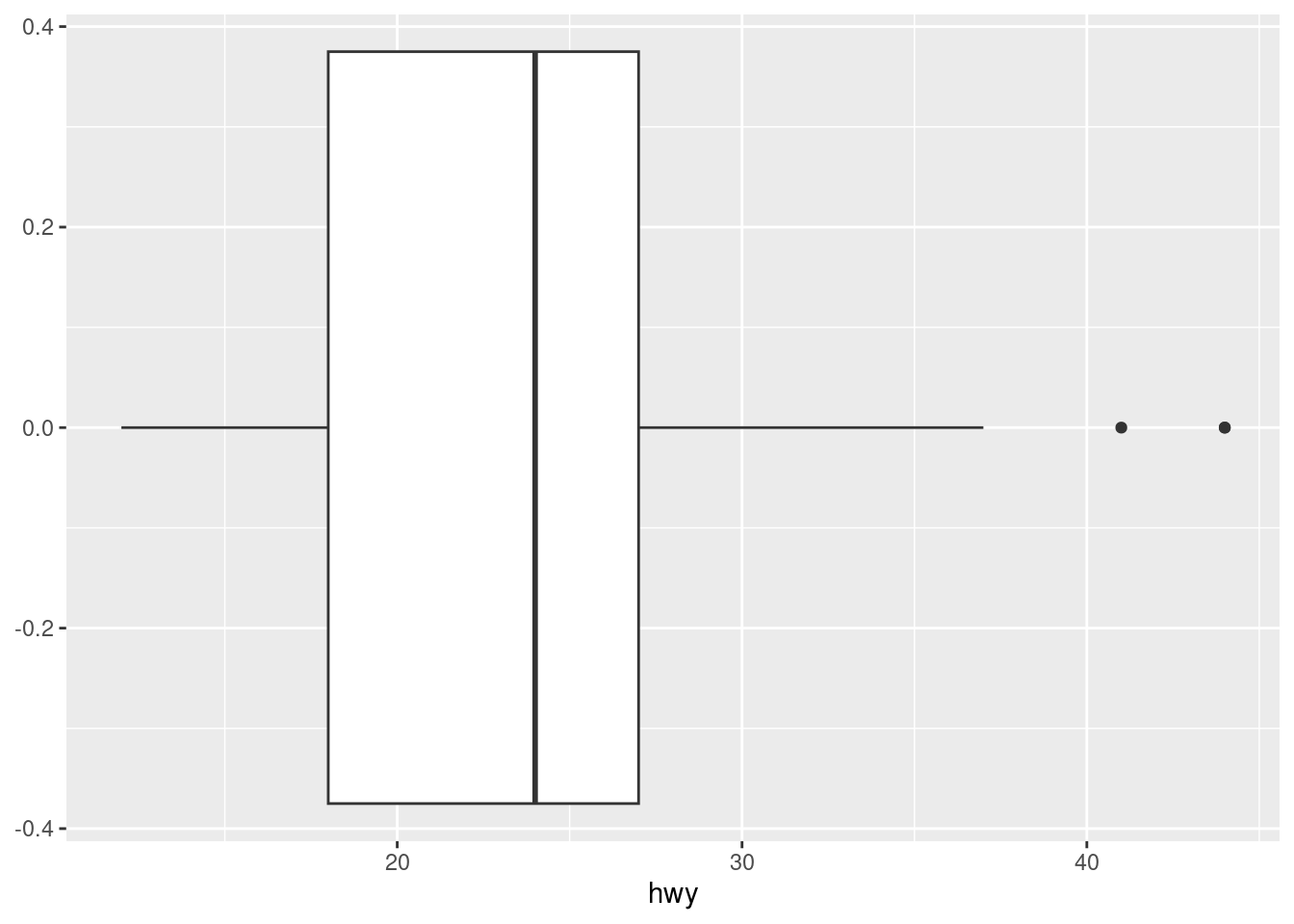
- The histogram and density plot below reveal that the distribution of highway mileage is bimodal and right skewed while the boxplot reveals two potential outliers.
par(mar = c(4, 4, .1, .1))

# Left
ggplot(mpg, aes(x = hwy)) +
  geom_histogram(binwidth = 2)

# Middle
ggplot(mpg, aes(x = hwy)) +
  geom_density()

# Right
ggplot(mpg, aes(x = hwy)) +
  geom_boxplot()
ggplot2 provides more than 40 geoms but these don’t cover all possible plots one could make. If you need a different geom, we recommend looking into extension packages first to see if someone else has already implemented it here
The best place to get a comprehensive overview of all of the geoms ggplot2 offers, as well as all functions in the package, is the reference page:ggplot2-reference page