(Even More) Exercises
1. The mpg data frame that is bundled with the ggplot2 package contains 234 observations collected by the US Environmental Protection Agency on 38 car models. Which variables in mpg are categorical? Which variables are numerical? (Hint: Type ?mpg to read the documentation for the dataset.) How can you see this information when you run mpg?
Running glimpse(mpg) gets us most of the way there. We can assume all of the character-based variables (“<chr>”) are categorical. Since we know we’re dealing with cars, we can also recognize that year and cyl (number of cylinders), while technically numerical, are effectively categorical as there is a limited number of possible results. That leaves displ (engine displacement), cty (mpg in city), and hwy (mpg on a highway) as purely numerical.
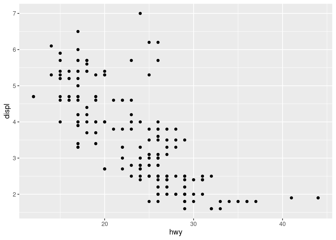
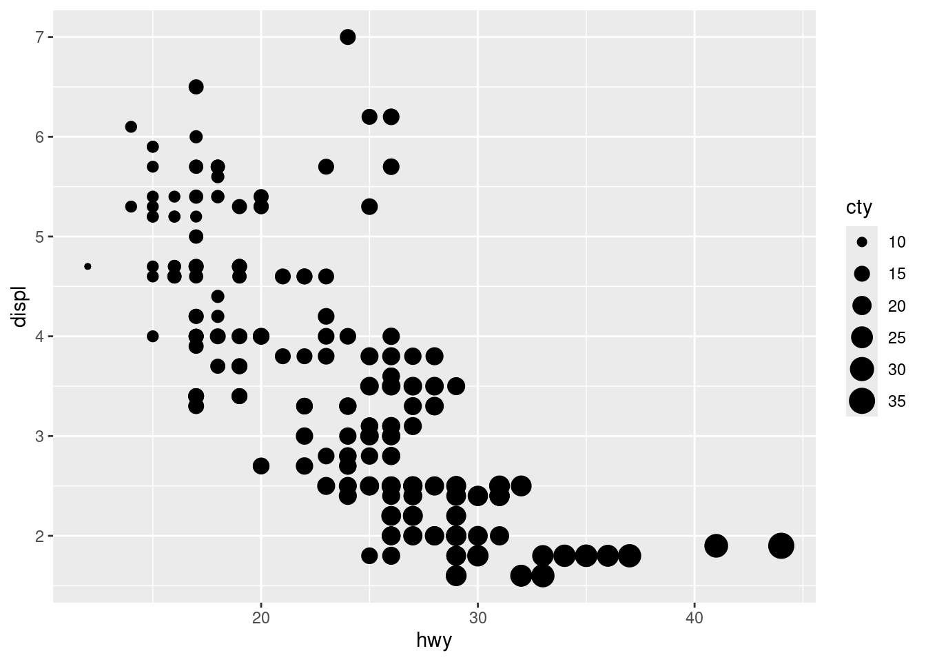
2. Make a scatterplot of hwy vs. displ using the mpg data frame. Next, map a third, numerical variable to color, then size, then both color and size, then shape. How do these aesthetics behave differently for categorical vs. numerical variables?


## Warning: The shape palette can deal with a maximum of 6 discrete values because more
## than 6 becomes difficult to discriminate
## ℹ you have requested 15 values. Consider specifying shapes manually if you need
##   that many have them.
## Warning: Removed 112 rows containing missing values or values outside the scale range
## (`geom_point()`).
First off, shape doesn’t accept numerical variables. When a categorical variable is mapped to size, a warning suggests this is ill-advised. With color, numerical variables are given a gradient palette while categoricals get varying colors (We’ve seen this behavior before [think penguin species], so it’s not plotted here).
3. In the scatterplot of hwy vs. displ, what happens if you map a third variable to linewidth?
ggplot(mpg) +
  geom_point(aes(x = hwy, y = displ, color = cty, size = year, linewidth = manufacturer))
## Warning in geom_point(aes(x = hwy, y = displ, color = cty, size = year, :
## Ignoring unknown aesthetics: linewidth## Warning: Using linewidth for a discrete variable is not advised.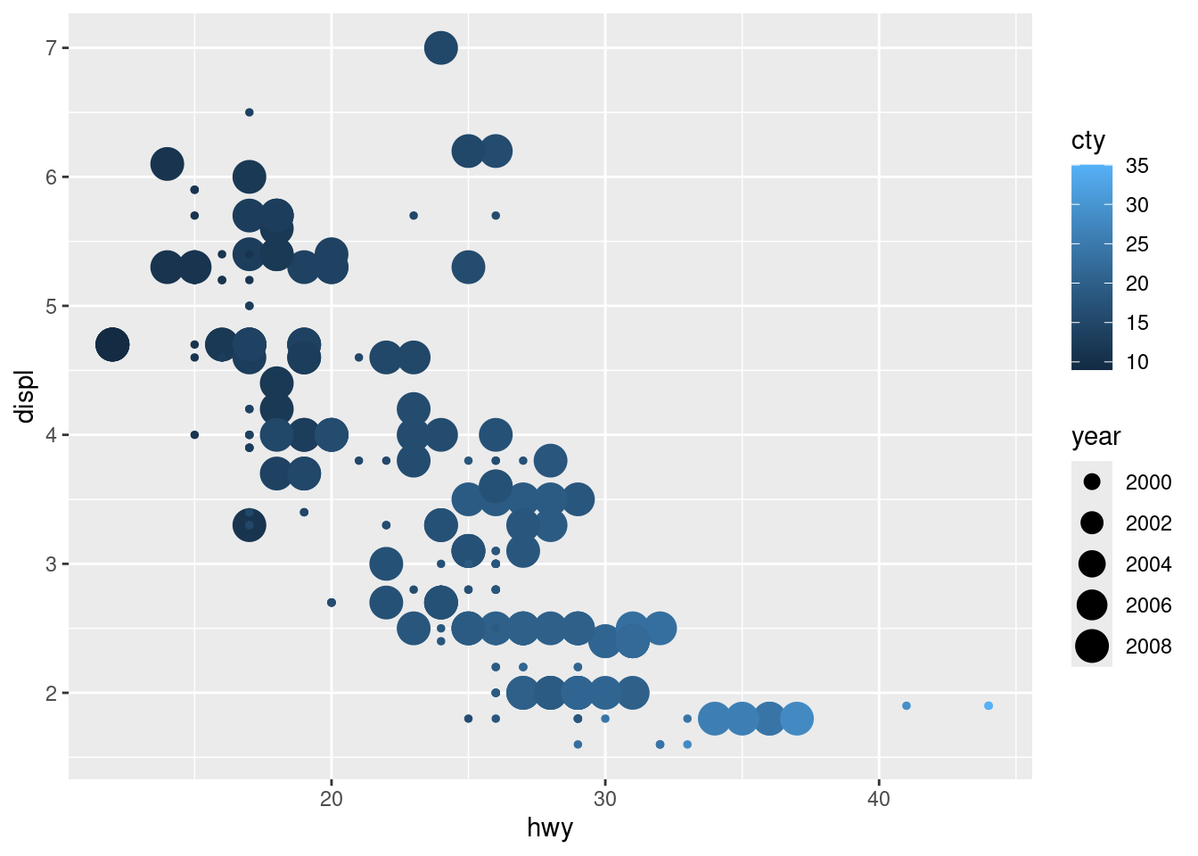
It’s ignored because there are no lines in a scatterplot. (Also, if you use a categorical variable, it advises you against it).
4. What happens if you map the same variable to multiple aesthetics?

Both work, but it can be kind of redundant. It can be useful for colorblind users, though (as we saw before with color + shape).
5. Make a scatterplot of bill_depth_mm vs. bill_length_mm and color the points by species. What does adding coloring by species reveal about the relationship between these two variables? What about faceting by species?
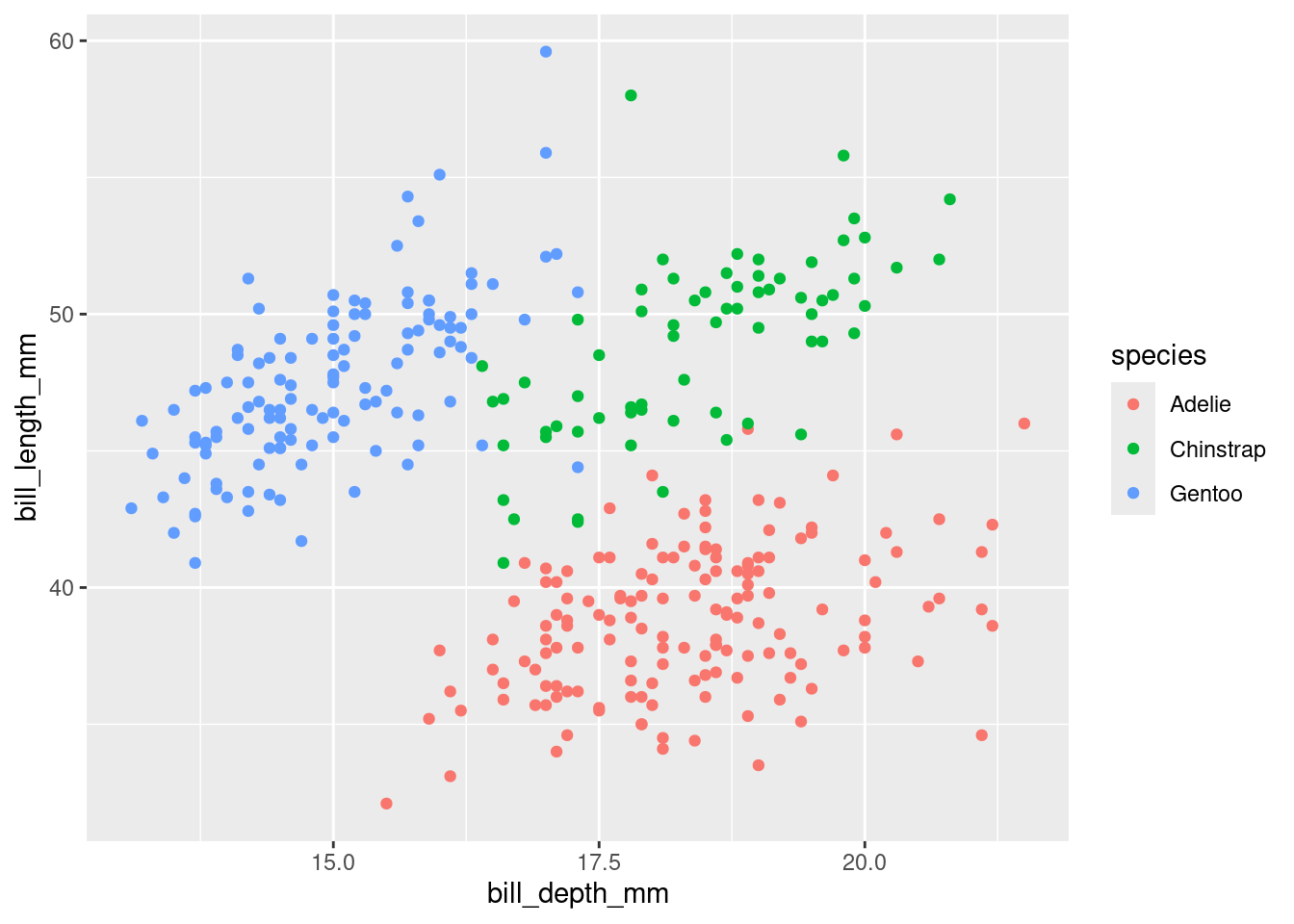
ggplot(penguins) +
geom_point(aes(x = bill_depth_mm, y = bill_length_mm, color = species))+
facet_wrap(~species)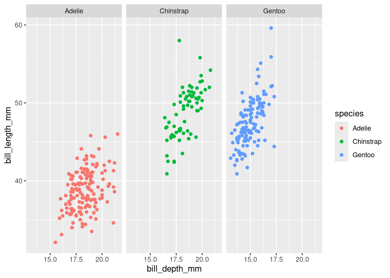
Color-coding helps spot the relationship of bill sizes by species (compare to Exercise 3 in the first block of exercises). Faceting helps the eye notice those relationships a little better by taking the “noise” of the other species out of the picture.
6. Why does the following yield two separate legends? How would you fix it to combine the two legends?
ggplot(
  data = penguins,
  mapping = aes(
    x = bill_length_mm, y = bill_depth_mm,
    color = species, shape = species
  )
) +
  geom_point() +
  labs(color = "Species")
## Warning: Removed 2 rows containing missing values or values outside the scale range
## (`geom_point()`).
Adding an argument to labs about our shape as well as our color should solve that.
ggplot(
  data = penguins,
  mapping = aes(
    x = bill_length_mm, y = bill_depth_mm
  )
) +
  geom_point(aes(color = species, shape = species)) +
  labs(color = "Species", shape = "Species")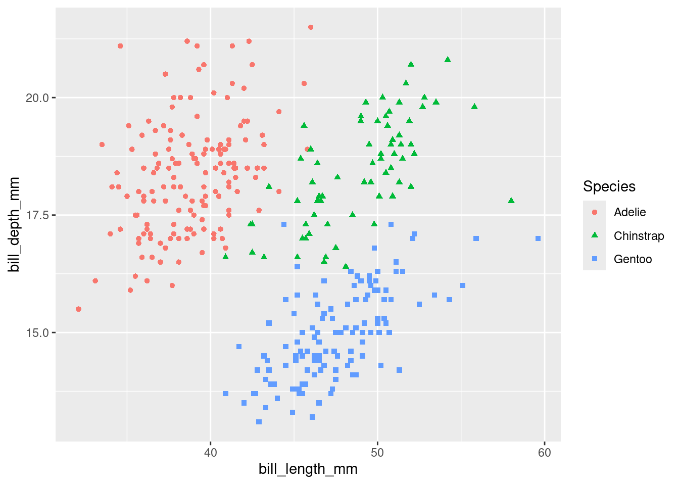
7. Create the two following stacked bar plots. Which question can you answer with the first one? Which question can you answer with the second one?
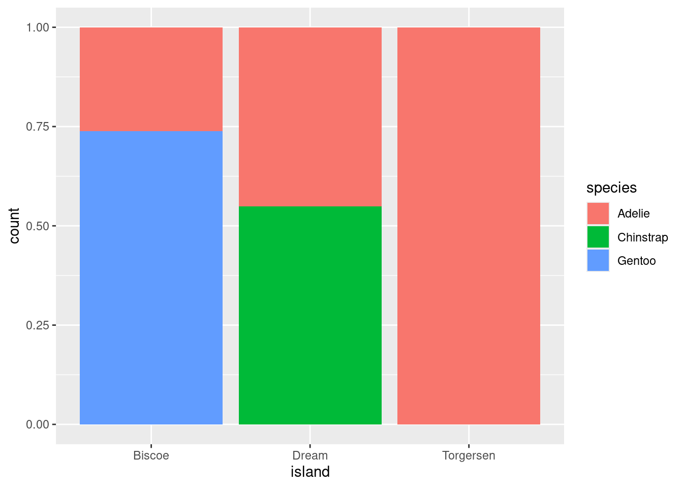
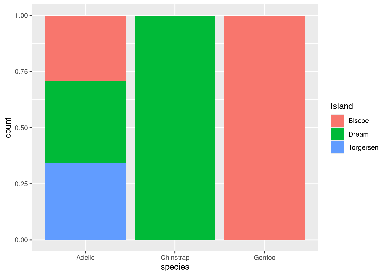
The first tells us which species make up certain proportions of an island’s overall population. The second tells us how a species’ overall population is split among the islands.