4.3 Quick Intuition on Collective Geoms
- Last chapter was on individual geoms. This chapter is on collective geoms.
- Oversimplification (but maybe useful)
- individual numbers vs the sum of the numbers
- sum converts a series of numbers (“individual”):
4, 7, 9, 3, 3 - to a single number (“collective”):
26
- sum converts a series of numbers (“individual”):
- home prices
- under individual geoms each home price has a point on a plot/table
- under collective geoms we may use
medianas a single number that summarizes all individuals
- individual numbers vs the sum of the numbers
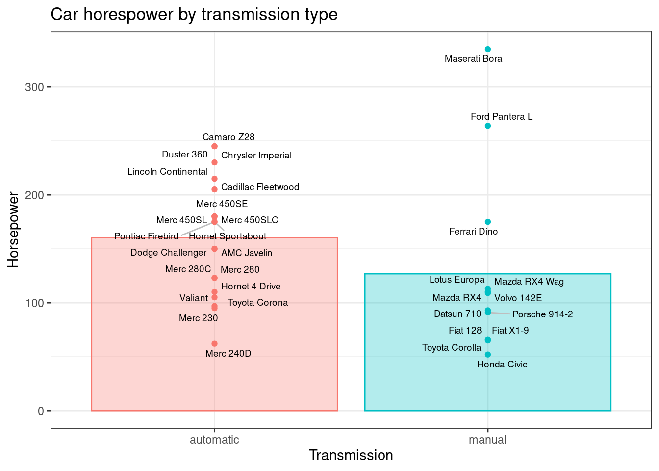
This blog post by Simon Jackson illustrates these foundations using mtcars. The points are individual geoms and the bars are a collective geom showing the average of the individual observations.
id <- mtcars %>%
  tibble::rownames_to_column() %>%
  as_tibble() %>%
  mutate(am = factor(am, levels = c(0, 1), labels = c("automatic", "manual")))

gd <- id %>%
        group_by(am) %>%
        summarise(hp = mean(hp))

ggplot(id, aes(x = am, y = hp, color = am, fill = am)) +
  geom_bar(data = gd, stat = "identity", alpha = 0.3) +
  ggrepel::geom_text_repel(aes(label = rowname), color = "black", size = 2.5, segment.color = "grey") +
  geom_point() +
  guides(color = "none", fill = "none") +
  theme_bw() +
  labs(
    title = "Car horespower by transmission type",
    x = "Transmission",
    y = "Horsepower"
  )
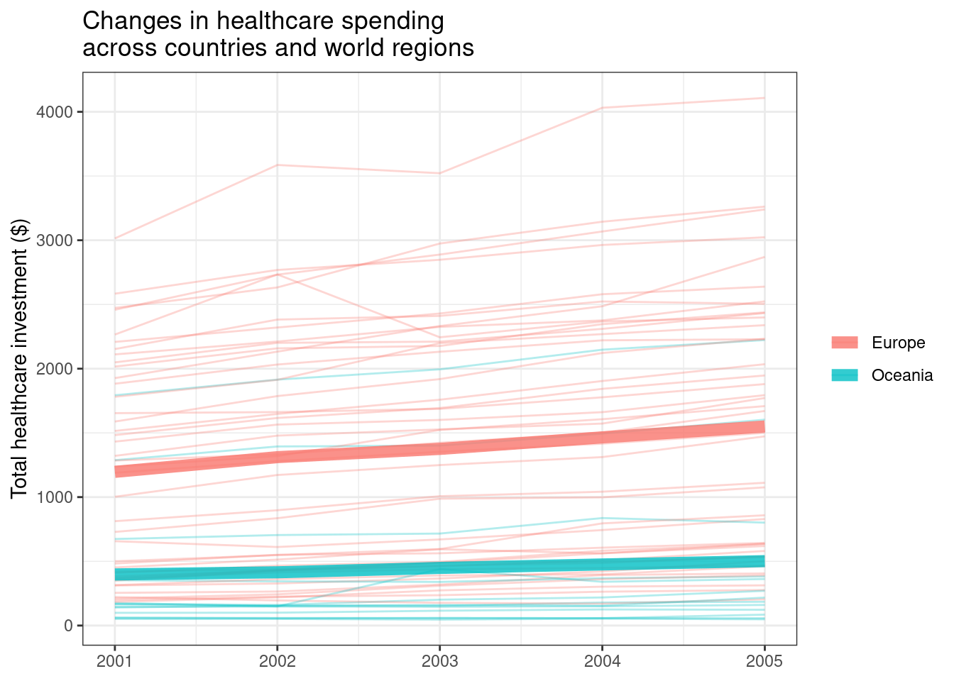
Next, a separate longitudinal study from the blog post (because the book example is also a longitudinal study). This example uses the ourworldindata dataset which shows healthcare spending per country over time.
#library(devtools)
#install_github("drsimonj/ourworldindata")

library(ourworldindata)

id <- financing_healthcare %>%
        filter(continent %in% c("Oceania", "Europe") & between(year, 2001, 2005)) %>%
        select(continent, country, year, health_exp_total) %>%
na.omit()- raw data
## # A tibble: 275 × 4
##    continent country  year health_exp_total
##    <chr>     <chr>   <int>            <dbl>
##  1 Europe    Albania  2001             198.
##  2 Europe    Albania  2002             225.
##  3 Europe    Albania  2003             236.
##  4 Europe    Albania  2004             264.
##  5 Europe    Albania  2005             277.
##  6 Europe    Andorra  2001            1432.
##  7 Europe    Andorra  2002            1565.
##  8 Europe    Andorra  2003            1601.
##  9 Europe    Andorra  2004            1662.
## 10 Europe    Andorra  2005            1794.
## # ℹ 265 more rows- individual observations are at the combined country-year level. For the purposes of plotting, though, the “individual geom” will just be the country and all of the yearly observations for each country.
gd <- id %>%
        group_by(continent, year) %>%
        summarise(health_exp_total = mean(health_exp_total))


ggplot(id, aes(x = year, y = health_exp_total, color = continent)) +
  geom_line(aes(group = country), alpha = 0.3) +
  geom_line(data = gd, alpha = 0.8, size = 3) +
  theme_bw() +
  labs(
    title = "Changes in healthcare spending\nacross countries and world regions",
    x = NULL,
    y = "Total healthcare investment ($)",
    color = NULL
  )