22.4 Adding complexity; faceting, coordinates, hierarchy of defaults
facets, multiple layers and statistics
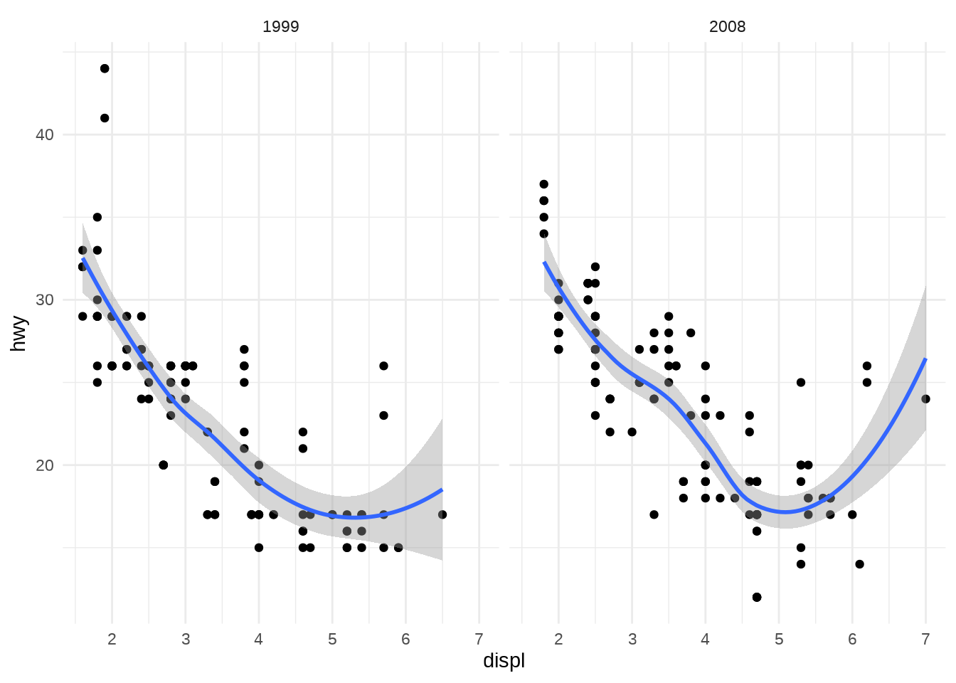
“A coordinate system, coord for short, maps the position of objects onto the plane of the plot. Position is often specified by two coordinates (x, y), but could be any number of coordinates. The Cartesian coordinate system is the most common coordinate system for two dimensions, whereas polar coordinates and various map projections are used less frequently.” (Wickham, 2010, p. 13)
“Coordinate systems affect all position variables simultaneously and differ from scales in that they also change the appearance of the geometric objects. For example, in polar coordinates, bar geoms look like segments of a circle. Additionally, scaling is performed before statistical transformation, whereas coordinate transformations occur afterward.” (Wickham, 2010, p. 13)
Coord_polar
ggplot(mpg, aes(displ, hwy, colour = factor(cyl))) +
  geom_bar(stat = "identity", position = "identity", fill = NA) +
  theme(legend.position = "none") +
  coord_polar()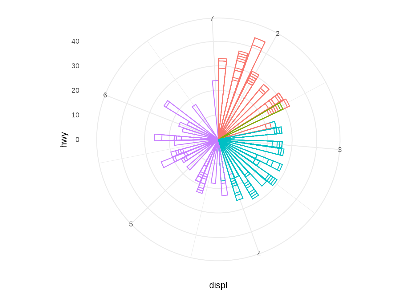
“The angle component is particularly useful for cyclical data because the starting and ending points of a single cycle are adjacent. Common cyclical variables are components of dates, like days of the year or hours of the day, and angles, like wind direction.” (Wickham, 2010, p. 22)
“In the grammar, a pie chart is a stacked bar geom drawn in a polar coordinate system.” (Wickham, 2010, p. 22)
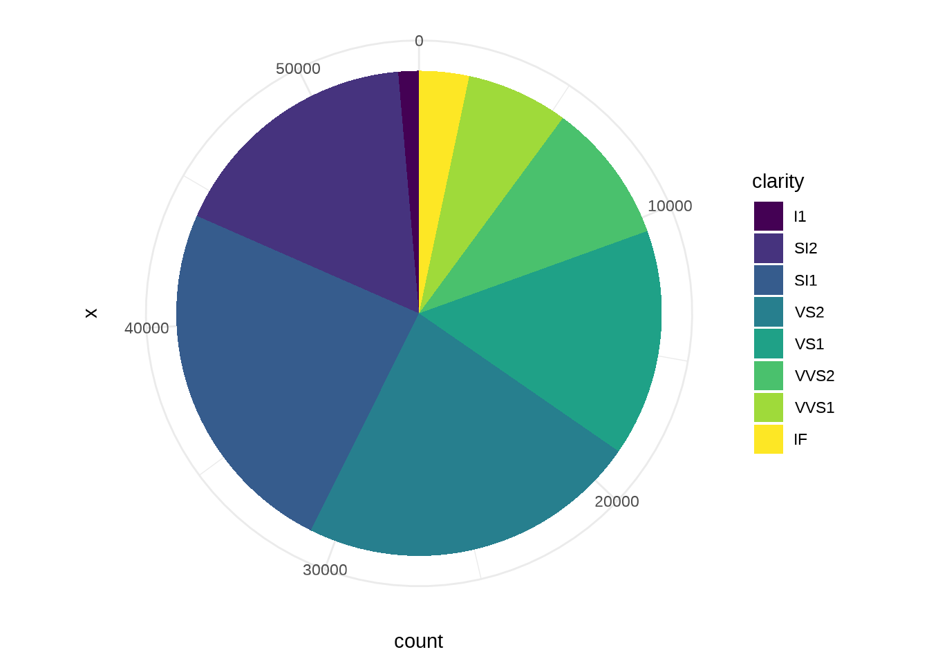
Figure 15 shows this, as well as a bullseye plot, which arises when we map the height to radius instead of angle. (Wickham, 2010, p. 22)
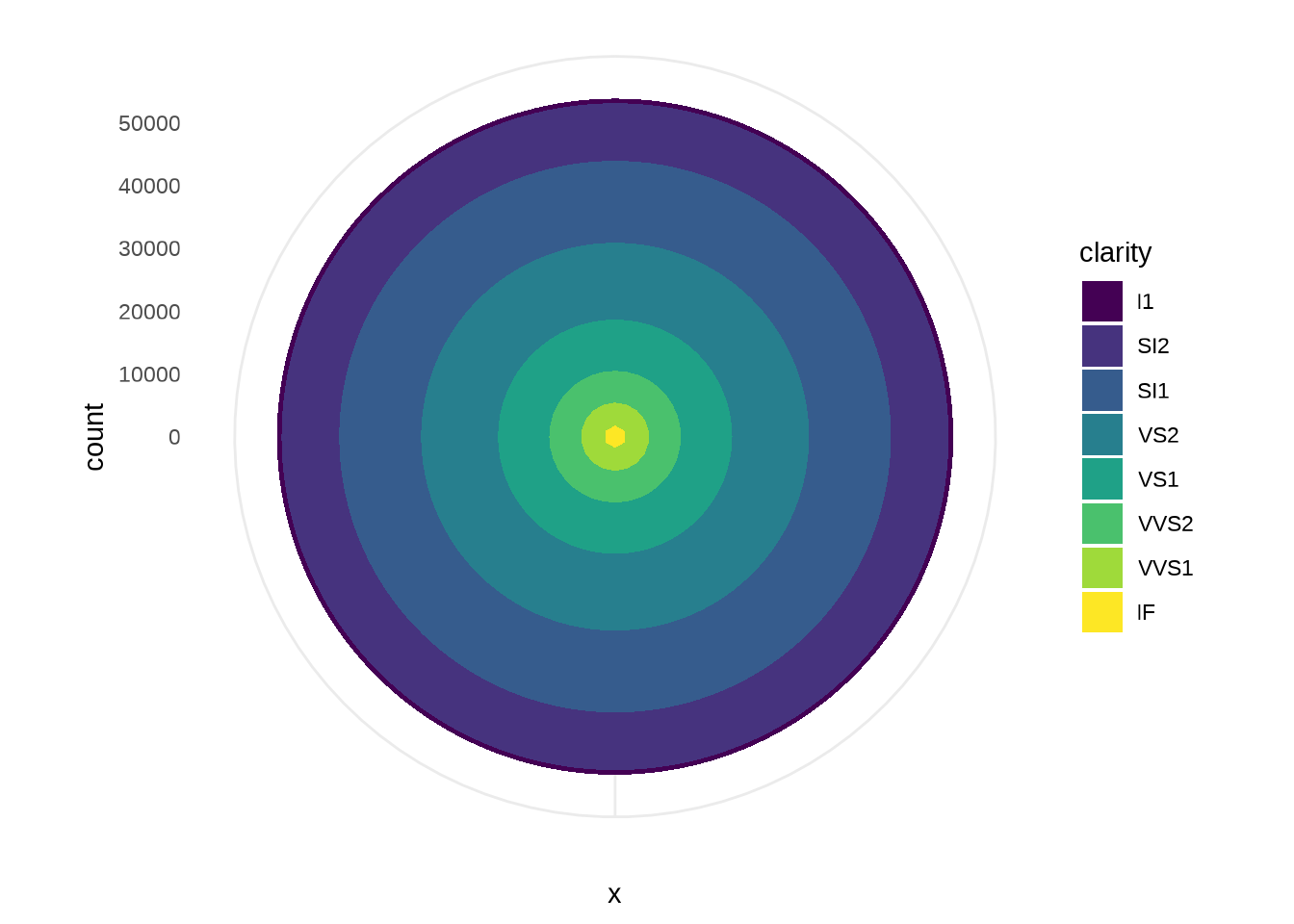
The Coxcomb plot is a bar chart in polar coordinates. Note that the categories abut in the Coxcomb, but are separated in the bar chart: this is an example of a graphical convention that differs in different coordinate systems. (Wickham, 2010, p. 23)
library(patchwork)
a <- ggplot(diamonds,aes(x = clarity, fill=clarity)) + geom_bar(width =
1) +  theme(legend.position = "none")
b <- ggplot(diamonds,aes(x = clarity, fill=clarity)) + geom_bar(width =
1) + coord_polar (theta="y")  + theme(legend.position = "none")
a + b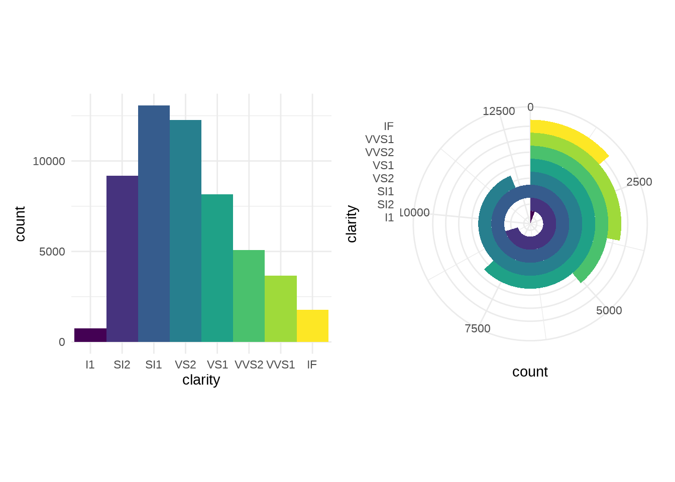
Defaults
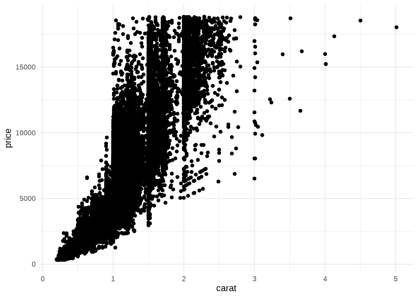
The full ggplot2 specification of the scatterplot of price versus weight is:
ggplot() +
layer(
data = diamonds, mapping = aes(x = carat, y = price),
geom = "point", stat = "identity", position = "identity"
) +
scale_y_continuous() +
scale_x_continuous() +
coord_cartesian()