5.5 Dealing with overplotting
- Scatterplot is a very important tool for assessing relationship
- Too large a dataset may obscure any true relationship
- This is called Over plotting
To compensate for Over plotting, tweaking the aesthetic can help. Techniques like hollow glyphs can help.
df <- data.frame(x = rnorm(2000), y = rnorm(2000))
norm <- ggplot(df, aes(x, y)) + xlab(NULL) + ylab(NULL)
norm + geom_point()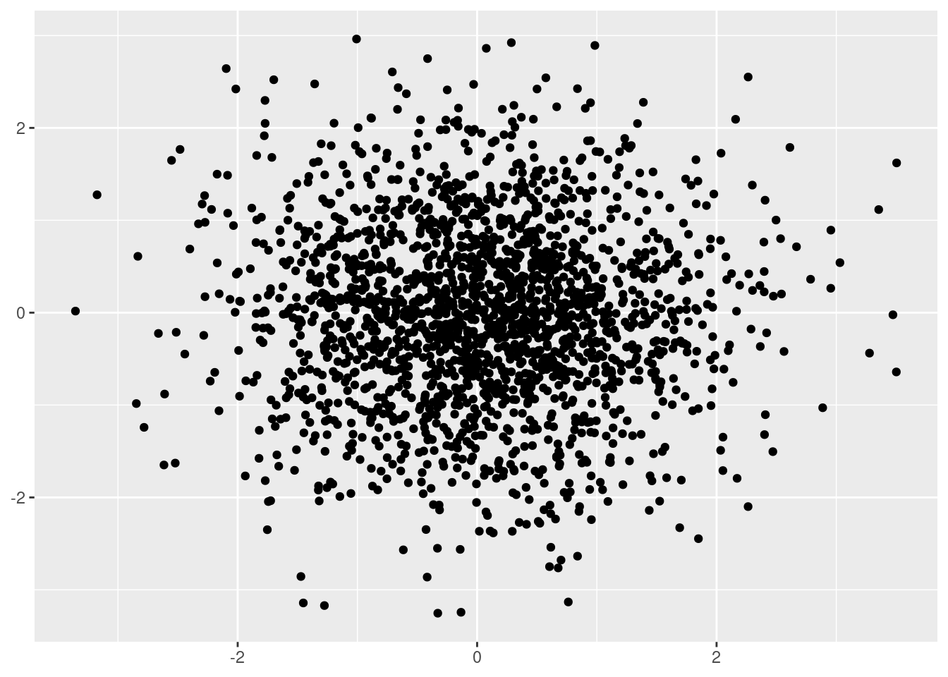
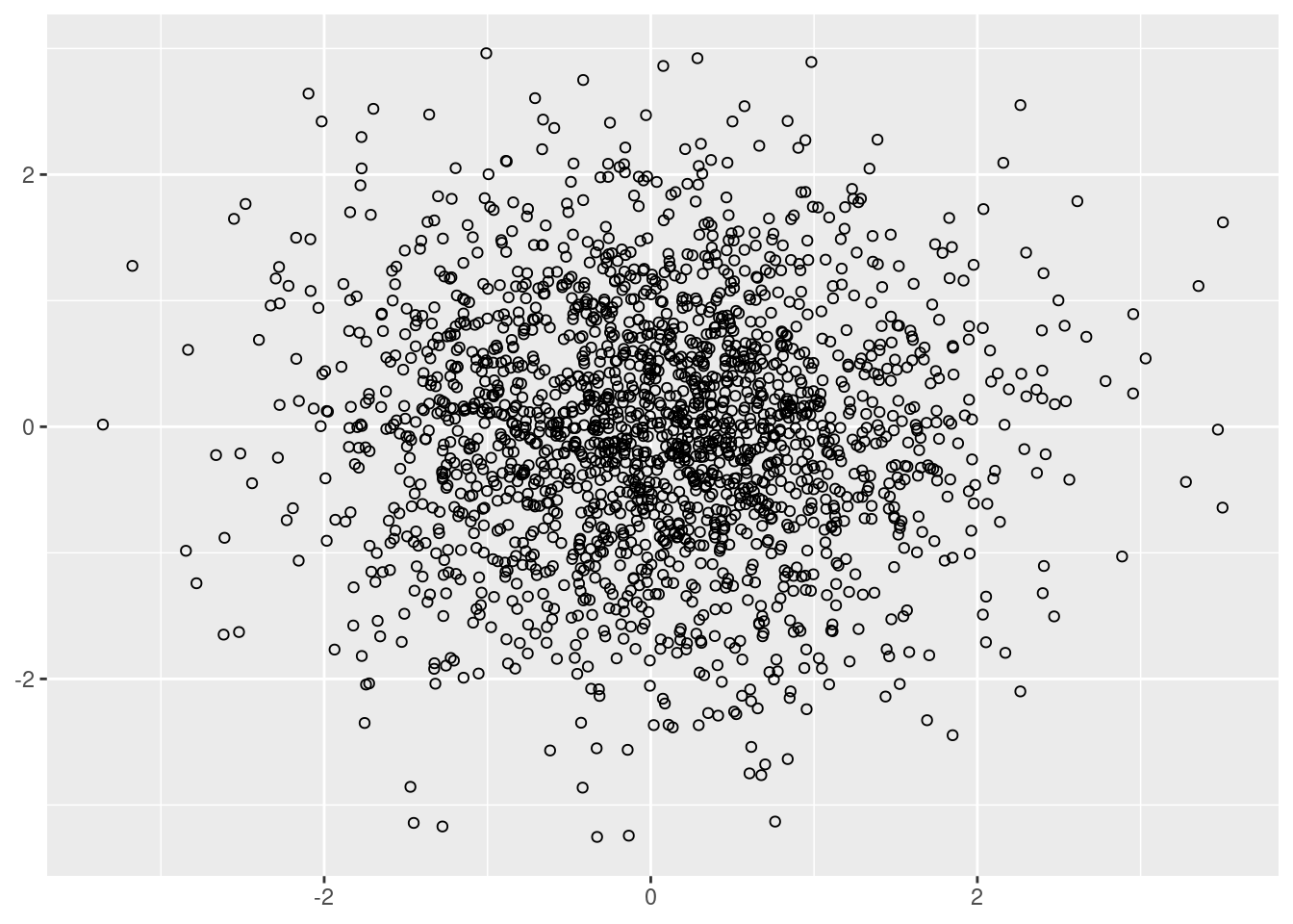
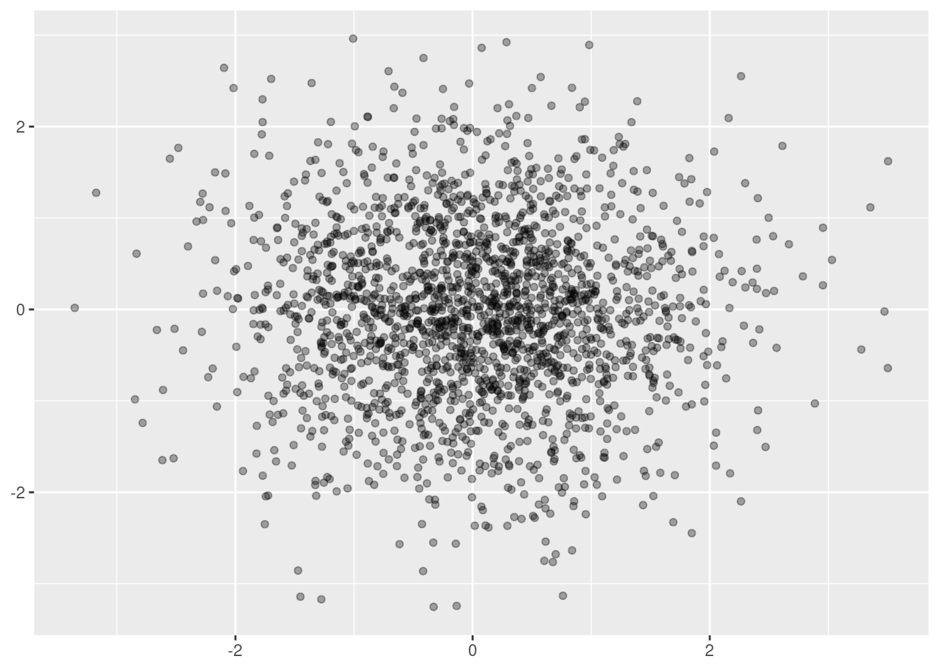
Alternative ways using large data sets, you can use alpha blending (transparency). If you specify alpha as a ratio, the denominator gives the number of points that must be over plotted to give a solid color.
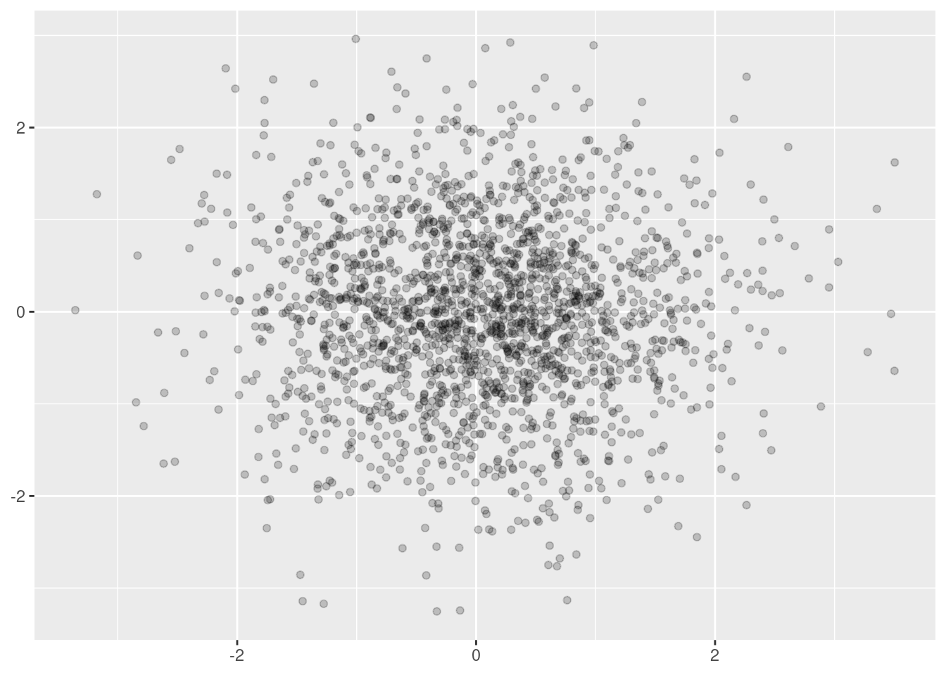
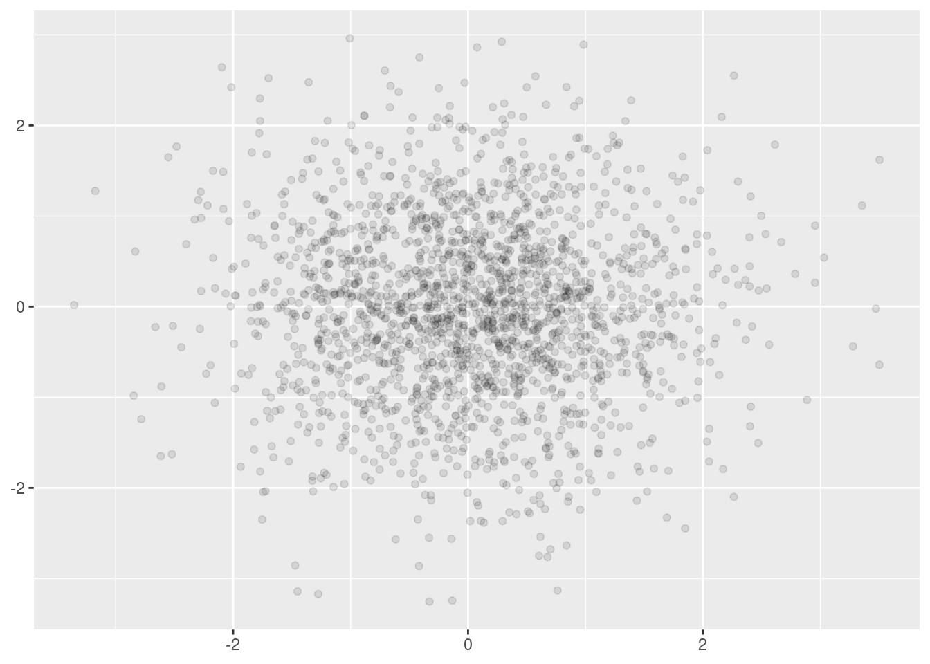
geom_jitter() can be used if your data has some discreteness. By default, 40% is used. You can overide the default with width and height arguments.
Alternatively, we can think of overplotting as a 2d density estimation problem, which gives rise to two more approaches:
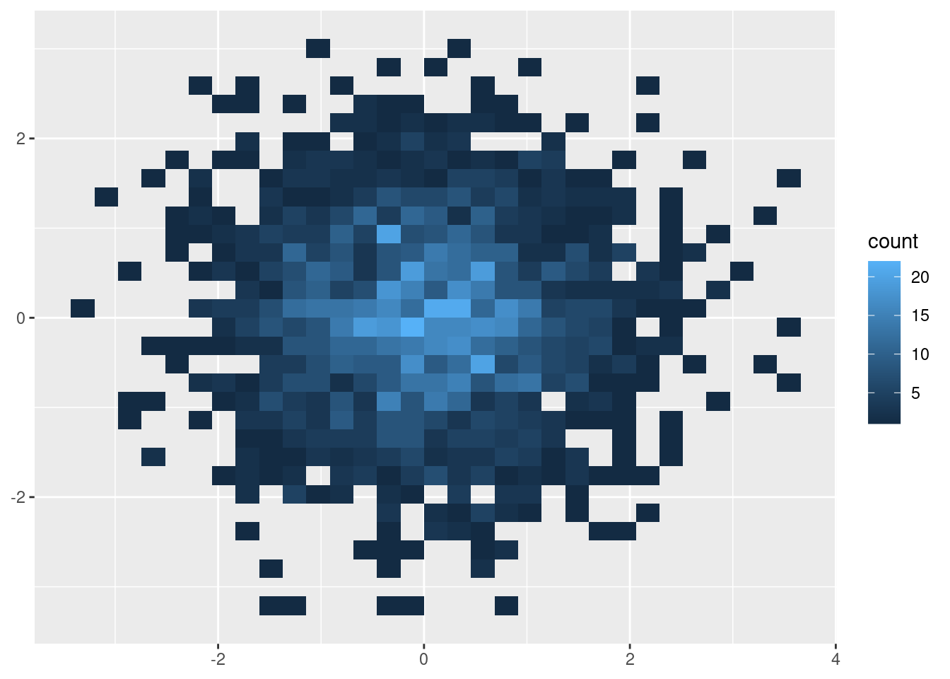
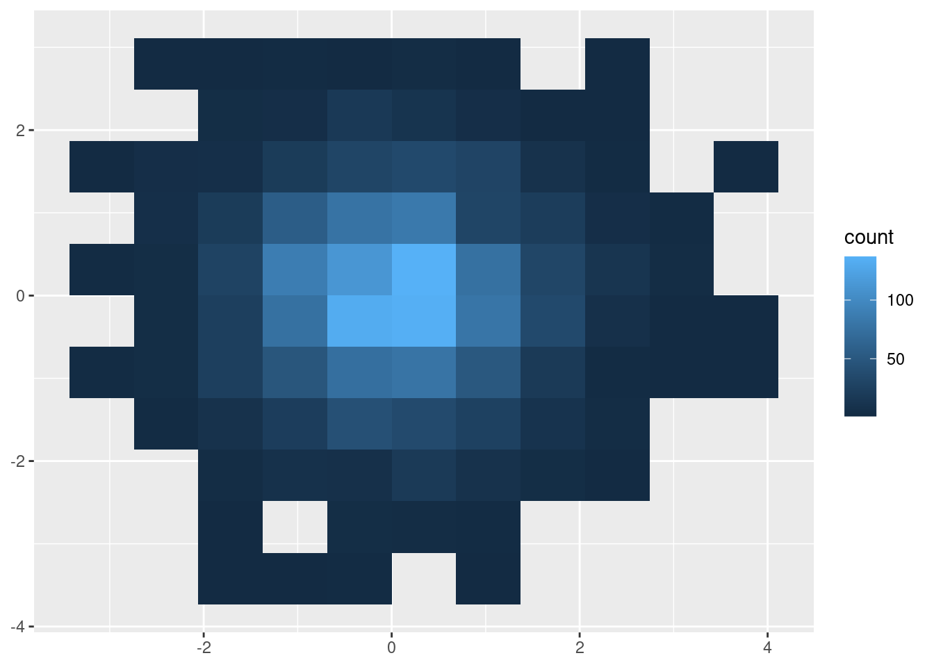
- Bin the points and count the number in each bin, then visualise that count (the 2d generalisation of the histogram),
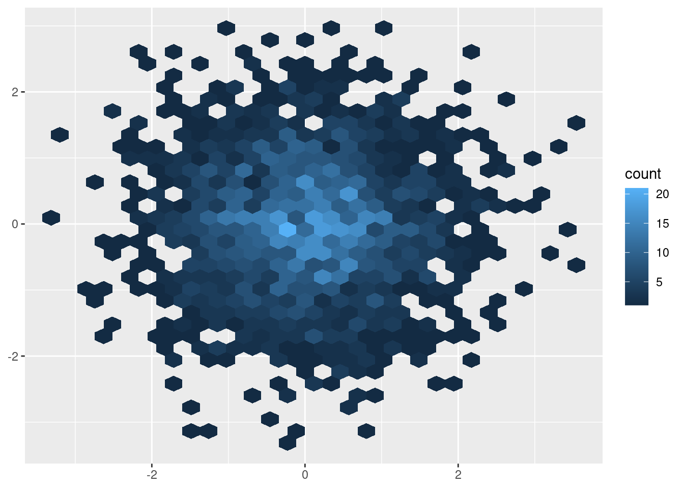
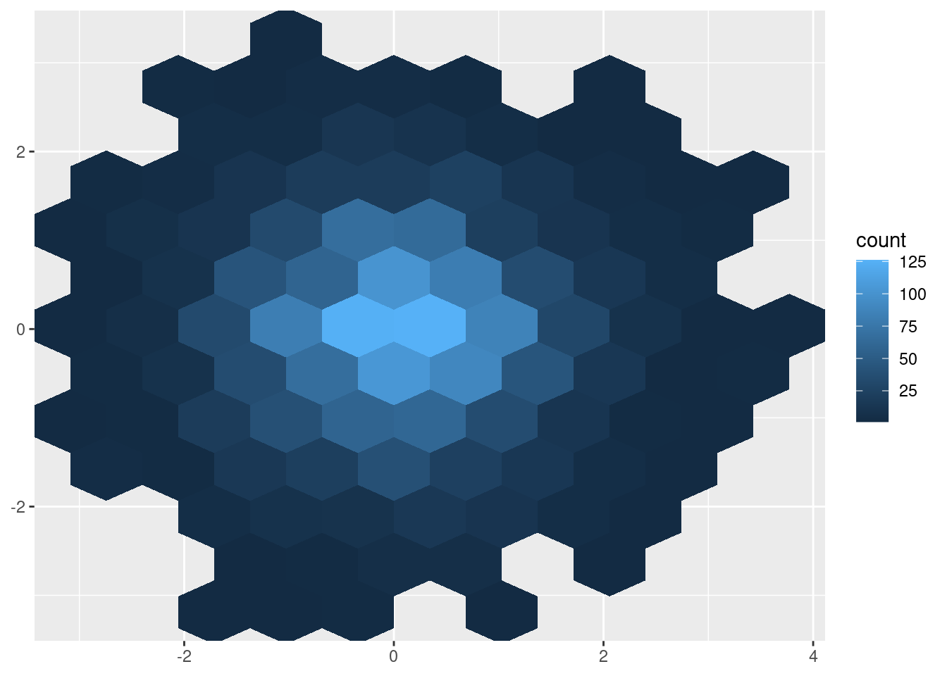
geom_bin2d().- The code below compares square and hexagonal bins, using parameters
binsandbinwidthto control the number and size of the bins.
- The code below compares square and hexagonal bins, using parameters
Another approach to dealing with overplotting is to add data summaries to help guide the eye to the true shape of the pattern within the data.