19.2 Model Applicability
Let’s stress-test a model, seeing how it might work on some unusual observations.
For this, we fit a new model with pre-game team 1 probability of winning (prob1) and pre-game probability of a draw (probtie). (We can better illustrate an extreme example with these features.)
fit2 <-
  logistic_reg() %>%
  set_engine('glm') %>%
  fit(w1 ~ prob1 + probtie, data = trn)
fit2 %>% tidy()
## # A tibble: 3 × 5
## term estimate std.error statistic p.value
## <chr> <dbl> <dbl> <dbl> <dbl>
## 1 (Intercept) -2.25 0.440 -5.12 3.10e- 7
## 2 prob1 4.48 0.357 12.6 3.59e-36
## 3 probtie 0.116 1.36 0.0852 9.32e- 1How’s the accuracy looking?
preds_tst2 <- fit2 %>% predict_stuff(tst)

preds_tst2 %>%
  accuracy(estimate = .pred_class, truth = w1)
## # A tibble: 1 × 3
## .metric .estimator .estimate
## <chr> <chr> <dbl>
## 1 accuracy binary 0.604preds_tst2 %>% conf_mat(w1, .pred_class) %>% autoplot('heatmap')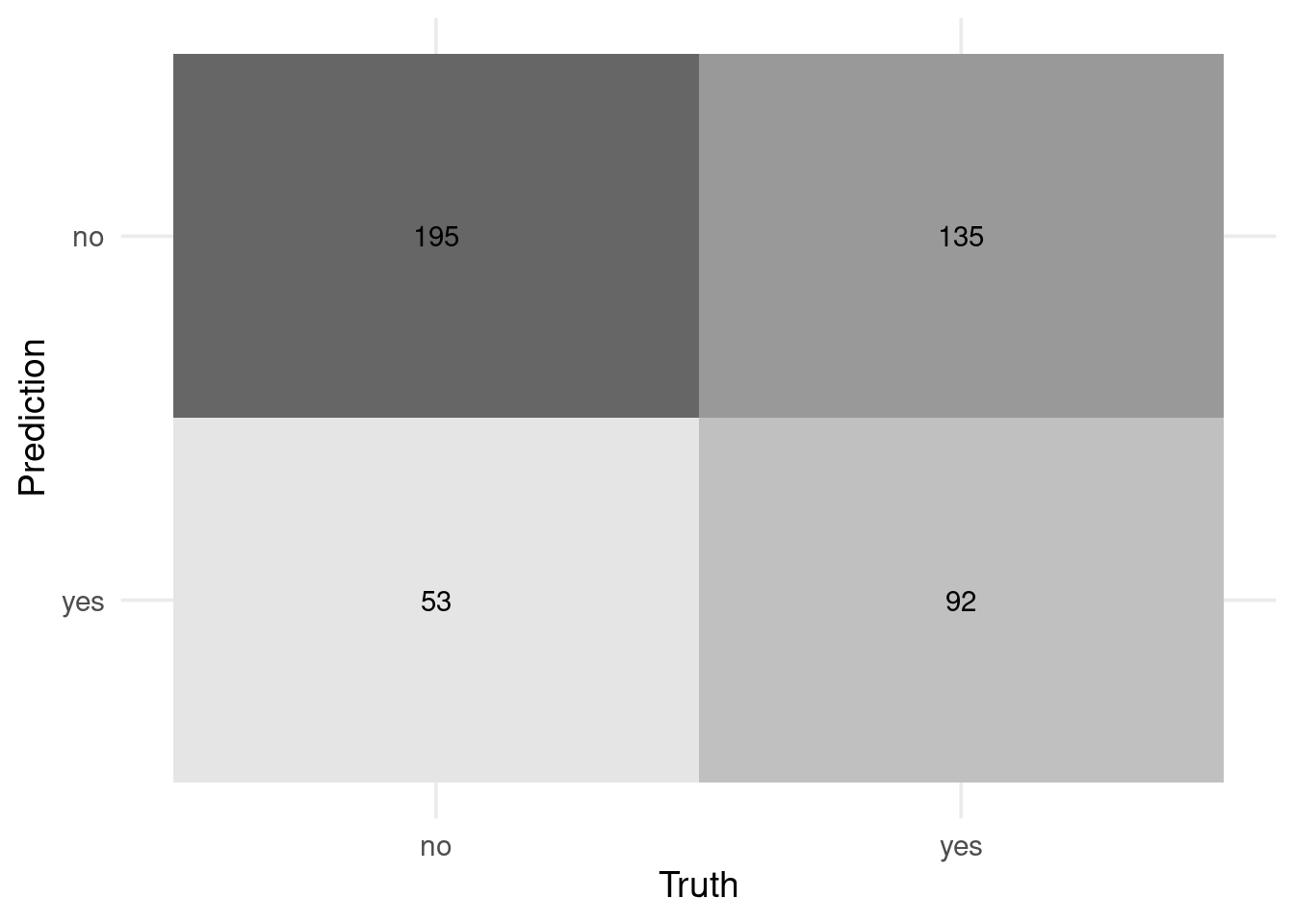
Not bad… but is it deceiving in some extreme cases?

Note that this model is pretty confident even for weird combinations like probtie = 0.5 and prob1 = 0.5 (implying that the other team has 0% chance of winning).
Can we identify how applicable the model is for any new prediction (a.k.a the model’s applicability domain)?
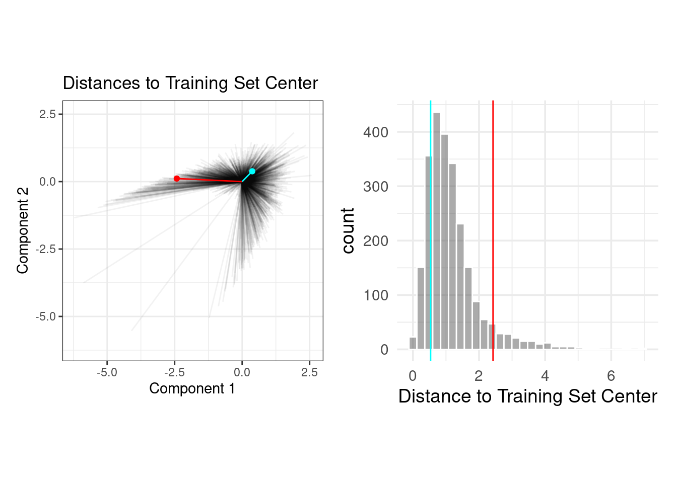
Let’s use PCA to do so.

The PCA scores for the training set are shown in panel (b). Next, using these results, we measure the distance of each training set point to the center of the PCA data (panel (c)). We can then use this reference distribution (panel (d)) to estimate how far away a data point is from the mainstream of the training data.
So, how can we use this PCA suff? Well, we can compute distances and percentiles based on those distances.
The plot below overlays an average testing set sample (in blue) and a rather extreme sample (in red) with the PCA distances from the training set.
Let’s use the {applicable} package! (We’ll include more features this time around.)
pca_stat <- apd_pca(~ ., data = trn %>% select(where(is.numeric)), threshold = 0.99)
pca_stat
## # Predictors:
## 7
## # Principal Components:
## 5 components were needed
## to capture at least 99% of the
## total variation in the predictors.We can plot a CDF looking thing with our computed distances.
autoplot(pca_stat, distance)
Observe that a strange observation gets a very high distance and 100 distance_pctl.
score(
  pca_stat,
  bind_rows(
    tibble(
      # set these to pretty average values
      spi1 = 40, spi2 = 40, importance1 = 100/3, importance2 = 100/3,
      # set these to weird values
      prob1 = 0.1, prob2 = 0.1, probtie = 0.8
    ),
    tst
  )
) %>%
  select(starts_with("distance"))
## # A tibble: 476 × 2
## distance distance_pctl
## <dbl> <dbl>
## 1 14.9 1
## 2 1.93 39.6
## 3 3.27 84.1
## 4 5.31 96.6
## 5 3.04 80.4
## 6 0.569 0.772
## 7 1.05 6.62
## 8 1.57 22.6
## 9 2.56 67.2
## 10 5.76 98.1
## # ℹ 466 more rows