16.7 Individual conditional expectation
16.7.1 Concept
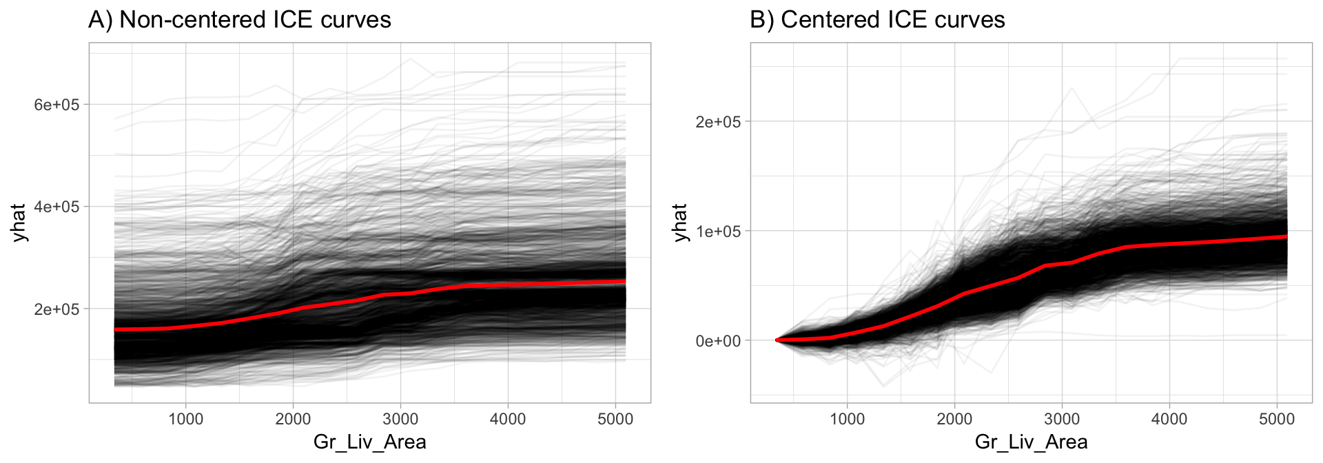
ICE plots can help to highlight interactions between features by showing the predicted response of each instance separately.
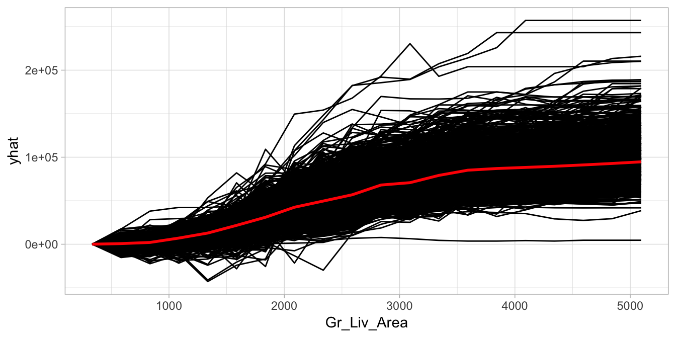
Centering the ICE curves at the minimum value of the feature makes easier to see:
- How effects change as the feature value increases (highlight heterogeneity)
- Observations that deviate from the general pattern.

16.7.2 Implementation
# Construct c-ICE curves
partial(
  ensemble_tree,
  train = as.data.frame(train_h2o),
  pred.var = "Gr_Liv_Area",
  pred.fun = pred,
  grid.resolution = 20,
  plot = TRUE,
  center = TRUE,
  plot.engine = "ggplot2"
)
PDPs, ICE curves and c-ICE curves for classification models are typically plotted on a logit-type scale to facilitate interpretation.