4.5 Exploring Australian tourism data
All of the features included in the feasts package can be computed in one line like this.
## # A tibble: 304 × 51
##    Region State Purpose trend_strength seasonal_strength_year seasonal_peak_year
##    <chr>  <chr> <chr>            <dbl>                  <dbl>              <dbl>
##  1 Adela… Sout… Busine…          0.464                  0.407                  3
##  2 Adela… Sout… Holiday          0.554                  0.619                  1
##  3 Adela… Sout… Other            0.746                  0.202                  2
##  4 Adela… Sout… Visiti…          0.435                  0.452                  1
##  5 Adela… Sout… Busine…          0.464                  0.179                  3
##  6 Adela… Sout… Holiday          0.528                  0.296                  2
##  7 Adela… Sout… Other            0.593                  0.404                  2
##  8 Adela… Sout… Visiti…          0.488                  0.254                  0
##  9 Alice… Nort… Busine…          0.534                  0.251                  0
## 10 Alice… Nort… Holiday          0.381                  0.832                  3
## # ℹ 294 more rows
## # ℹ 45 more variables: seasonal_trough_year <dbl>, spikiness <dbl>,
## #   linearity <dbl>, curvature <dbl>, stl_e_acf1 <dbl>, stl_e_acf10 <dbl>,
## #   acf1 <dbl>, acf10 <dbl>, diff1_acf1 <dbl>, diff1_acf10 <dbl>,
## #   diff2_acf1 <dbl>, diff2_acf10 <dbl>, season_acf1 <dbl>, pacf5 <dbl>,
## #   diff1_pacf5 <dbl>, diff2_pacf5 <dbl>, season_pacf <dbl>,
## #   zero_run_mean <dbl>, nonzero_squared_cv <dbl>, zero_start_prop <dbl>, …
This gives 48 features for every combination of the three key variables (Region, State and Purpose). We can treat this tibble like any data set and analyse it to find interesting observations or groups of observations.
We can also do pairwise plots of groups of features (Figure 4.3).
library(glue)
tourism_features %>%
     select_at(vars(contains("season"), Purpose)) %>%
     mutate(
          seasonal_peak_year = seasonal_peak_year +
               4*(seasonal_peak_year==0),
          seasonal_trough_year = seasonal_trough_year +
               4*(seasonal_trough_year==0),
          seasonal_peak_year = glue("Q{seasonal_peak_year}"),
          seasonal_trough_year = glue("Q{seasonal_trough_year}"),
     ) %>%
     GGally::ggpairs(mapping = aes(colour = Purpose))
## Registered S3 method overwritten by 'GGally':
## method from
## +.gg ggplot2## `stat_bin()` using `bins = 30`. Pick better value with `binwidth`.
## `stat_bin()` using `bins = 30`. Pick better value with `binwidth`.
## `stat_bin()` using `bins = 30`. Pick better value with `binwidth`.
## `stat_bin()` using `bins = 30`. Pick better value with `binwidth`.
## `stat_bin()` using `bins = 30`. Pick better value with `binwidth`.
## `stat_bin()` using `bins = 30`. Pick better value with `binwidth`.
## `stat_bin()` using `bins = 30`. Pick better value with `binwidth`.
## `stat_bin()` using `bins = 30`. Pick better value with `binwidth`.
## `stat_bin()` using `bins = 30`. Pick better value with `binwidth`.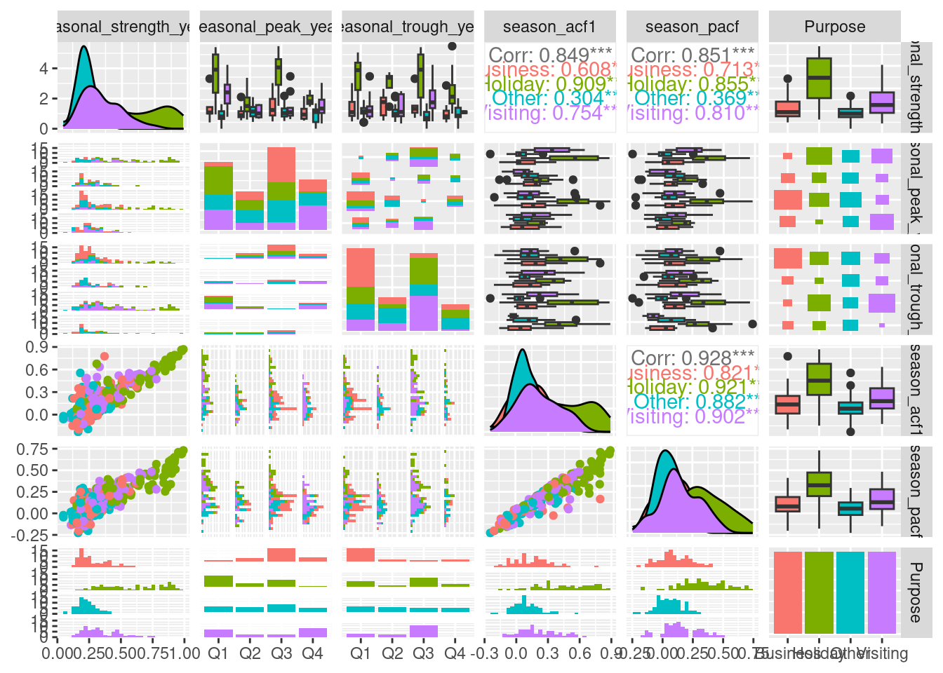
Here, the Purpose variable is mapped to colour. There is a lot of information in this figure, and we will highlight just a few things we can learn.
- The three numerical measures related to seasonality (seasonal_strength_year, season_acf1 and season_pacf) are all positively correlated.

- The bottom left panel and the top right panel both show that the most strongly seasonal series are related to holidays (as we saw previously).

- The bar plots in the bottom row of the seasonal_peak_year and seasonal_trough_year columns show that seasonal peaks in Business travel occurs most often in Quarter 3, and least often in Quarter 1.
4.5.1 Principal Component Analysis (PCA)
A useful way to handle many more variables is to use a dimension reduction technique such as principal components.
This gives linear combinations of variables that explain the most variation in the original data.
We can compute the principal components of the tourism features as follows.
library(broom)

pcs <- tourism_features %>%
     select(-State, -Region, -Purpose) %>%
     prcomp(scale = TRUE) %>%
     augment(tourism_features)

pcs %>%
     ggplot(aes(x = .fittedPC1, y = .fittedPC2, col = Purpose)) +
     geom_point() +
     theme(aspect.ratio = 1)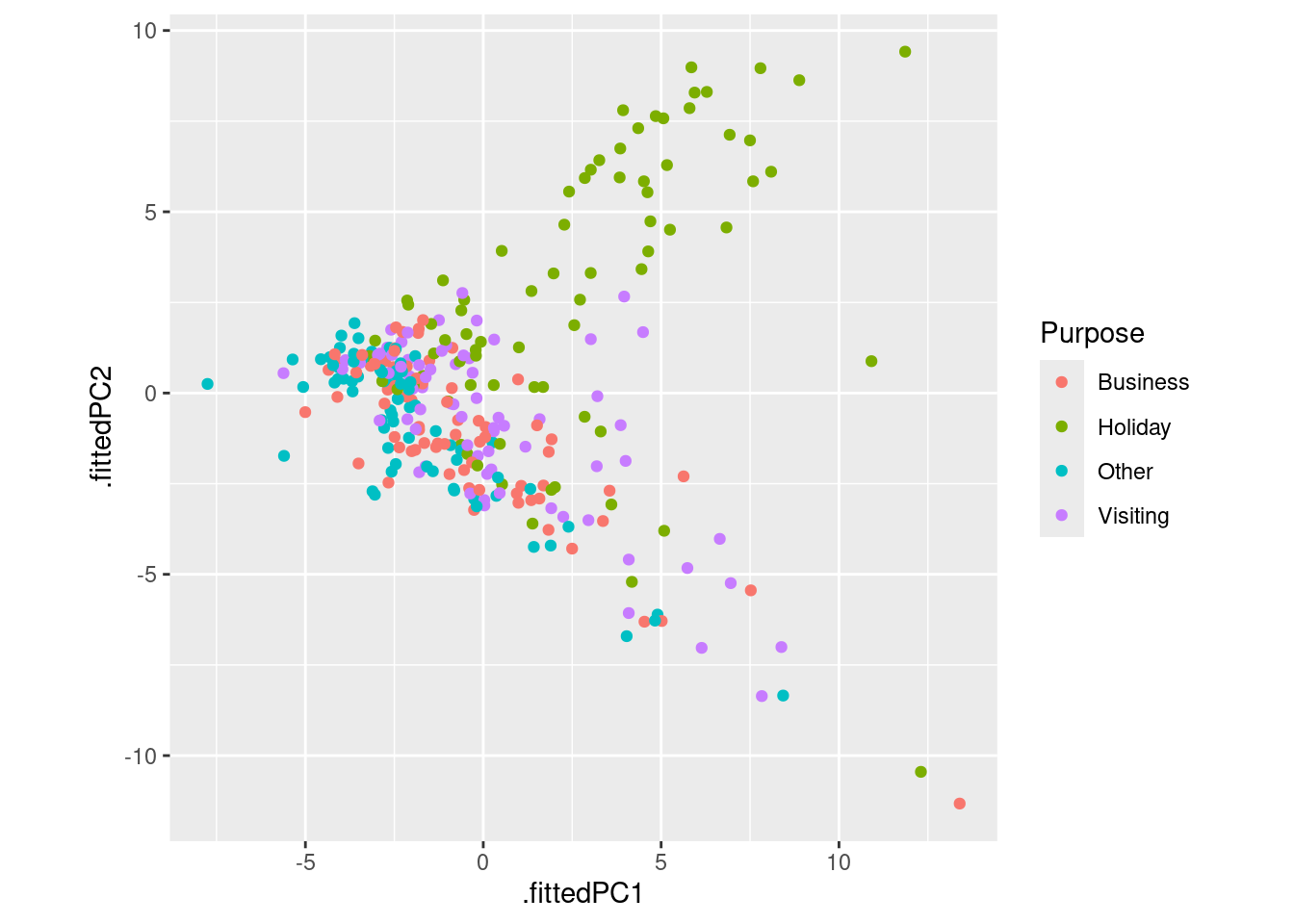
Each point on Figure 4.4 represents one series and its location on the plot is based on all 48 features.
The first principal component (
.fittedPC1) is the linear combination of the features which explains the most variation in the data.The second principal component (
.fittedPC2) is the linear combination which explains the next most variation in the data, while being uncorrelated with the first principal component.For more information about principal component dimension reduction, see Izenman (2008).
The preceding plot also allows us to identify anomalous time series — series which have unusual feature combinations.
These appear as points that are separate from the majority of series in Figure 4.4. There are four that stand out, and we can identify which series they correspond to as follows.
outliers <- pcs %>%
     filter(.fittedPC1 > 10) %>%
     select(Region, State, Purpose, .fittedPC1, .fittedPC2)

outliers
## # A tibble: 4 × 5
## Region State Purpose .fittedPC1 .fittedPC2
## <chr> <chr> <chr> <dbl> <dbl>
## 1 Australia's North West Western Australia Business 13.4 -11.3
## 2 Australia's South West Western Australia Holiday 10.9 0.880
## 3 Melbourne Victoria Holiday 12.3 -10.4
## 4 South Coast New South Wales Holiday 11.9 9.42outliers %>%
left_join(tourism, by = c("State", "Region", "Purpose")) %>%
mutate(
Series = glue("{State}", "{Region}", "{Purpose}",
.sep = "\n\n")
) %>%
ggplot(aes(x = Quarter, y = Trips)) +
geom_line() +
facet_grid(Series ~ ., scales = "free") +
labs(title = "Outlying time series in PC space")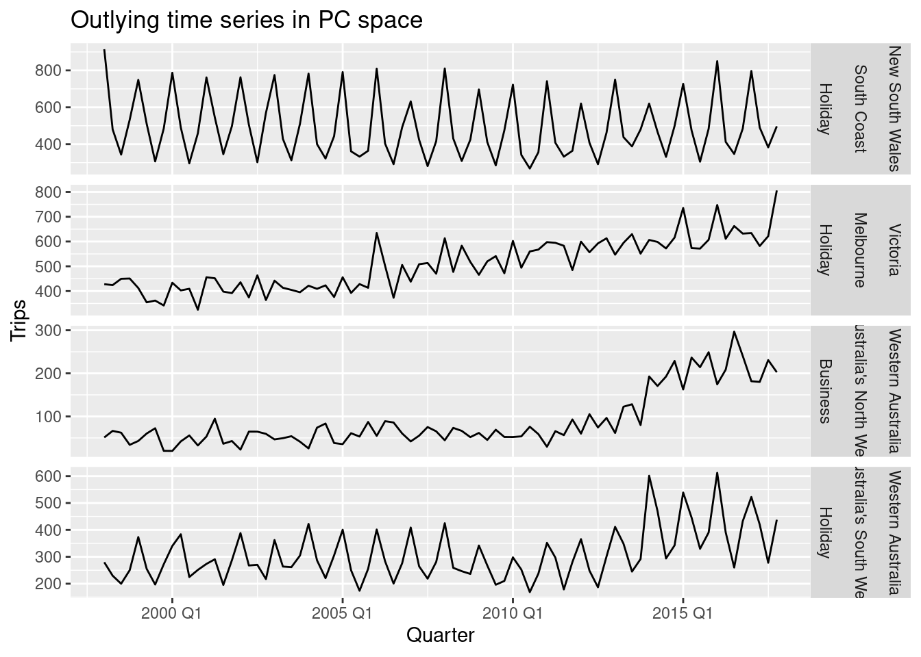
We can speculate why these series are identified as unusual.
- Holiday visits to the south coast of NSW is highly seasonal but has almost no trend, whereas most holiday destinations in Australia show some trend over time.

- Melbourne is an unusual holiday destination because it has almost no seasonality, whereas most holiday destinations in Australia have highly seasonal tourism.

- The north western corner of Western Australia is unusual because it shows an increase in business tourism in the last few years of data, but little or no seasonality.

- The south western corner of Western Australia is unusual because it shows both an increase in holiday tourism in the last few years of data and a high level of seasonality.
Source: Izenman, A. J. (2008). Modern multivariate statistical techniques: Regression, classification and manifold learning. Springer.