9.2 Exercise 11
Choose one of the following seasonal time series: the Australian production (aus_production) of:
- electricity
- cement
- gas
## # A tsibble: 6 x 2 [1Q]
##   Quarter Electricity
##     <qtr>       <dbl>
## 1 1956 Q1        3923
## 2 1956 Q2        4436
## 3 1956 Q3        4806
## 4 1956 Q4        4418
## 5 1957 Q1        4339
## 6 1957 Q2 4811## <yearquarter[2]>
## [1] "1956 Q1" "2010 Q2"
## # Year starts on: January9.2.1 Do the data need transforming?
If so, find a suitable transformation.
aus_production%>%
  select(Quarter,Electricity) %>%
     drop_na() %>%
     autoplot() +
     geom_smooth(method = 'loess', se = FALSE, color = 'steelblue') +
     labs(x = "Quarter",
          y = 'Electricity in kWh (billion)',
          title = 'Australian quarterly electricity production (1956 Q1 - 2010 Q2)')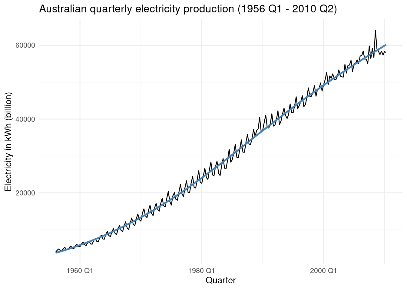
 aus_production%>%
  select(Quarter,Electricity) %>%
  gg_season(Electricity, period = "year")+
  theme(legend.position = "none") +
  labs(y="kWh (billion)", title="Australian Electricity production by year (1956-2010)")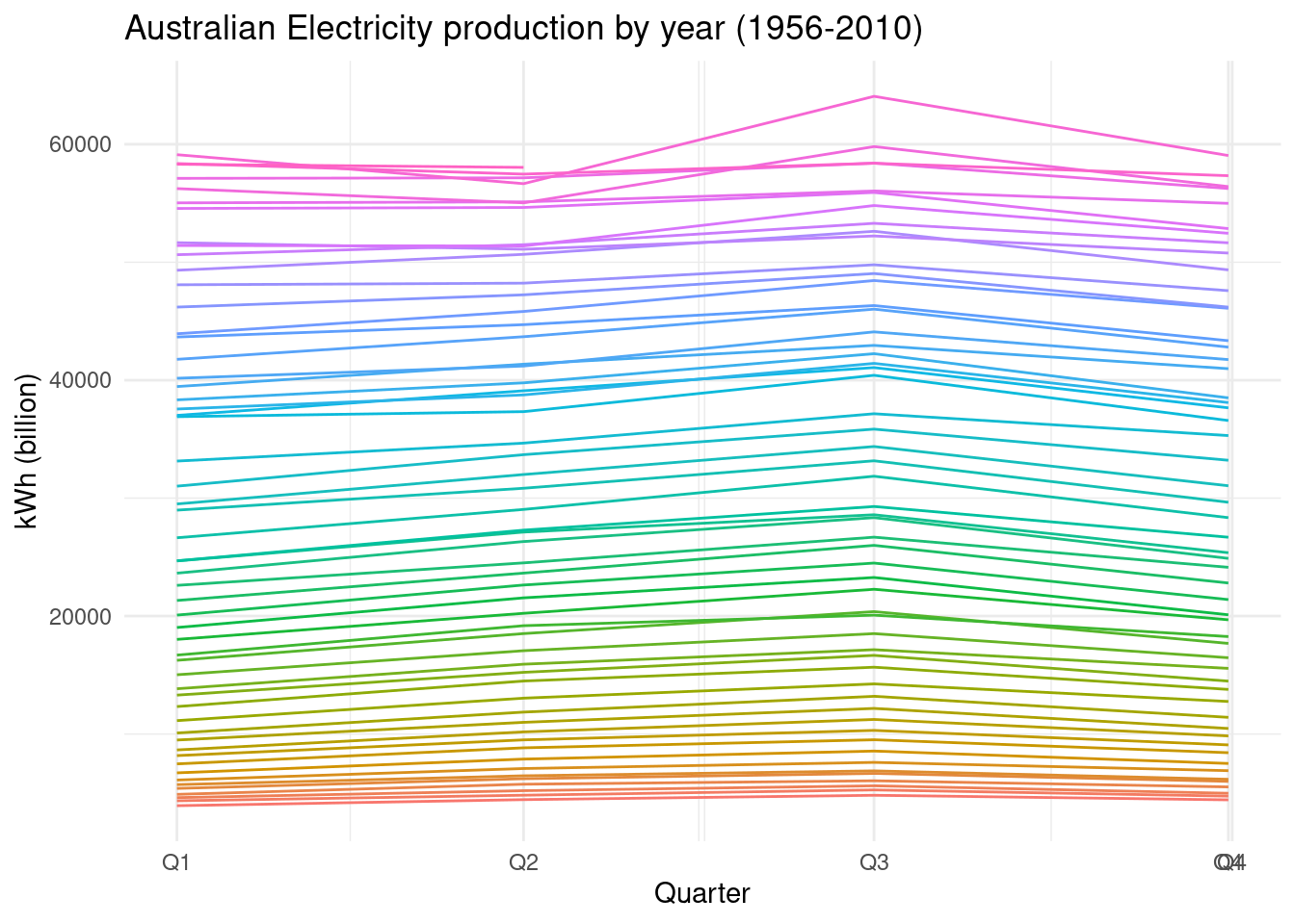
aus_production%>%
  select(Quarter,Electricity) %>%
  filter(year(Quarter) %in%c(1960,2000)) %>%
  mutate(year=year(Quarter))%>%
  ggplot(aes(Quarter,Electricity,group=year,color=factor(year)))+
  geom_line() +
  facet_wrap(vars(year),scales = "free_x") +
  labs(y="kWh (billion)", title="Australian Electricity production",color="Year")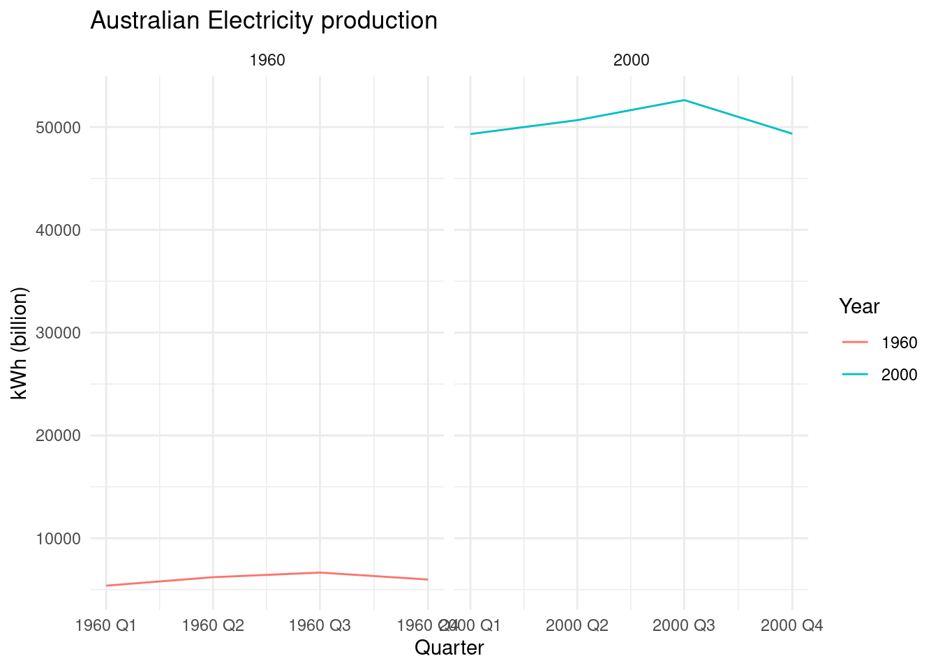
Classical decomposition methods assume that the seasonal component repeats from year to year.
For many series, this is a reasonable assumption, but for some longer series it is not.
For example, electricity demand patterns have changed over time as air conditioning has become more widespread. In many locations, the seasonal usage pattern from several decades ago had its maximum demand in winter (due to heating), while the current seasonal pattern has its maximum demand in summer (due to air conditioning).
Classical decomposition methods are unable to capture these seasonal changes over time.
9.2.2 Are the data stationary?
If not, find an appropriate differencing which yields stationary data.
First step is to apply the difference() function. We can see that there is some stationarity in the data, but we need to apply further modifications in order to conform it.
 aus_production%>%
  select(Quarter,Electricity) %>%
  mutate(Electricity = difference(Electricity)) %>%
     drop_na() %>%
     autoplot() +
     geom_smooth(method = 'loess', se = FALSE, color = 'steelblue') +
     labs(x = "Quarter",
          y = 'Electricity in kWh (billion)',
          title = 'Australian quarterly electricity production (1956 Q1 - 2010 Q2)')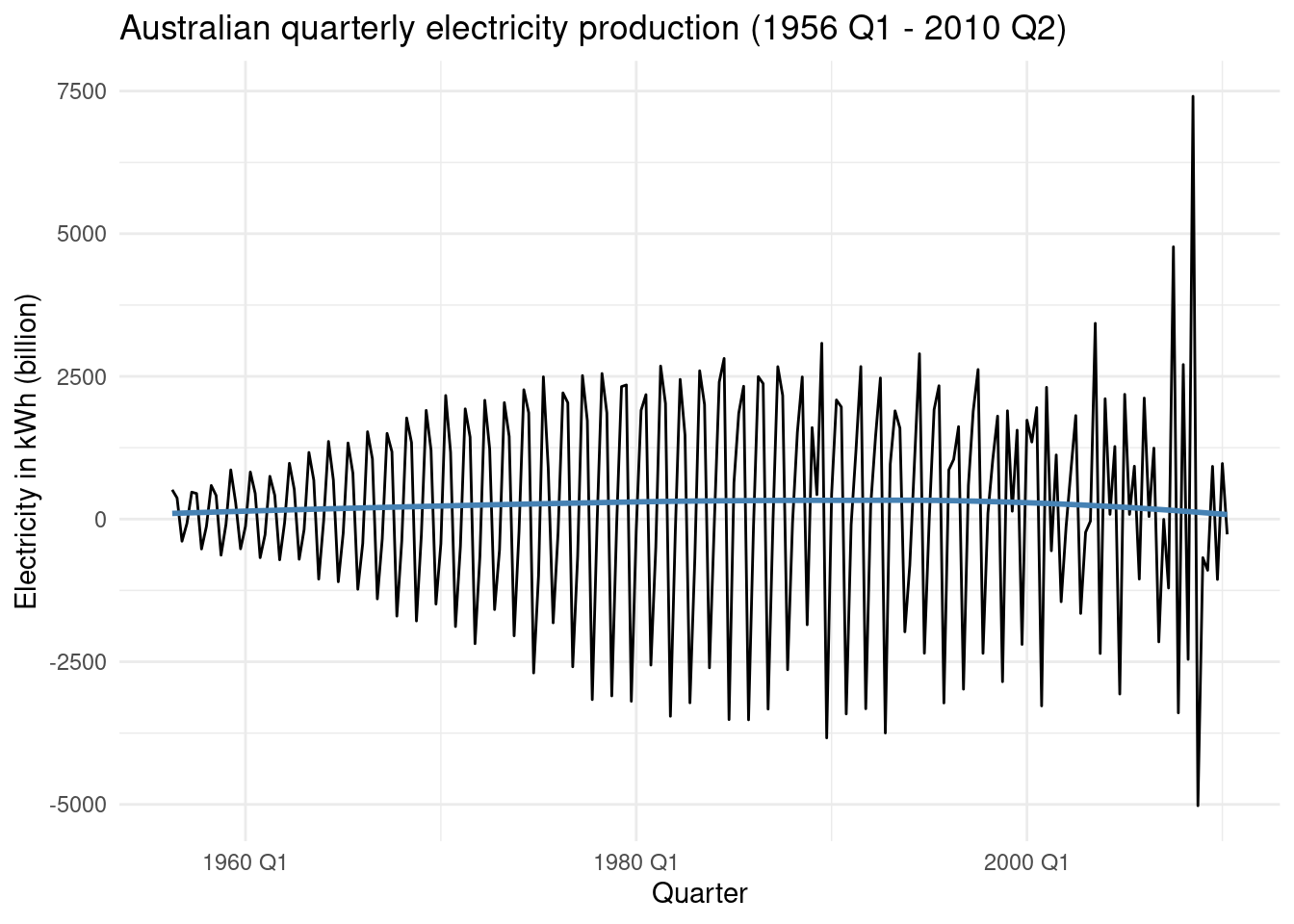
Let’s check the Autocorrelation with the ACF() function, to see whether some lags appear in the data. We do this in the orginal/observed data and in the differencing data.
p1 <- aus_production%>%
  select(Quarter,Electricity) %>%
     drop_na() %>%
  ACF(Electricity) %>%
  autoplot()
p2 <- aus_production%>%
select(Quarter,Electricity) %>%
mutate(Electricity = difference(Electricity)) %>%
drop_na() %>%
ACF(Electricity) %>%
autoplot()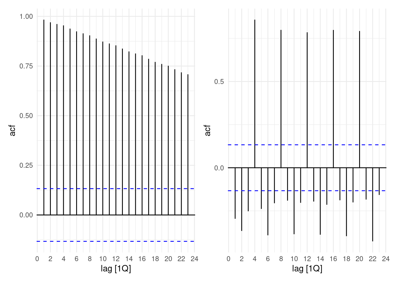
Lags appear to be very evident. Also, applying ljung_box option in the features() function, with a lag of 4.
aus_production%>%
  select(Quarter,Electricity) %>%
  mutate(Electricity = difference(Electricity)) %>%
  drop_na() %>%
  features(Electricity, ljung_box, lag = 4)
## # A tibble: 1 × 2
## lb_stat lb_pvalue
## <dbl> <dbl>
## 1 227. 0So, we apply a differencing of 4:
`Electricity = difference(Electricity, differences = 4)`aus_production%>%
select(Quarter,Electricity) %>%
mutate(Electricity = difference(Electricity,differences = 4)) %>%
drop_na() %>%
autoplot() +
geom_smooth(method = 'loess', se = FALSE, color = 'steelblue') +
labs(x = "Quarter",
y = 'Electricity in kWh (billion)',
title = 'Australian quarterly electricity production (1956 Q1 - 2010 Q2)')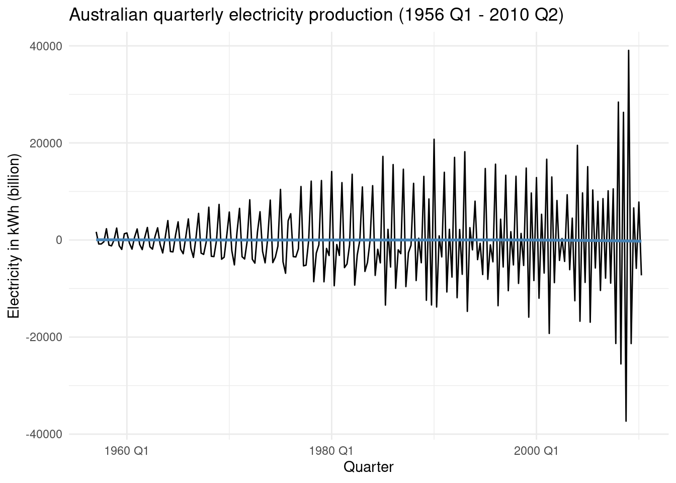
And then, again a difeerence of the differencing of 4:
aus_production%>%
  select(Quarter,Electricity) %>%
  mutate(Electricity = difference(Electricity,differences = 4),
         Electricity = difference(Electricity)) %>%
     drop_na() %>%
     autoplot() +
     geom_smooth(method = 'loess', se = FALSE, color = 'steelblue') +
     labs(x = "Quarter",
          y = 'Electricity in kWh (billion)',
          title = 'Australian quarterly electricity production (1956 Q1 - 2010 Q2)')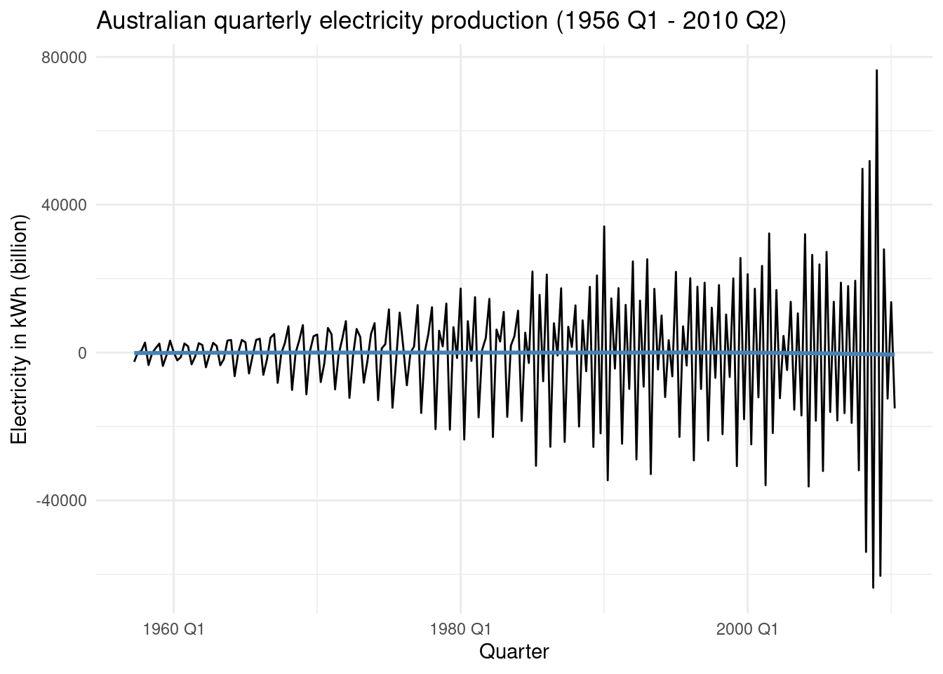
Essentially it is not random, which means that it is correlated with that of previous days.
What happens if we apply the log tranformation as well as previous differencing? We can clearly see how the variance in the data changes:
aus_production%>%
  select(Quarter,Electricity) %>%
  mutate(Electricity = log(Electricity),
         Electricity = difference(Electricity,differences = 4),
         Electricity = difference(Electricity)) %>%
     drop_na() %>%
     autoplot() +
     geom_smooth(method = 'loess', se = FALSE, color = 'steelblue') +
     labs(x = "Quarter",
          y = 'Electricity in kWh (billion)',
          title = 'Australian quarterly electricity production (1956 Q1 - 2010 Q2)')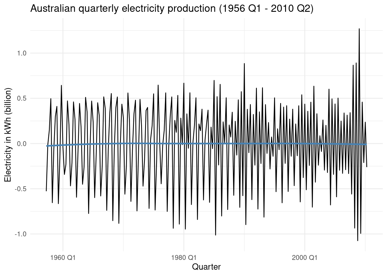
And, perform the autocorrelation checks:
aus_production%>%
  select(Quarter,Electricity) %>%
  mutate(Electricity = log(Electricity),
         Electricity = difference(Electricity,differences = 4),
         Electricity = difference(Electricity)) %>%
  drop_na() %>%
  ACF(Electricity) %>%
  autoplot()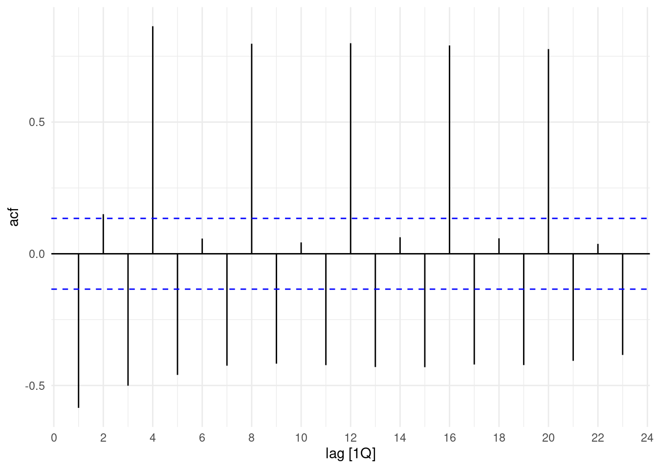
We still see many lags, to have a clearer vision of the applied transformation. In this visualization the last plot shows the best transformation to data:
`Doubly differenced log Electricity` = difference(difference(log(Electricity), 4), 1)aus_production%>%
select(Quarter,Electricity) %>%
transmute(
`kWt (biillion)` = Electricity,
`Log Electricity` = log(Electricity),
`Annual change in log Electricity` = difference(log(Electricity), 4),
`Doubly differenced log Electricity` = difference(difference(log(Electricity), 4), 1)
) %>%
pivot_longer(-Quarter, names_to="Type", values_to="Electricity") |>
mutate(
Type = factor(Type, levels = c(
"kWt (biillion)",
"Log Electricity",
"Annual change in log Electricity",
"Doubly differenced log Electricity"))
) |>
ggplot(aes(x = Quarter, y = Electricity)) +
geom_line() +
geom_smooth(linewidth=0.3,se=F,color="steelblue")+
facet_grid(vars(Type), scales = "free_y") +
labs(title = "Electricity", y = NULL)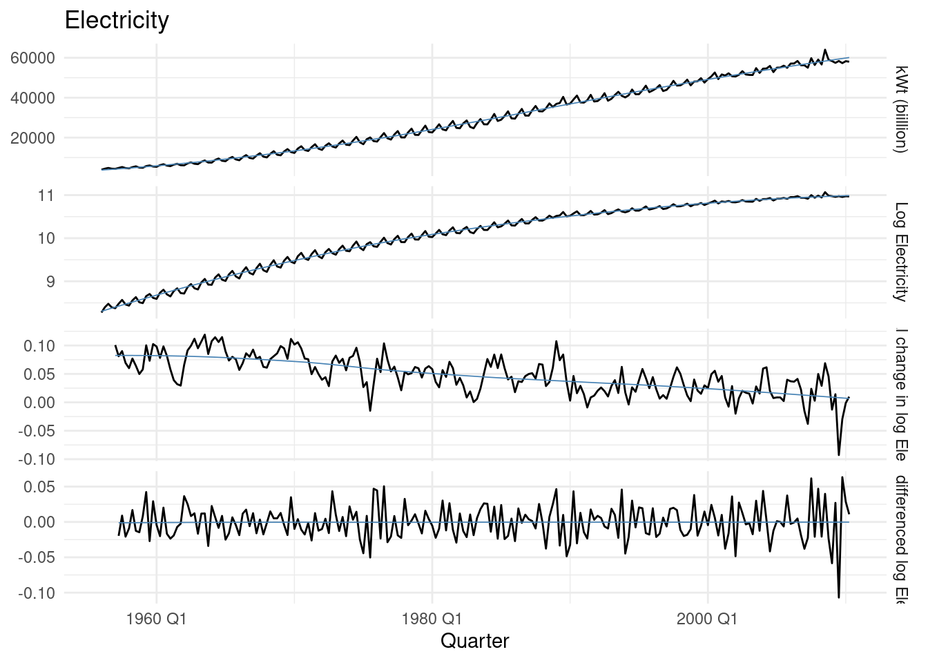
Finally, the application of the ACF() to this last transformation let’s us confirming the 4 lags option. To determine more objectively whether differencing is required is to use a unit root test.
In this test, the null hypothesis is that the data are stationary, and we look for evidence that the null hypothesis is false.
So, we apply the Kwiatkowski-Phillips-Schmidt-Shin (KPSS) test, or KPSS test p-value.
aus_production%>%
  select(Quarter,Electricity) %>%
  mutate(Electricity= difference(difference(log(Electricity), 4), 1)) %>%
  drop_na() %>%
  ACF() %>%
  autoplot()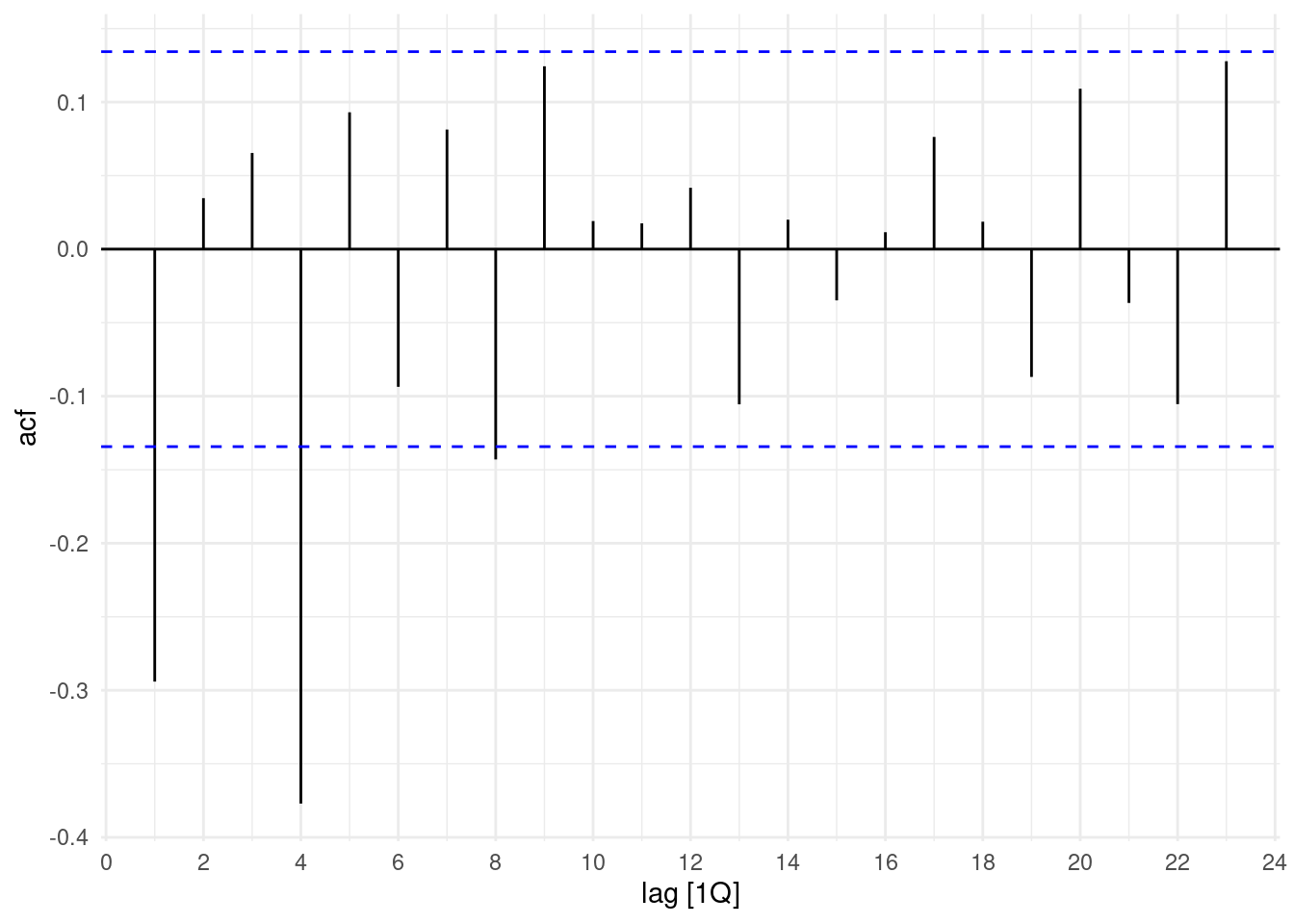
The KPSS test p-value is reported as a number between 0.01 and 0.1.
If we use it on observed data the result shows that the null hypothesis would need to be rejected, and the data would be not stationary.
What’s happen if we apply our previous transformations?
## # A tibble: 1 × 2
##   kpss_stat kpss_pvalue
##       <dbl>       <dbl>
## 1      4.46        0.01
Differencing data appear stationary
aus_production%>%
  select(Quarter,Electricity) %>%
  mutate(Electricity = difference(Electricity)) %>%
features(Electricity, unitroot_kpss)
## # A tibble: 1 × 2
## kpss_stat kpss_pvalue
## <dbl> <dbl>
## 1 0.0591 0.1aus_production%>%
select(Quarter,Electricity) %>%
mutate(Electricity= difference(difference(log(Electricity), 4), 1)) %>%
drop_na() %>%
features(Electricity, unitroot_kpss)## # A tibble: 1 × 2
## kpss_stat kpss_pvalue
## <dbl> <dbl>
## 1 0.0111 0.1Further checks can be done with unitroot_ndiffs which in this case is 1, indicating that one seasonal difference is required.
## # A tibble: 1 × 1
##   ndiffs
##    <int>
## 1      1
A further look at how the differencing changes, if we consider the log() and the period differencing. Four Quarters, or 4 periods are 1 year.
aus_production %>%
select(Quarter, Electricity) |>
mutate(Electricity=log(Electricity) %>% difference(4)) |>
autoplot()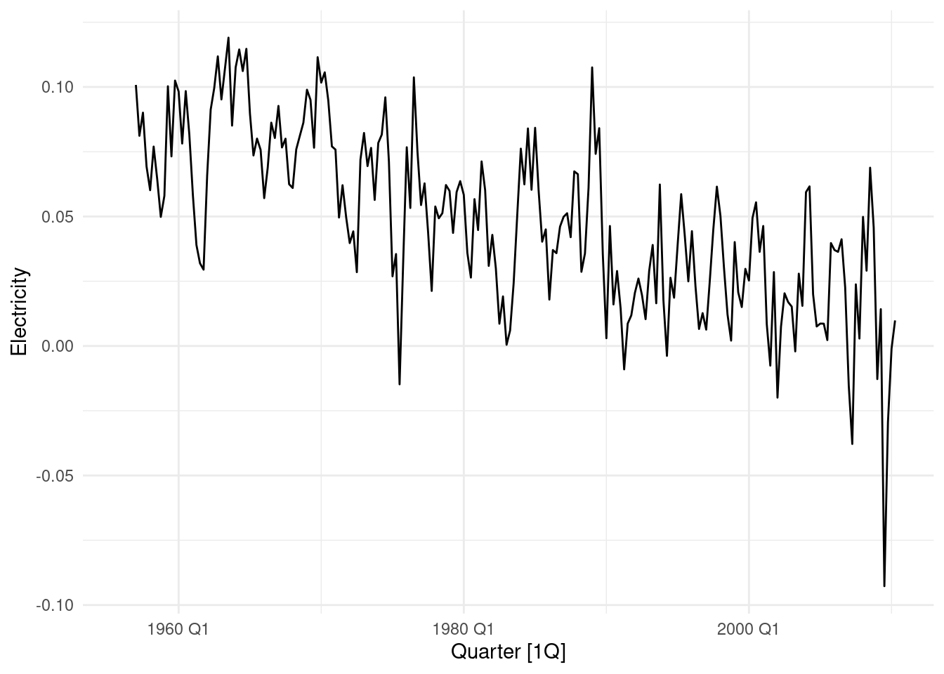 What if we use 8 periods?
aus_production %>%
  select(Quarter, Electricity)  |>
  mutate(Electricity=log(Electricity) %>% difference(8)) |>
  autoplot()
Just a remainder of what happen in 1 period.
aus_production %>%
  select(Quarter, Electricity)  |>
  mutate(Electricity=log(Electricity) %>% difference(1)) |>
  autoplot()
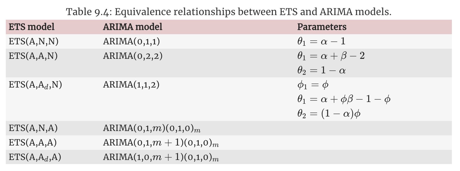
9.2.3 Which of the models is the best according to their AIC values?
Identify a couple of ARIMA models that might be useful in describing the time series.
ARIMA(p,d,q) = autoregressive AR(p) + differencing d + moving average MA(q)ARIMA(1,0,1) model - Auto Arima
## Series: Electricity
## Model: ARIMA(1,0,1)(1,1,2)[4] w/ drift
##
## Coefficients:
##          ar1      ma1    sar1     sma1    sma2  constant
##       0.9163  -0.4416  0.8623  -1.6919  0.7736   10.5956
## s.e.  0.0467   0.0942  0.1434   0.1436  0.0960    2.1097
##
## sigma^2 estimated as 508179:  log likelihood=-1708.84
## AIC=3431.68   AICc=3432.22   BIC=3455.24
Let’s apply the partial autocorrealtion with the PACF() function:
aus_production%>%
  select(Quarter,Electricity) %>%
  mutate(Electricity = difference(Electricity)) %>%
     drop_na() %>%
  PACF(Electricity) |>
  autoplot()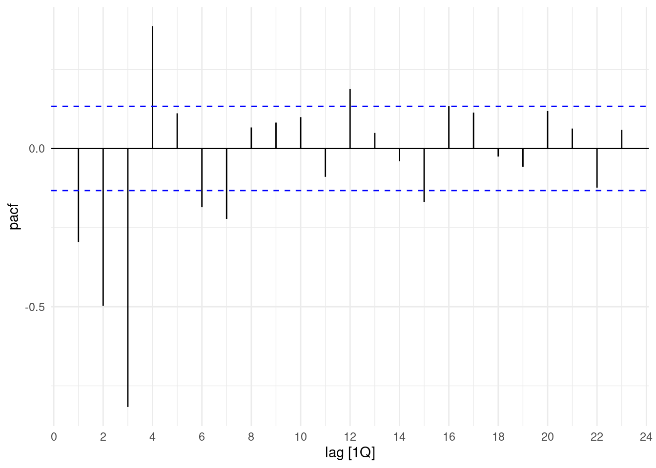
To see ACF() and PACF() together we can use gg_tsdisplay()
aus_production %>%
  select(Quarter, Electricity)  |>
  gg_tsdisplay(difference(Electricity), plot_type='partial')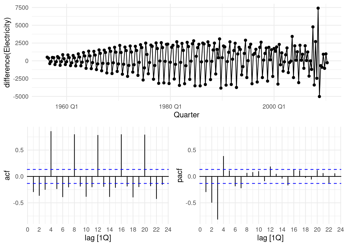
ARIMA(4,0,0) model
And then try with arima with 4 differencing.
model(ARIMA(Electricity ~ pdq(4,0,0)))fit2 <- aus_production %>%
select(Quarter, Electricity) %>%
model(ARIMA(Electricity ~ pdq(4, 0, 0)))
report(fit2)## Series: Electricity
## Model: ARIMA(4,0,0)(0,1,2)[4] w/ drift
##
## Coefficients:
## ar1 ar2 ar3 ar4 sma1 sma2 constant
## 0.4589 0.1815 0.0539 0.2190 -0.9733 0.2480 82.5476
## s.e. 0.0690 0.0780 0.0743 0.0951 0.1236 0.1077 13.7643
##
## sigma^2 estimated as 533342: log likelihood=-1712.56
## AIC=3441.13 AICc=3441.83 BIC=3468.06Results of the two models:
Model: ARIMA(1,0,1)(1,1,2)[4] w/ drift - AICc = 3432.22 the best Model: ARIMA(4,0,0)(0,1,2)[4] w/ drift - AICc = 3441.83
9.2.4 Do the residuals resemble white noise?
Estimate the parameters of your best model and do diagnostic testing on the residuals. If not, try to find another ARIMA model which fits better.
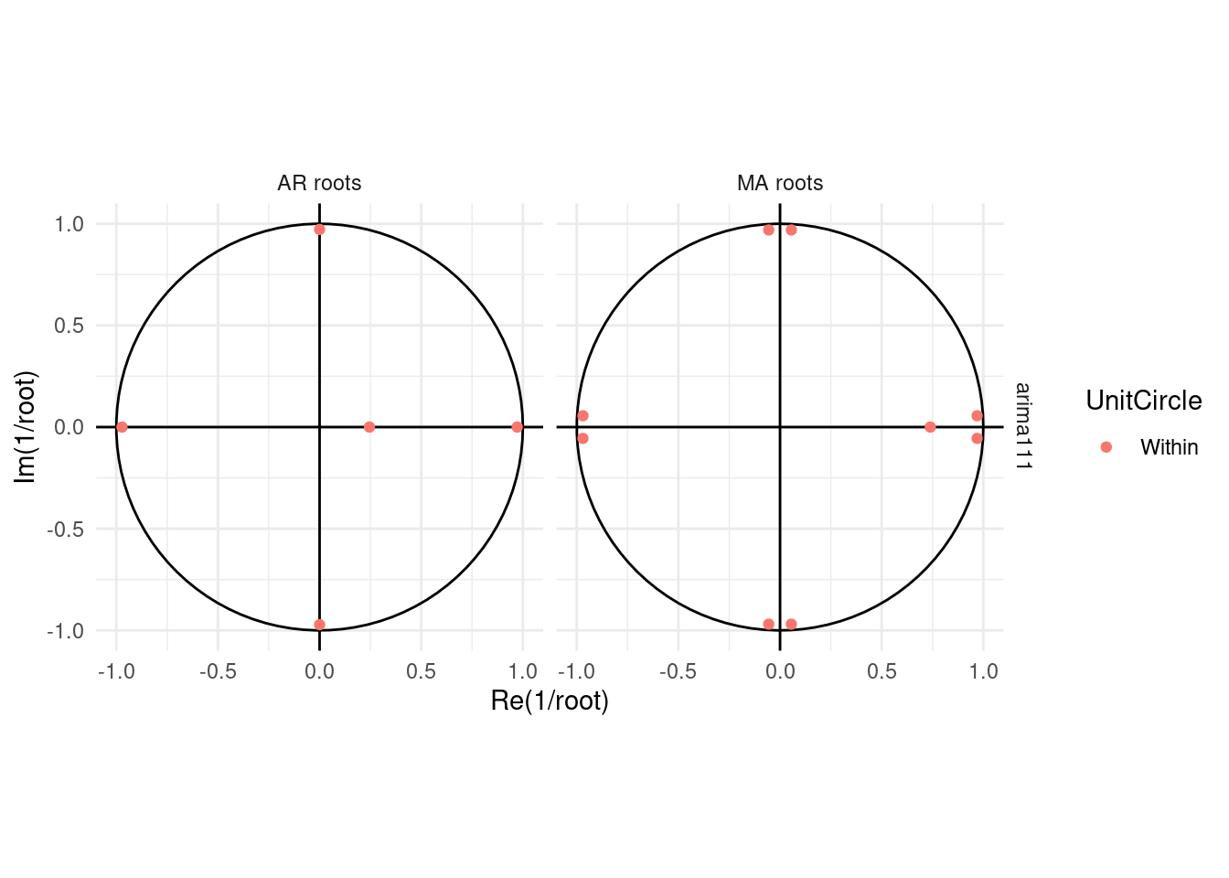
ARIMA(1,1,1) model
Let’s check another arima model with one:
model(ARIMA(Electricity ~ pdq(1,1,1)))
fit3 <- aus_production%>%
  select(Quarter,Electricity) %>%
 model(ARIMA(Electricity ~ pdq(1,1,1)))

report(fit3)
## Series: Electricity
## Model: ARIMA(1,1,1)(1,1,2)[4]
##
## Coefficients:
## ar1 ma1 sar1 sma1 sma2
## 0.2454 -0.7394 0.8927 -1.7320 0.7908
## s.e. 0.1366 0.1071 0.0851 0.0941 0.0752
##
## sigma^2 estimated as 512273: log likelihood=-1703.01
## AIC=3418.03 AICc=3418.43 BIC=3438.19Here we compare all models together:
compare_fit <- aus_production%>%
  select(Quarter,Electricity) |>
  model(arima400 = ARIMA(Electricity ~ pdq(4,0,0)),
        arima210 = ARIMA(Electricity ~ pdq(2,1,0)),
        arima111 = ARIMA(Electricity ~ pdq(1,1,1)),
        search = ARIMA(Electricity, stepwise=FALSE))

compare_fit |> pivot_longer(cols=everything(),
                            names_to = "Model name",
                            values_to = "Orders")
## # A mable: 4 x 2
## # Key: Model name [4]
## `Model name` Orders
## <chr> <model>
## 1 arima400 <ARIMA(4,0,0)(0,1,2)[4] w/ drift>
## 2 arima210 <ARIMA(2,1,0)(1,1,2)[4]>
## 3 arima111 <ARIMA(1,1,1)(1,1,2)[4]>
## 4 search <ARIMA(1,0,1)(1,1,2)[4] w/ drift>## # A tibble: 4 × 6
## .model sigma2 log_lik AIC AICc BIC
## <chr> <dbl> <dbl> <dbl> <dbl> <dbl>
## 1 arima111 512273. -1703. 3418. 3418. 3438.
## 2 arima210 538128. -1708. 3427. 3428. 3447.
## 3 search 508179. -1709. 3432. 3432. 3455.
## 4 arima400 533342. -1713. 3441. 3442. 3468.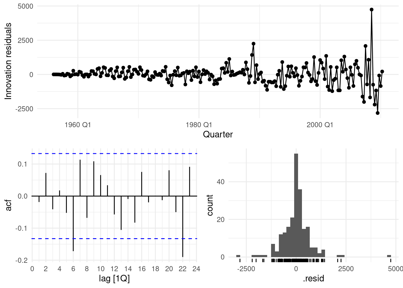
## # A tibble: 1 × 3
##   .model   lb_stat lb_pvalue
##   <chr>      <dbl>     <dbl>
## 1 arima111    1.68     0.641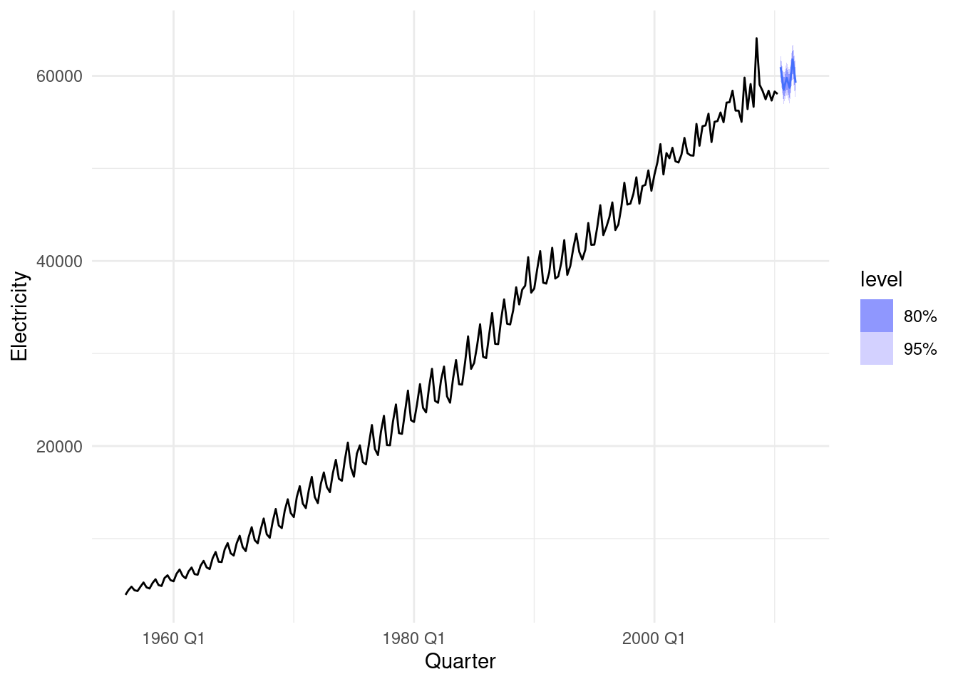
This last gg_tsdisplay() testes some other parameter values.
aus_production%>%
  select(Quarter,Electricity) |>
  gg_tsdisplay(difference(log(Electricity), 12),
               plot_type='partial', lag=36) +
  labs(title="Seasonally differenced", y="")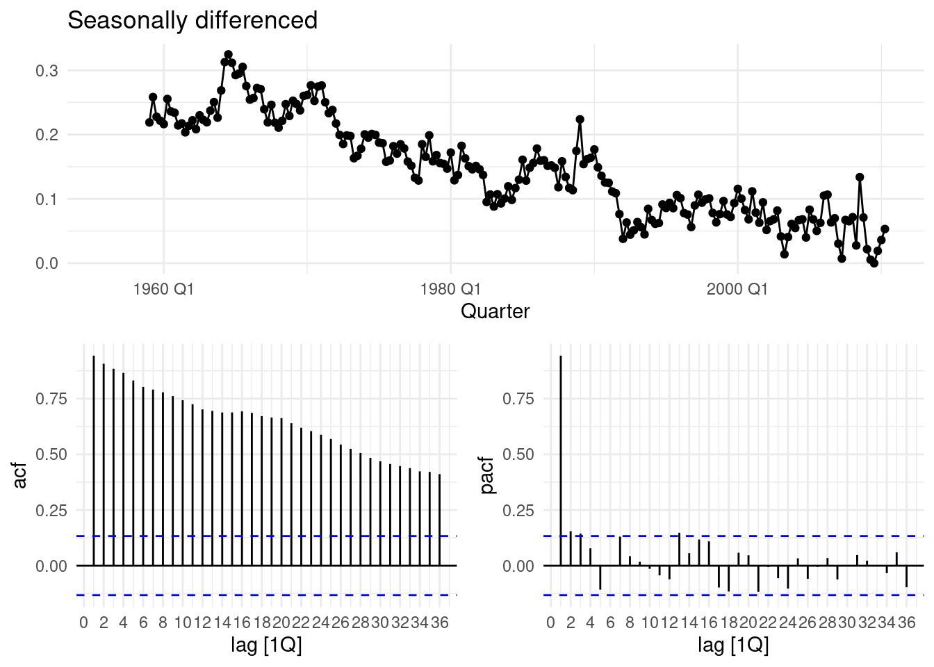
aus_production%>%
  select(Quarter,Electricity) |>
  gg_tsdisplay(difference(log(Electricity), 12)|> difference(),
               plot_type='partial', lag=36) +
  labs(title="Double differenced", y="")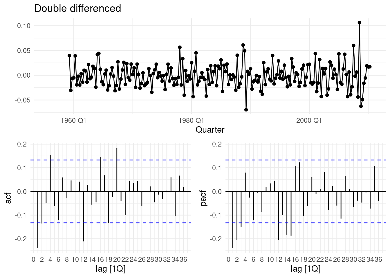
fit5 <- aus_production%>%
  select(Quarter,Electricity) |>
  model(
    arima012011 = ARIMA(Electricity ~ pdq(0,1,2) + PDQ(0,1,1)),
    arima210011 = ARIMA(Electricity ~ pdq(2,1,0) + PDQ(0,1,1)),
    auto = ARIMA(Electricity, stepwise = FALSE, approx = FALSE)
  )
fit5 |> pivot_longer(everything(),
                     names_to = "Model name",
                     values_to = "Orders")
## # A mable: 3 x 2
## # Key: Model name [3]
## `Model name` Orders
## <chr> <model>
## 1 arima012011 <ARIMA(0,1,2)(0,1,1)[4]>
## 2 arima210011 <ARIMA(2,1,0)(0,1,1)[4]>
## 3 auto <ARIMA(1,0,1)(2,1,2)[4] w/ drift>9.2.5 Compare the forecasts obtained using ETS()
Forecast the next 24 months of data using your preferred model.
observed_data <- aus_production%>% select(Quarter,Electricity)

forecast_data <- fit %>%
  forecast(h=8) %>%
  as.data.frame()%>%
  select(Quarter,Electricity='.mean')%>%
  mutate(model="Arima101") %>%
  rbind(fit3 %>%
  forecast(h=8) %>%
  as.data.frame()%>%
  select(Quarter,Electricity='.mean')%>%
mutate(model="Arima111"))ggplot(mapping=aes(Quarter,Electricity))+
geom_line(data=observed_data%>%filter(year(Quarter) > 2000)) +
geom_line(data=forecast_data,
aes(group=model,color=factor(model)),
inherit.aes = TRUE,
linewidth=0.3)+
scale_color_viridis_d(begin = 0,end = 0.5,direction = -1)+
labs(y = "kWt (billion)",
color="Model",
title = "Australian Electricity 2-model forecast (24 months)")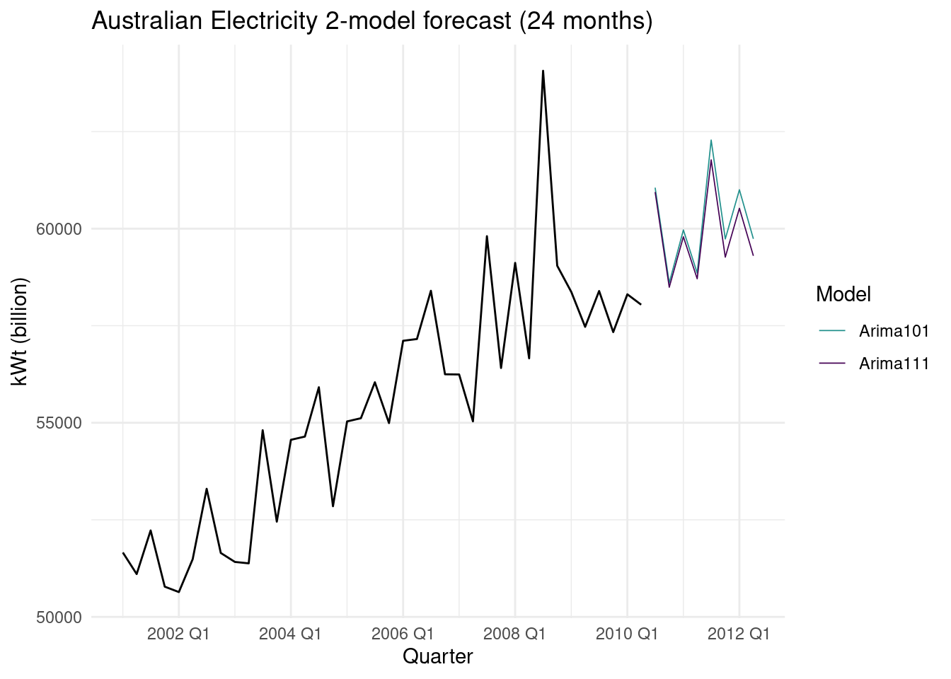
ETS (ExponenTial Smoothing)
aus_production |>
  select(Quarter,Electricity) |>
  stretch_tsibble(.init = 10) |>
  model(
    ETS(Electricity),
    ARIMA(Electricity)
  ) |>
  forecast(h = 8) |>
  fabletools::accuracy(aus_production) |>
  select(.model, RMSE:MAPE)
## Warning: The future dataset is incomplete, incomplete out-of-sample data will be treated as missing.
## 8 observations are missing between 2010 Q3 and 2012 Q2## # A tibble: 2 × 5
## .model RMSE MAE MPE MAPE
## <chr> <dbl> <dbl> <dbl> <dbl>
## 1 ARIMA(Electricity) 1033. 715. 0.310 2.50
## 2 ETS(Electricity) 1044. 719. 0.587 2.59# Estimate parameters
fit4 <- aus_production |>
model(ETS(Electricity ~ error("A") + trend("Ad") + season("A")))
fc <- fit4 |>
forecast(h = 8)
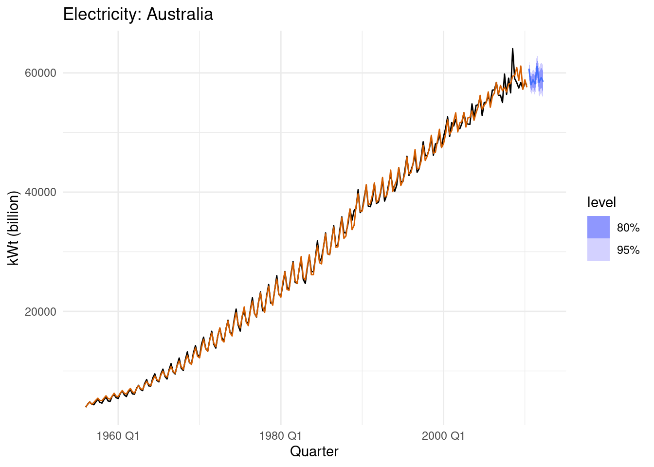
fc |>
autoplot(aus_production) +
geom_line(aes(y = .fitted), col="#D55E00",
data = augment(fit)) +
labs(y="kWt (billion)", title="Electricity: Australia") +
guides(colour = "none")