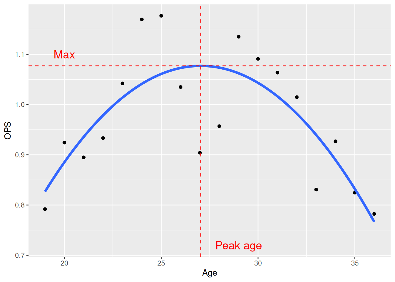
Plot it
ggplot(Mantle, aes(Age, OPS)) + geom_point() +
  geom_smooth(
    method = "lm", se = FALSE, linewidth = 1.5,
    formula = y ~ poly(x, 2, raw = TRUE)
  ) +
  geom_vline(
    xintercept = F2$Age_max,
    linetype = "dashed", color = "red"
  ) +
  geom_hline(
    yintercept = F2$Max,
    linetype = "dashed", color = "red"
  ) +
  annotate(
    geom = "text", x = c(29, 20), y = c(0.72, 1.1),
    label = c("Peak age", "Max"), size = 5,
    color = "red"
  )