Patterns of peak age over time
age_plot <- ggplot(beta_coefs, aes(Midyear, Peak_age)) +
  geom_point(alpha = 0.5) +
  geom_smooth(color = "red", method = "loess") +
  ylim(20, 40) +
  xlab("Mid Career") + ylab("Peak Age")
age_plot
## `geom_smooth()` using formula = 'y ~ x'
## Warning: Removed 188 rows containing non-finite outside the scale range
## (`stat_smooth()`).
## Warning: Removed 188 rows containing missing values or values outside the scale range
## (`geom_point()`).
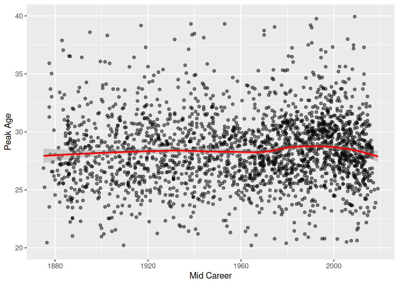
- Shows a gradual increase over time (except maybe in last decade?)