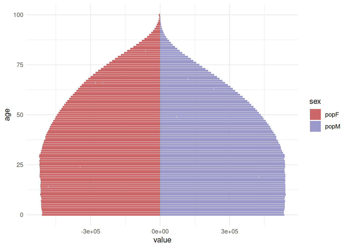
13.2 Pyramid plot
A pyramid plot is a type of plot that allows the visualization of the distribution of a variable across different categories or groups. It is particularly useful for comparing the age distribution of population life expectancy.
We can use the {wpp2022} package for the population data, which provides age-specific population data for different countries and regions.
high_income_pop <- popAge1dt %>%
  dplyr::select(name, year, age, popF, popM) %>%
  tidyr::pivot_longer(cols = c(popM, popF),
                      names_to = "sex",
                      values_to = "population") %>%
  dplyr::mutate(value = ifelse(sex == "popF",
                               as.integer(population * -1),
                               as.integer(population))) %>%
  dplyr::filter(name == "High-income countries")
Pyramid plot
high_income_pop %>%
  ggplot(aes(x = age, y = value, fill = sex)) +
  geom_bar(stat = "identity") +
  scale_fill_manual(values = c("#CC6666", "#9999CC")) +
  coord_flip() +
  theme_minimal()