13.1 Contour plot
A contour plot is a graphical representation where contour lines connect points of equal value. It is particularly useful for visualizing interactions between two continuous variables.
Let’s consider the risk of cardiovascular disease (CVD) as a function of three predictors: age, cholesterol level, and smoking.
\[ y = \beta_0 + \beta_1 x_1 + \beta_2 x_2 + \beta_3 x_3 \]
where \(y\) is the response variable (CVD), \(x_1\) and \(x_2\) are age and cholesterol, respectively. While \(x_3\) is the interaction term given by the product of the two predictors, \(x_1 \times x_2\).
\[ y = \beta_0 + \beta_1 x_1 + \beta_2 x_2 + \beta_3 (x_1 \times x_2) \]
We can visualize the interaction effect between age and cholesterol on CVD risk using a contour plot. The contour lines will show how the risk of CVD changes with different combinations of age and cholesterol levels.
To visualize if within this data there is a interaction effect between variables, and what type of interaction effect it is, we can use a contour plot.
Imagine these are the coefficients for the model, we can create a contour plot to visualize the interaction effect between two predictors, \(x_1\) and \(x_2\).
library(tidyverse)
set.seed(123)
beta0<- rep(0,200)
beta1<- rep(1,200)
beta2<- rep(1,200)
x1<- runif(200, min = 0, max = 1)
x2 <- runif(200, min = 0, max = 1)
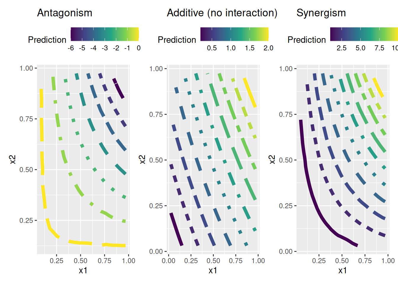
e <- rnorm(200)Then we simulate the interaction effect using three different scenarios: antagonism, additive (no interaction), and synergism.
\(\beta_3 \approx 0\), it indicates no interaction effect, meaning that the risk of CVD is simply the sum of the individual effects of age and cholesterol without any additional interaction.
\(\beta_3 > 0\), it indicates that the interaction effect is positive, meaning that as both age and cholesterol increase, the risk of CVD increases more than if they were considered independently. Conversely,
\(\beta_3 < 0\), it suggests a negative interaction effect, meaning that the risk of CVD does not increase as much with increasing age and cholesterol.
beta3_antagonism <- rep(-10,200) # Antagonism
beta3_additive <- rep(0,200) # Additive (no interaction)
beta3_synergism <- rep(10,200) # Synergism
We build three models to represent the three different interaction effects: antagonism, additive, and synergism.
y1 = beta0 + beta1*x1 + beta2*x2 + beta3_antagonism*(x1*x2) + e
y2 = beta0 + beta1*x1 + beta2*x2 + beta3_additive*(x1*x2) + e
y3 = beta0 + beta1*x1 + beta2*x2 + beta3_synergism*(x1*x2) + e
observed1 <- tibble(y1, x1, x2)
observed2 <- tibble(y2, x1, x2)
observed3 <- tibble(y3, x1, x2)
mod1 <- lm(y1 ~ x1*x2, data = observed1)
mod2 <- lm(y2 ~ x1*x2, data = observed2)
mod3 <- lm(y3 ~ x1*x2, data = observed3)
observed1$z <- predict(mod1, observed1)
observed2$z <- predict(mod2, observed2)
observed3$z <- predict(mod3, observed3)We need to create a grid of points to plot the contour lines. This grid will cover the range of values for \(x_1\) and \(x_2\).
grid1 <- with(observed1,
             interp::interp(x = x1, y = x2, z))
griddf1 <- subset(data.frame(x = rep(grid1$x, nrow(grid1$z)),
                            y = rep(grid1$y,
                                    each = ncol(grid1$z)),
                            z = as.numeric(grid1$z)),!is.na(z))

grid2 <- with(observed2,
             interp::interp(x = x1, y = x2, z))
griddf2 <- subset(data.frame(x = rep(grid2$x, nrow(grid2$z)),
                            y = rep(grid2$y,
                                    each = ncol(grid2$z)),
                            z = as.numeric(grid2$z)),!is.na(z))

grid3 <- with(observed3,
             interp::interp(x = x1, y = x2, z))
griddf3 <- subset(data.frame(x = rep(grid3$x, nrow(grid3$z)),
                            y = rep(grid3$y,
                                    each = ncol(grid3$z)),
                            z = as.numeric(grid3$z)),!is.na(z))
We can now create the contour plots for each of the three scenarios using ggplot2. Each plot will show the contour lines representing the predicted values of \(y\) based on the interaction between \(x_1\) and \(x_2\).
p1 <- ggplot(griddf1, aes(x, y, z = z)) +
  geom_contour(aes(colour = after_stat(level),
                   linetype = factor(after_stat(level))),
                   linewidth = 2) +
  scale_color_viridis_c() +
  guides(linetype = "none") +
  labs(title="Antagonism",
       color="Prediction", x = "x1", y = "x2") +
  theme(legend.position = "top")

p2 <- ggplot(griddf2, aes(x, y, z = z)) +
  geom_contour(aes(colour = after_stat(level),
                   linetype = factor(after_stat(level))),
                   linewidth = 2) +
  scale_color_viridis_c()+
  guides(linetype = "none")+
  labs(title="Additive (no interaction)",
       color="Prediction", x = "x1", y = "x2")+
  theme(legend.position = "top")

p3 <- ggplot(griddf3, aes(x, y, z = z)) +
  geom_contour(aes(colour = after_stat(level),
                   linetype = factor(after_stat(level))),
                   linewidth = 2) +
  scale_color_viridis_c()+
  guides(linetype = "none")+
  labs(title="Synergism",
       color="Prediction", x = "x1", y = "x2")+
  theme(legend.position = "top")
Combine the three contour plots using patchwork: