10.4 Example: Visualising Lung Cancer Deaths by Prevalence and Age in Germany
## # A tibble: 6 × 8
##   age   sex    prevalence prev_upper prev_lower    dx dx_uppe dx_lower
##   <chr> <chr>       <dbl>      <dbl>      <dbl> <dbl>   <dbl>    <dbl>
## 1 10-14 male         0.08       0.13       0.05 0.322   0.461    0.217
## 2 10-14 female       0.18       0.32       0.09 0.457   0.761    0.248
## 3 10-14 both         0.13       0.22       0.07 0.779   1.21     0.468
## 4 15-19 male         0.48       0.77       0.29 1.27    1.75     0.916
## 5 15-19 female       0.9        1.52       0.5  1.56    2.46     0.941
## 6 15-19 both         0.68       1.02       0.44 2.83    3.88     2.07
Scatter plot
library(ggplot2)

lung_scatter <- hmsidwR::germany_lungc |>

  # Initialise ggplot with arguments to set the x and y
  # aesthetics
  ggplot(aes(x = prevalence, y = dx)) +

  # Create a scatter plot, using sex to modify the shape
  # aesthetic
  geom_point(aes(shape = sex)) +

  # Set the title and names for x and y axes
  labs(title = "Lung Cancer Deaths by Prevalence in Germany",
       x = "Prevalence",
       y = "Deaths")

lung_scatter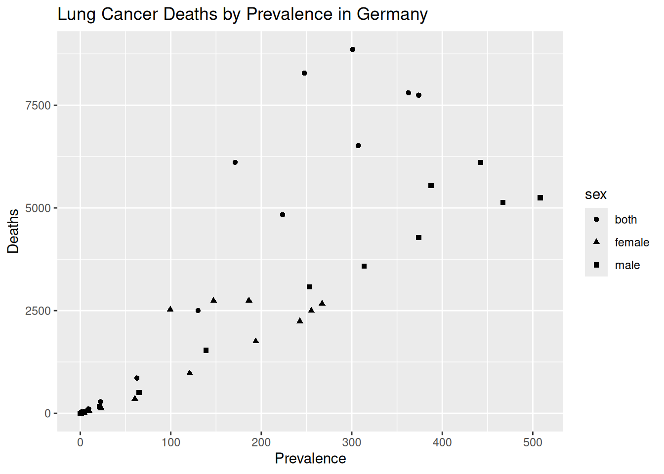
Things to do:
Change the size of the points with the
sizeaesthetic withingeom_point.Change the colour of the points with the
colourargument withingeom_point.Remove the grey background with
theme:theme_classic()ortheme_bw()with extra parameters do the same job.
Check the readability of colours for people with colour vision deficiency.
hmsidwR::germany_lungc |>
  ggplot(
    aes(
      x = prevalence,
      y = dx,
      shape = sex,
      colour = sex)) +
  geom_point(size = 4) +
  labs(title = "Lung Cancer Deaths by Prevalence in Germany",
       x = "Prevalence",
       y = "Deaths") +
  theme_classic() +
  theme(text = element_text(family = "Lato",
                            size = 14),
        axis.text = element_text(colour = "black"))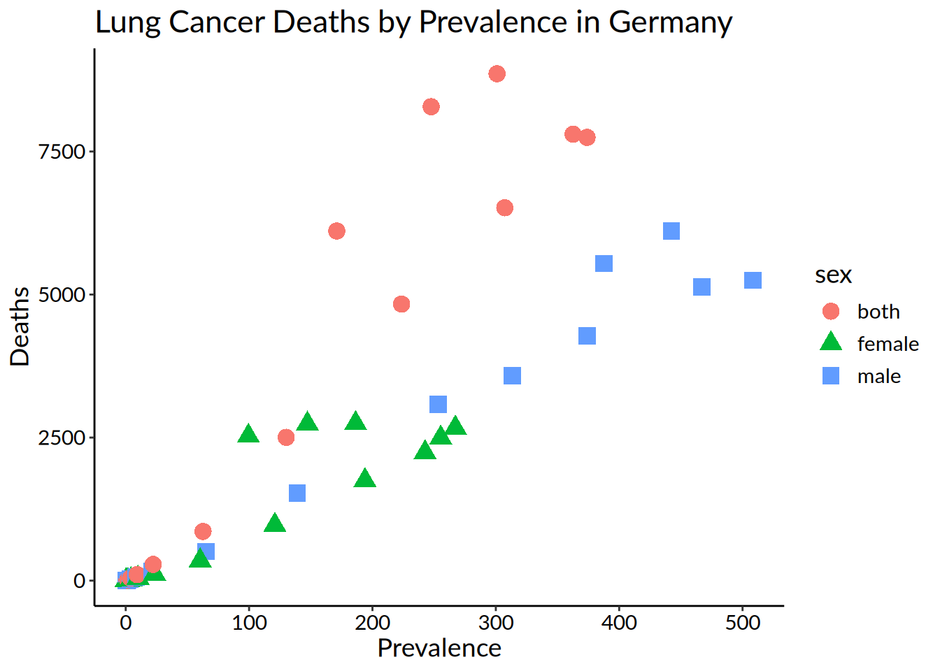
hmsidwR::germany_lungc |>
  ggplot(
    aes(
      x = prevalence,
      y = dx,
      shape = sex,
      colour = sex)) +
  geom_point(size = 4) +
  labs(title = "Lung Cancer Deaths by Prevalence in Germany",
       x = "Prevalence",
       y = "Deaths") +
  theme_bw() +
  theme(axis.line = element_line(colour = "black"),
        plot.background = element_blank(),
        panel.grid.major = element_blank(),
        panel.grid.minor = element_blank(),
        panel.border = element_blank(),
        text = element_text(family = "Lato",
                            size = 14),
        axis.text = element_text(colour = "black"))
It’s ok, but maybe not for people who are colourblind.
How to check?
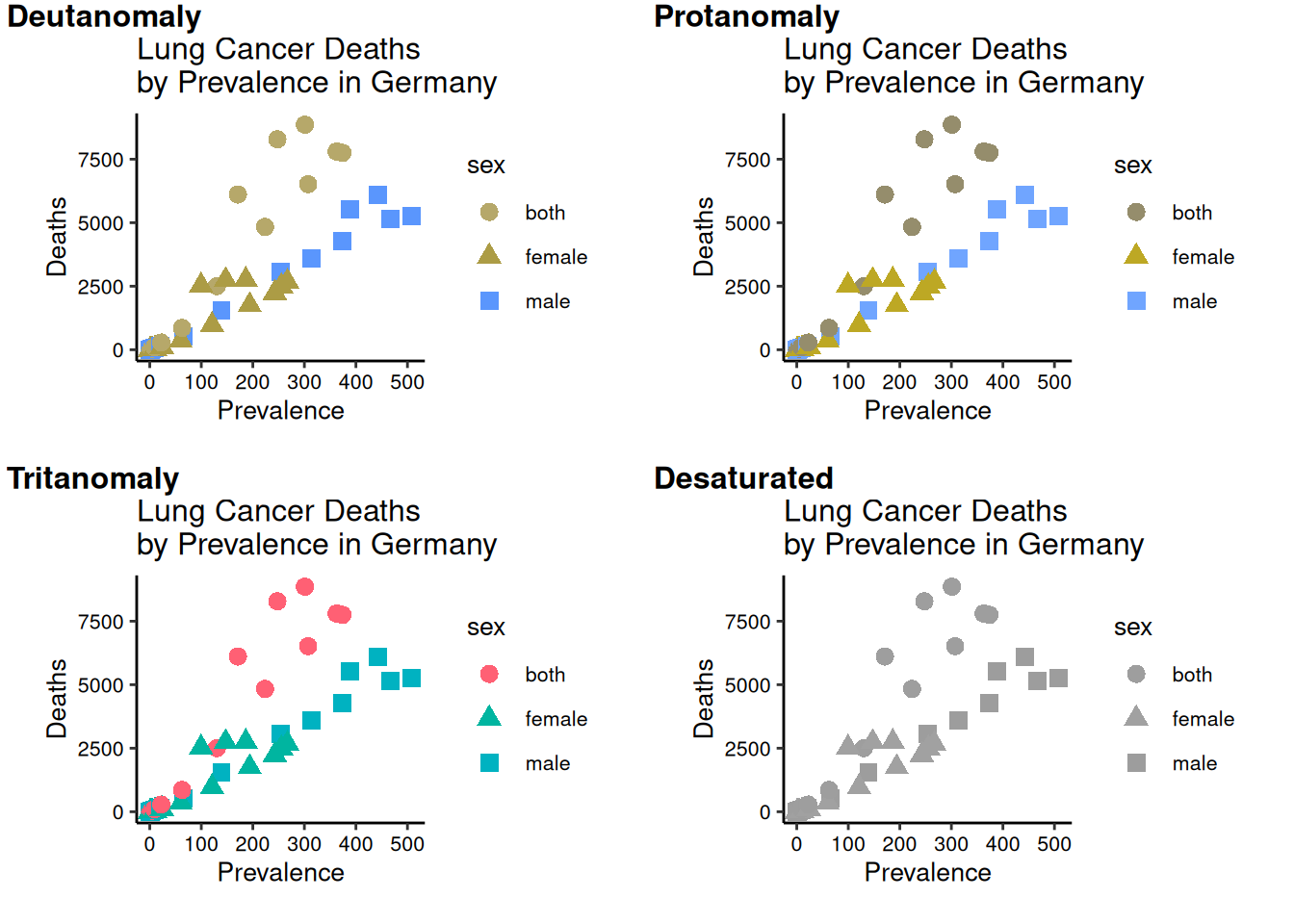
Possible options:
Don’t use colour.
Put black outlines around the shapes.
Choose a better palette.
The Okabe-Ito palette (below) was designed for qualitative data.
The
viridispalette may be suitable for continuous data.{colorbrewer}package has colourblind-friendly palettes.

- Control colour and shape using
scale_colour_manualandscale_shape_manual(necessary if modifying the legend title).
scatter +
  labs(title = "Lung Cancer Deaths by Prevalence in Germany") +
  scale_color_manual(name = "Sex",
                     values = c("#000000", "#009E73", "#D55E00"),
                     labels = c("Both", "Female", "Male")) +
  scale_shape_manual(name = "Sex",
                     values = c(16, 17, 15),
                     labels = c("Both", "Female", "Male"))
- Can also use
scale_color_OkabeItoandscale_fill_OkabeIto.
Barplot
library(ggpattern)

# Create a barplot
hmsidwR::germany_lungc |>

  # This time, the aesthetics are age and estimated death rate
  # with patterns for sex
  ggplot(aes(x = age, y = dx, group = sex))  +

  # The ggpattern package creates stacked charts with
  # geom_col_pattern different patterns based on the sex
  # variable
  ggpattern::geom_col_pattern(aes(pattern=sex),
                              position="stack",
                              fill= 'white',
                              colour= 'black') +

  # Again, set the title and names for x and y axes
  labs(title = "Lung Cancer Deaths by Age in Germany",
       x = "Age",
       y = "Deaths")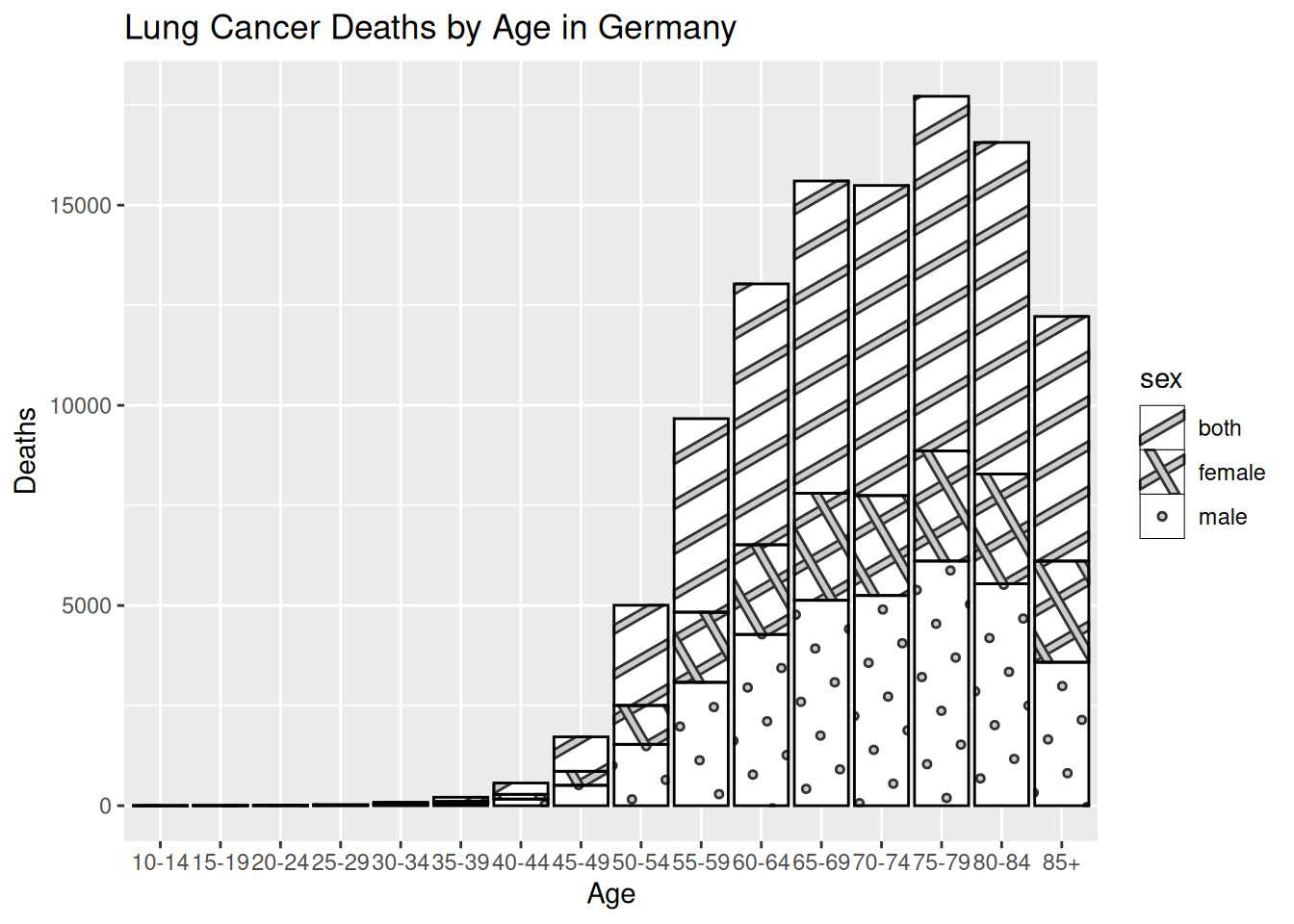
Things to do:
Create a bar chart with
geom_bar.Use faceting to separate the categories with
facet_grid.Angle the x-axis category labels with
hjust.Set the y-axis origin to 0.
# Create a barplot
barplot <- hmsidwR::germany_lungc |>

  # This time, the aesthetics are age and number of deaths with
  # patterns for sex
  ggplot(aes(x = age, y = dx))  +

  # The geom_bar argument is used for bar charts
  geom_bar(fill = "white",

           # stat = "identity" tells R to calculate the sum of
           # the y variable, grouped by the x variable
           stat = "identity",

           # Add a black outline
           colour = "black") +

  # Set the origin for the y-axis at 0
  scale_y_continuous(expand = c(0, 0)) +

  # Again, set the title and names for x and y axes
  labs(title = "Lung Cancer Deaths by Age in Germany",
       x = "Age",
       y = "Deaths") +

  # Separate panels for each sex category, and modify the
  # fonts and some styling
  facet_grid(sex ~ .) +
  theme_classic() +
  theme(text = element_text(family = "Lato",
                            size = 12),
        axis.text = element_text(colour = "black"),
        axis.text.x = element_text(angle = 45,
                                   hjust = 1))

barplot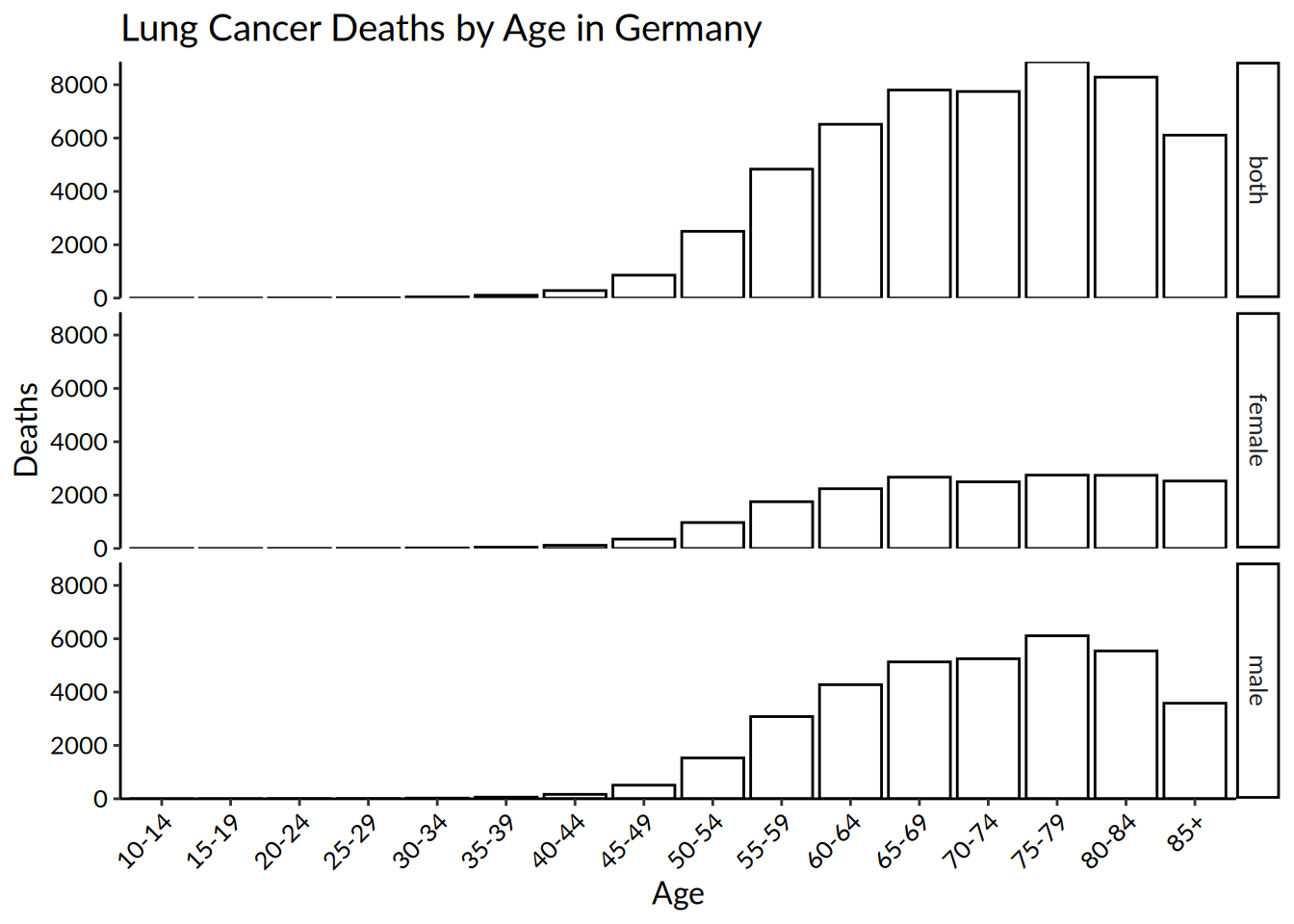
To format the strip text in the facets, use the labeller argument inside facet_grid:
# Put the categories in a list
sex_categories <- list(
  "both" = "Both",
  "female" = "Female",
  "male" = "Male"
)

# Create a function to store the new names
sex_labeller <- function(variable,value){
  return(sex_categories[value])
}

# Add the names to the strip panels
barplot +
  facet_grid(~ sex, labeller = sex_labeller) +
  theme_classic() +
  theme(text = element_text(size = 10),
        axis.text = element_text(colour = "black"),
        axis.text.x = element_text(angle = 45,
                                   hjust = 1))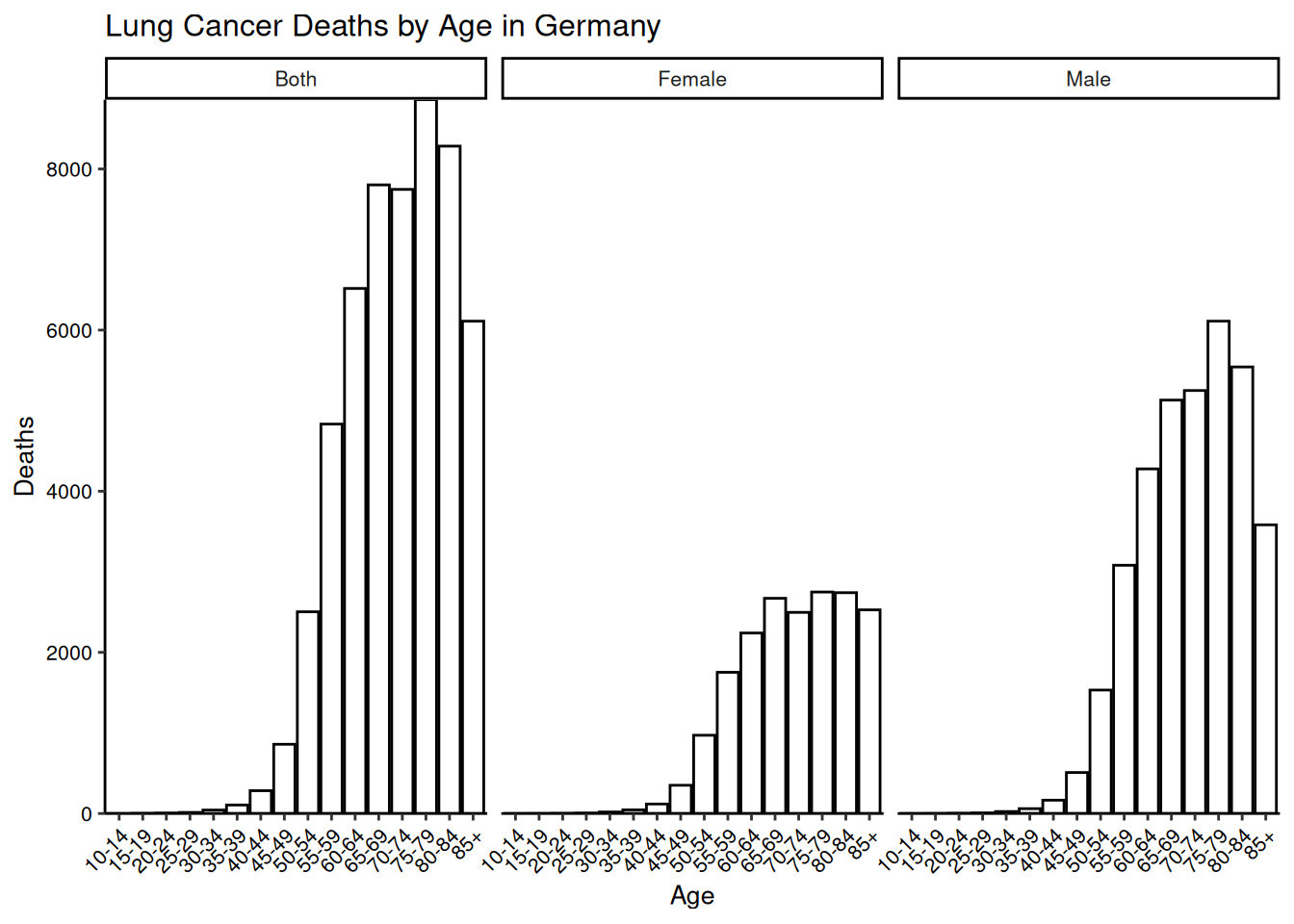
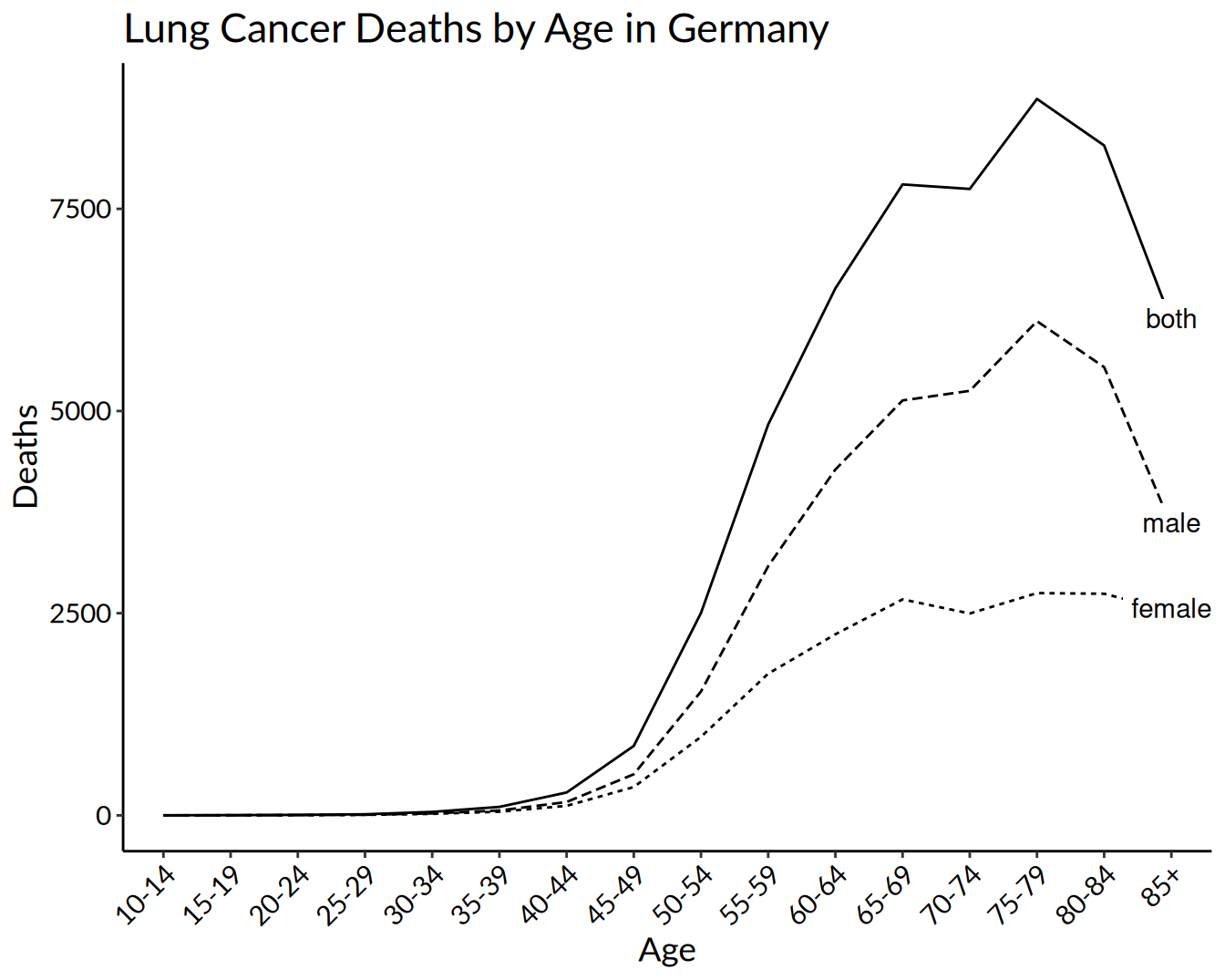
Line plot
lineplot <- hmsidwR::germany_lungc |>

  # Variables are age, deaths, grouped by sex
  ggplot(aes(x = age, y = dx, group = sex)) +

  # geom_line creates the lines, varying the type of line by sex
  geom_line(aes(linetype = sex)) +

  # Add points with geom_point
  geom_point() +
  labs(title = "Lung Cancer Deaths by Age in Germany",
       x = "Age",
       y = "Deaths")

lineplot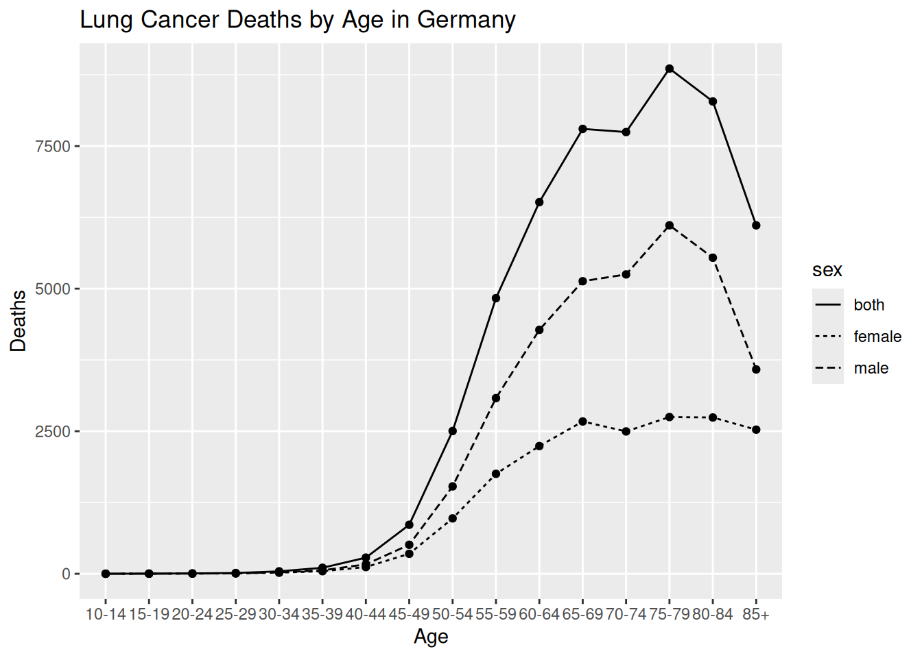
Lineplot
Things to do:
Remove the legend and add labels to the ends of the lines with package
{ggtext}.Plain background and similar formatting as before.
library(ggtext)

# Subset the data to create labels based on the oldest age
# category to put the labels at the end of the line
dat_label <- subset(hmsidwR::germany_lungc, age == max(age))

hmsidwR::germany_lungc |>

  # Same variables as before
  ggplot(aes(x = age, y = dx, group = sex)) +

  # geom_line creates the lines, varying the type of line by
  # sex; remove the legend
  geom_line(aes(linetype = sex),
            show.legend = FALSE) +

  # Use the subsetted data created to add the labels
  ggtext::geom_richtext(data = dat_label,
                        label.color = NA,
                        aes(label = sex)) +
  labs(title = "Lung Cancer Deaths by Age in Germany",
       x = "Age",
       y = "Deaths") +
  theme_classic() +
  theme(text = element_text(family = "Lato",
                            size = 14),
        axis.text = element_text(colour = "black"),
        axis.text.x = element_text(angle = 45,
                                   hjust = 1))