Predicted vs Actual Plots
- Predicted vs Actual Plot: Scatter of model predictions vs observed values
- 45° line = perfect match of prediction and actual (very rare!)
- Near line = predictions close to true values (high accuracy)
- Far off line = larger errors, indicators performing less well
- Can reveals patterns of bias: e.g. consistent under-prediction or over-prediction
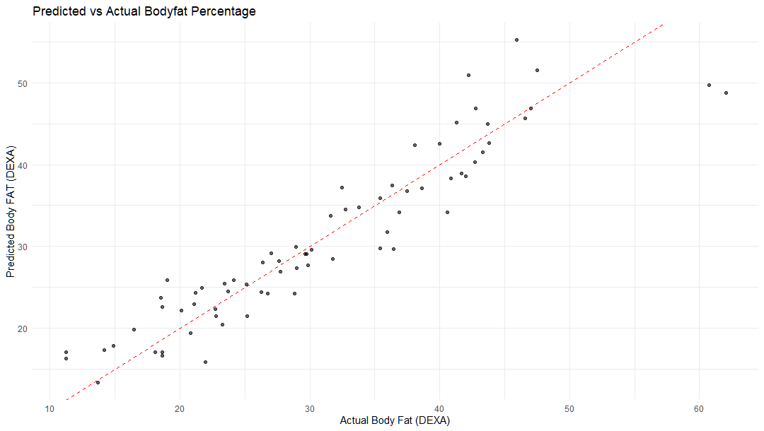
Example body fat prediction model