Fundamentals of Data Visualization Book Club
Welcome
Book club meetings
Pace
1
Introduction
What is this book about?
Preface
Preface
Thoughts on graphing software and figure-preparation pipelines
Introducion
How is the book divided?
Figures
2
Visualizing data: Mapping data onto aesthetics
SLIDE 1
3
Coordinate systems and axes
Coordinates in real life
Coordinates in data viz
Cartesian coordinates
Coordinates for curved axes
Polar coordinates
Geospatial
Axes
Scale
4
Color scales
Color as a tool to distinguish
Color to represent data values
Diverging Color Scales: midpoints
Color as a tool to highlight
5
Directory of visualizations
Amounts
Distributions
Proportions
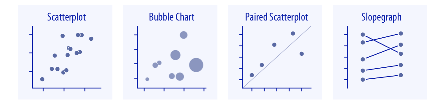
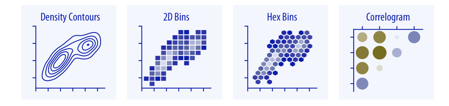
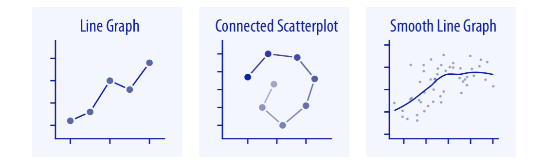
x-y relationships
Geospatial data
Uncertainty
6
Visualizing amounts
6.1 Bar plots
6.1
6.2 Grouped and stacked bars
6.2
6.3 Dot plots and heatmaps
7
Visualizing distributions: Histograms and density plots
7.1 Visualizing a single distribution
7.2 Visualizing multiple distributions at the same time
8
Visualizing distributions: Empirical cumulative distribution functions and q-q plots
Empirical cumulative distribution functions
Highly skewed distributions
Quantile-Quantile plots
9
Visualizing many distributions at once
Introduction 1
Visualizing distributions along the vertical axis
Visualizing distributions along the horizontal axis
10
Visualizing proportions
How to plot percentages: it depends
Pie
Where it works
Where it fails
Other viz strategies
Waffle
Side-by-side bars
Where it works
But could it be made better?
Stacked bars
Stacked densities
Percentages separately as parts of a whole
Group count compared to total count
Relative percentages
11
Visualizing nested proportions
Nested proportions
Caveat visualizator
What may work
Mosiac plots
Treemaps
Problems of mosaic / treemaps
Nested pie
Parallel sets
Other strategies
Sunburst
Fixed length
Varying length
Nice resources
Coxcomb / Nightingale
Multiple charts: overview; selective drill-down
Interactive drill-down
12
Visualizing associations among two or more quantitative variables
SLIDE 1
13
Visualizing time series and other functions of an independent variable
SLIDE 1
14
Visualizing trends
Why smooth?
Smoothing by transforming data
Smoothing by applying smoothing functions
Smoothing by applying defined functions
Smoothing by transforming axes
Detrending a time series
15
Visualizing geospatial data
The earth as an oblate elipsoid
Projections
Layers
Choropleth mapping
Cartograms
16
Visualizing uncertainty
Visualizing uncertainty
Probabilities as frequencies
Visualizing the uncertainty of point estimates
Bayesian uncertainty
Visualizing the uncertainty of curve fits
17
The principle of proportional ink
The principle of proportional ink
Visualizations along linear axes
How to properly represent visualizations along linear axes
Visualization along logarithmic axes
Working with log scales that do not work
How to properly work with log scales in bar plots
Direct area visualization
Direct area visualiztion in bar graphs
18
Handling overlapping points
SLIDE 1
19
Common pitfalls of color use
SLIDE 1
20
Redundant coding
Redundant coding
Designing legends with redundant coding for scatter plots
Designing legends with redundant coding for line graphs
Designing figures without legends
Other examples
21
Multi-panel figures
Multi-panel figures
Small multiples
Compound figures
Labeling compound figures
Consistency across panels
22
Titles, captions, and tables
SLIDE 1
23
Balance the data and the context
SLIDE 1
24
Use larger axis labels
SLIDE 1
25
Avoid line drawings
SLIDE 1
26
Don’t go 3D
SLIDE 1
27
Understanding the most commonly used image file formats
SLIDE 1
28
Choosing the right visualization software
Choosing the right visualization software
Reproducibility and repeatability
Data exploration versus data presentation
Separation of content and design
29
Telling a story and making a point
What is a story
Make a figure for the generals
Build up towards complex figures
Make your figures memorable
Be consistent but don’t be repetitive
Published with bookdown
Fundamentals of Data Visualization Book Club
x-y relationships