Empirical cumulative distribution functions
- Example: student grades. A hypothetical class with 50 students that just completed an exam on which they could score between 0 and 100 points.
- How can we best visualize the class performance, for example to determine appropriate grade boundaries?
- Answer: with a cumulative distribution. The y-axis shows the students ordered by rank and the x-axis shows the student’s grades.
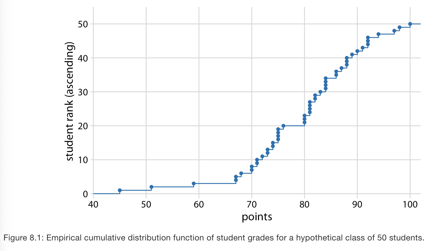
- Key points from the plot: Aprox 25% of students received less than 75 points. The median (50%) is 81. And 20% of students got 90 or more.