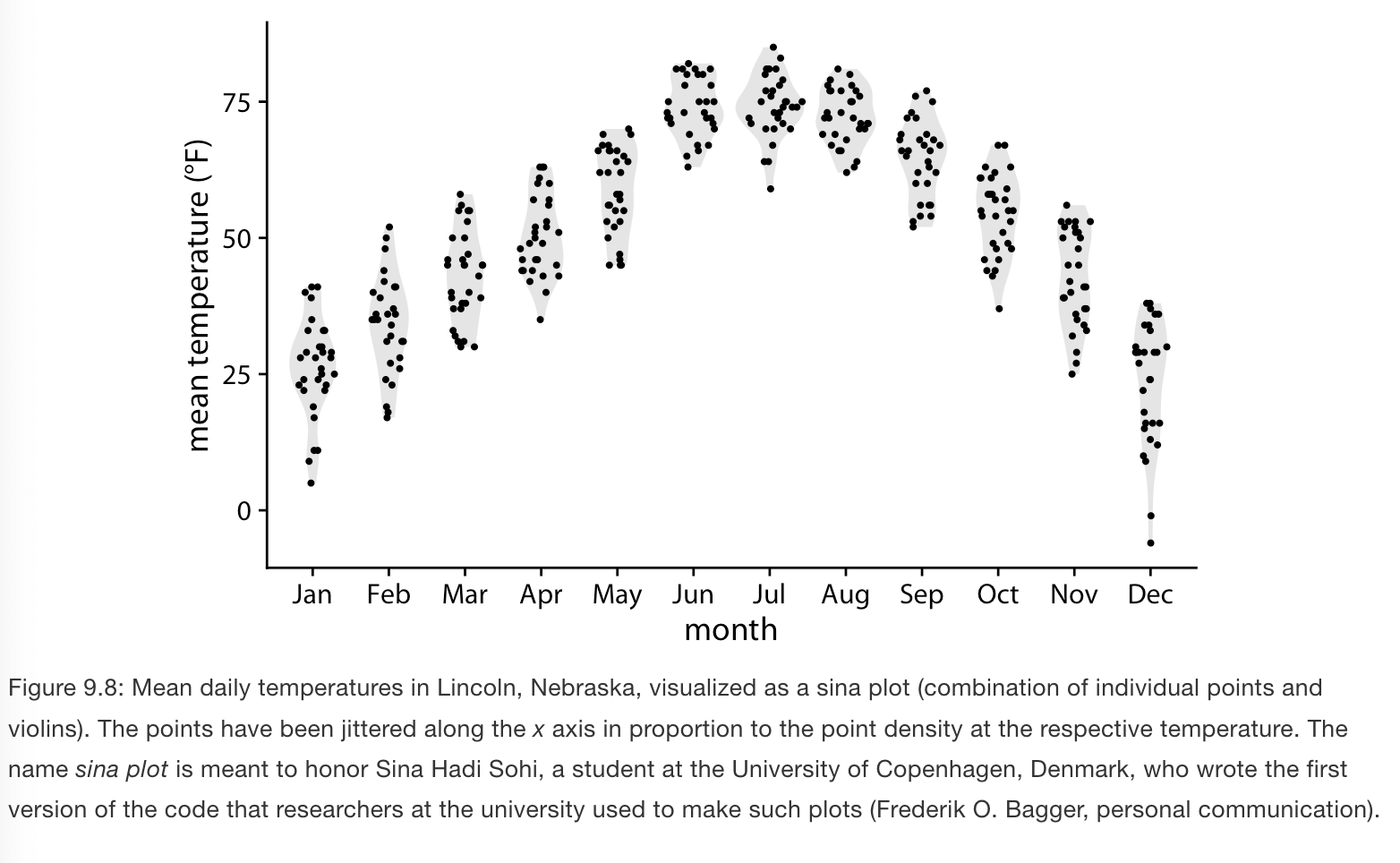
Visualizing distributions along the vertical axis
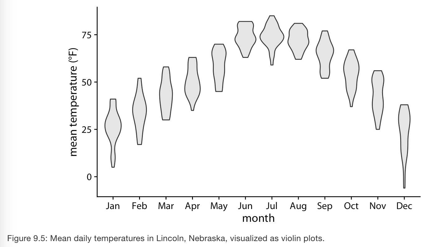
Example: Monthly temperatures in Lincoln, NE.
Violin plots are very useful to show multiple distributions but have some shortcomings:
- they can generate the appearance that there is data where none exists, or that the data set is very dense when actually it is quite sparse.
- Sina plots combine jittered points with violin plots which shows each individual point while also visualizing distributions.