• Fundamentals of Data Visualization Book Club
  • Welcome
    • Book club meetings
    • Pace
  • 1 Introduction
    • What is this book about?
    • Preface
    • Preface
    • Thoughts on graphing software and figure-preparation pipelines
    • Introducion
    • How is the book divided?
    • Figures
  • 2 Visualizing data: Mapping data onto aesthetics
    • SLIDE 1
  • 3 Coordinate systems and axes
    • Coordinates in real life
    • Coordinates in data viz
    • Cartesian coordinates
    • Coordinates for curved axes
    • Polar coordinates
    • Geospatial
    • Axes
    • Scale
  • 4 Color scales
    • Color as a tool to distinguish
    • Color to represent data values
    • Diverging Color Scales: midpoints
    • Color as a tool to highlight
  • 5 Directory of visualizations
    • Amounts
    • Distributions
    • Proportions
    • x-y relationships
    • Geospatial data
    • Uncertainty
  • 6 Visualizing amounts
    • 6.1 Bar plots
    • 6.1 6.2 Grouped and stacked bars
    • 6.2 6.3 Dot plots and heatmaps
  • 7 Visualizing distributions: Histograms and density plots
    • 7.1 Visualizing a single distribution
    • 7.2 Visualizing multiple distributions at the same time
  • 8 Visualizing distributions: Empirical cumulative distribution functions and q-q plots
    • Empirical cumulative distribution functions
    • Highly skewed distributions
    • Quantile-Quantile plots
  • 9 Visualizing many distributions at once
    • Introduction 1
    • Visualizing distributions along the vertical axis
    • Visualizing distributions along the horizontal axis
  • 10 Visualizing proportions
    • How to plot percentages: it depends
    • Pie
      • Where it works
    • Where it fails
    • Other viz strategies
    • Waffle
    • Side-by-side bars
    • Where it works
    • But could it be made better?
    • Stacked bars
    • Stacked densities
    • Percentages separately as parts of a whole
      • Group count compared to total count
      • Relative percentages
  • 11 Visualizing nested proportions
    • Nested proportions
    • Caveat visualizator
    • What may work
    • Mosiac plots
    • Treemaps
    • Problems of mosaic / treemaps
    • Nested pie
    • Parallel sets
    • Other strategies
    • Sunburst
      • Fixed length
      • Varying length
      • Nice resources
    • Coxcomb / Nightingale
    • Multiple charts: overview; selective drill-down
    • Interactive drill-down
  • 12 Visualizing associations among two or more quantitative variables
    • SLIDE 1
  • 13 Visualizing time series and other functions of an independent variable
    • SLIDE 1
  • 14 Visualizing trends
    • Why smooth?
    • Smoothing by transforming data
    • Smoothing by applying smoothing functions
    • Smoothing by applying defined functions
    • Smoothing by transforming axes
    • Detrending a time series
  • 15 Visualizing geospatial data
    • The earth as an oblate elipsoid
    • Projections
    • Layers
    • Choropleth mapping
    • Cartograms
  • 16 Visualizing uncertainty
    • Visualizing uncertainty
    • Probabilities as frequencies
    • Visualizing the uncertainty of point estimates
  • Bayesian uncertainty
    • Visualizing the uncertainty of curve fits
  • 17 The principle of proportional ink
    • The principle of proportional ink
    • Visualizations along linear axes
    • How to properly represent visualizations along linear axes
    • Visualization along logarithmic axes
    • Working with log scales that do not work
    • How to properly work with log scales in bar plots
    • Direct area visualization
    • Direct area visualiztion in bar graphs
  • 18 Handling overlapping points
    • SLIDE 1
  • 19 Common pitfalls of color use
    • SLIDE 1
  • 20 Redundant coding
    • Redundant coding
  • Designing legends with redundant coding for scatter plots
  • Designing legends with redundant coding for line graphs
    • Designing figures without legends
    • Other examples
  • 21 Multi-panel figures
    • Multi-panel figures
    • Small multiples
    • Compound figures
    • Labeling compound figures
    • Consistency across panels
  • 22 Titles, captions, and tables
    • SLIDE 1
  • 23 Balance the data and the context
    • SLIDE 1
  • 24 Use larger axis labels
    • SLIDE 1
  • 25 Avoid line drawings
    • SLIDE 1
  • 26 Don’t go 3D
    • SLIDE 1
  • 27 Understanding the most commonly used image file formats
    • SLIDE 1
  • 28 Choosing the right visualization software
    • Choosing the right visualization software
    • Reproducibility and repeatability
    • Data exploration versus data presentation
    • Separation of content and design
  • 29 Telling a story and making a point
    • What is a story
    • Make a figure for the generals
    • Build up towards complex figures
    • Make your figures memorable
    • Be consistent but don’t be repetitive
  • Published with bookdown

Fundamentals of Data Visualization Book Club

Waffle

Source: https://www.gov.uk/government/publications/a-bite-sized-guide-to-visualising-data-a-dstl-biscuit-book/a-bite-sized-guide-to-visualising-data
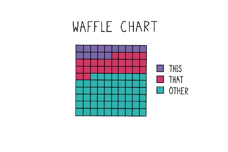
  • Equally sweet when pie charts are
  • But overcomes the radial area problem