Visualization along logarithmic axes
- On a linear scale, bar/rectangle areas are proportional to data values.
- On a logarithmic scale, this proportionality is lost because axis spacing isn’t linear.
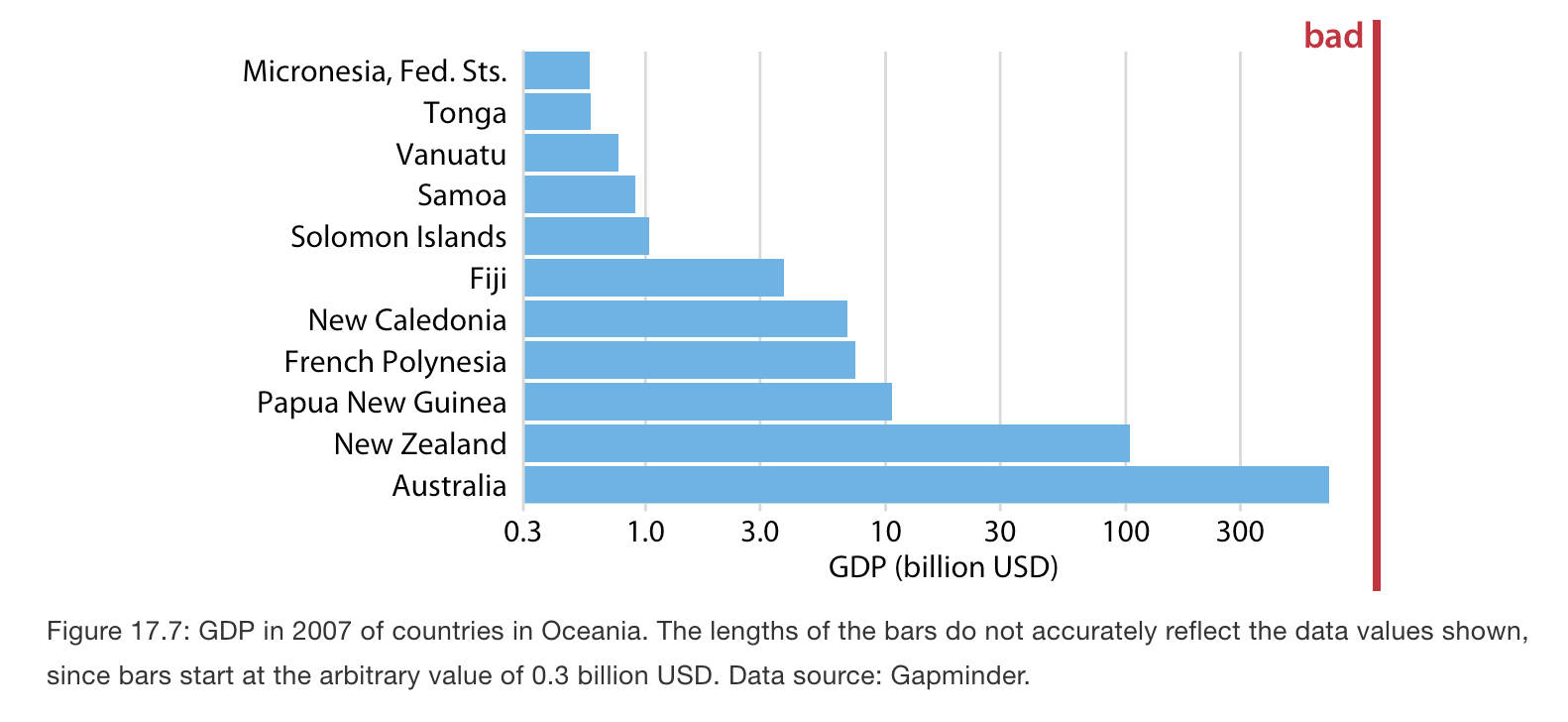
- As an example, consider the gross domestic products (GDPs) of countries in Oceania. In 2007, these varied from less than a billion U.S. dollars (USD) to over 300 billion USD.
- Visualizing these numbers on a linear scale would not work, because the two countries with the largest GDPs (New Zealand and Australia) would dominate the figure.