6.1 Bar plots
Plot a quantitative variable (e.g. an amount) versus a categorical variable
Axes showing amounts (e.g. bar charts) start at 0
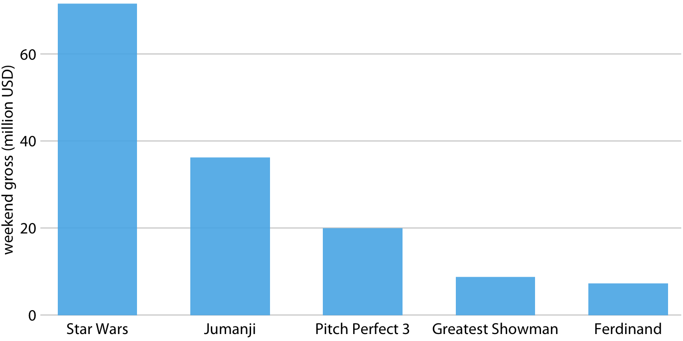
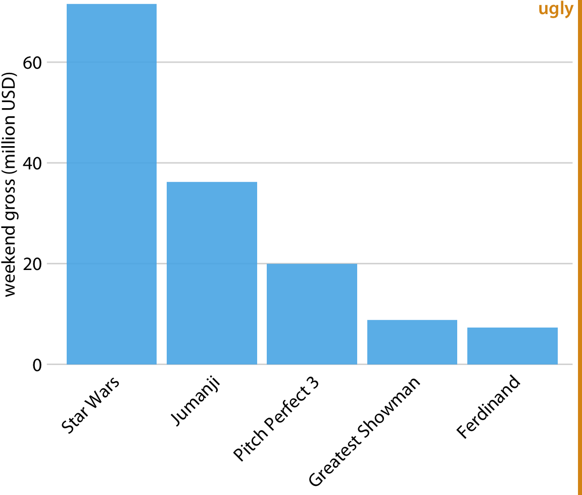
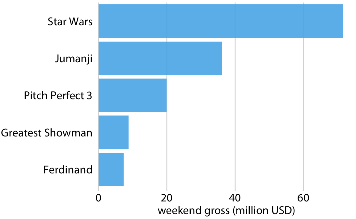
Axes labels for the categorical variable are a common frustration. Solutions include:
Rotating labels up to 90 degrees
Flipping the x and y coordinates
Wrapping long labels
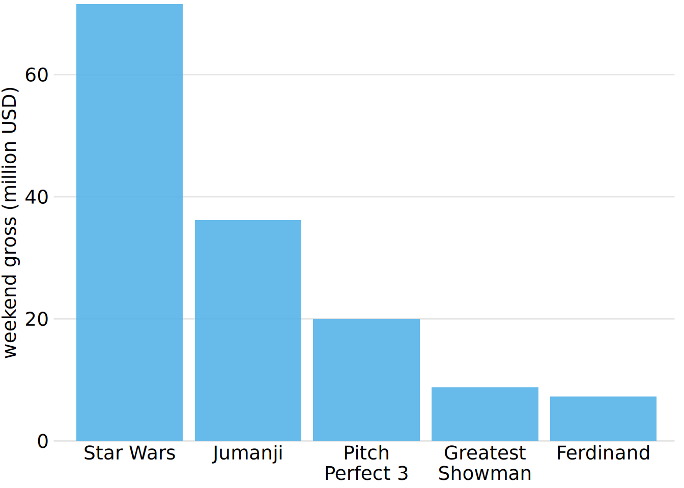
Ordering bars by ascending or descending data values, or by a natural order, aids in perceptability
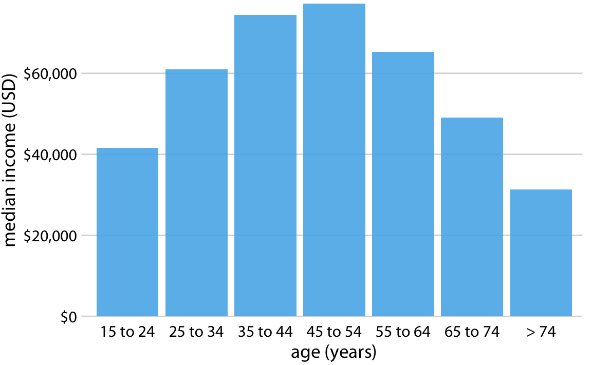
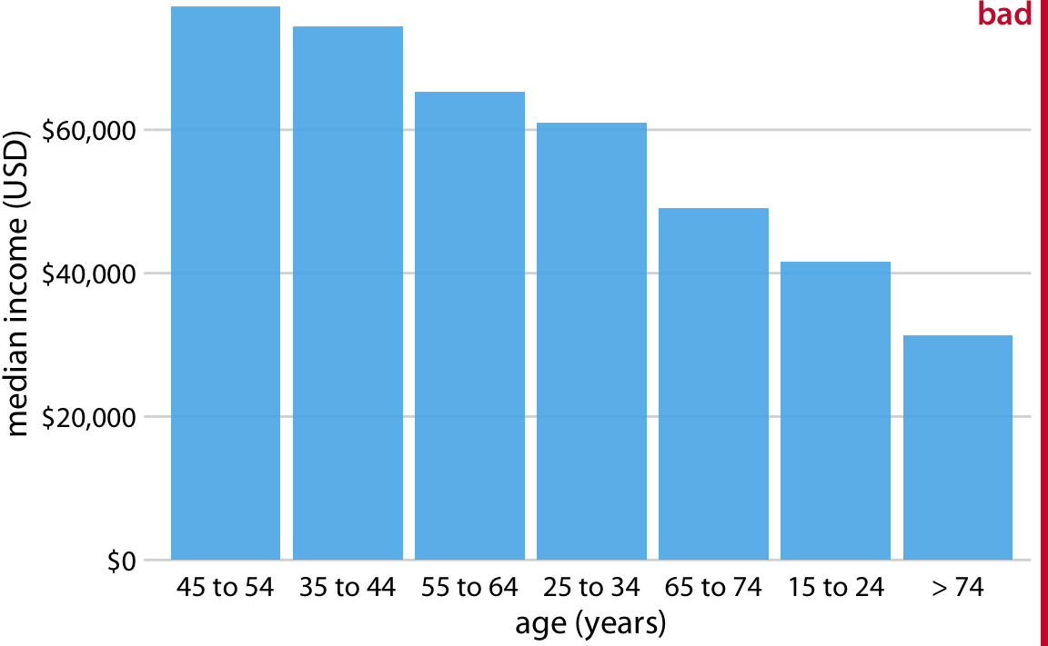
Since the quantitative variable axis must start at zero, are bar charts suitable for logarithmic scales, ratios, or products (all of which don’t necessarily include zero)?